Being a strategist, designer, marketer, and illustrator means you never know what you’ll be working on next. Which I love. So when I got a call from the local dog care experts at Skipper, I knew the universe was throwing me a creative bone I could really chew on. (See what I did there?) Their plan was genius. Skipper was already giving pets a loving, rewarding day when their owners couldn’t be there to supply it in person. Skipper’s smartphone app lets dog owners share in their pet’s experience in real time with photos at walk-time, pics of drop-off and other fun activities. But now, they wanted to create an amazing “together experience”.

The bar would be the focal point of this enormous space. And once we nailed the concept, the bar almost designed itself. A pub-like structure (faux brick below, dark green wood up top), tall and open but visually complete thanks to the hanging windows. The bar served beer for dogs, as well, so of course the bar’s logo would be a water dish with a mug handle full of suds. Customers would order on an app and be notified when to FETCH their drinks. How fun is that?
Skipper bought a giant warehouse space in a neighborhood that’s about to be chock-o-block with upscale apartments because they wanted to make it the ultimate doggy bonding destination. A couple of dog bars already exist here, but they’re smelly, unkempt, and furnished with cheap tables and plastic chairs. Skipper wanted to create a mind-blowing, immersive EXPERIENCE. In addition to a bar, the building would also house a kennel, exercise yard, and a new HQ for Skipper’s operations (a super smart way to expand your office space needs, capabilities, and profit margin). Exciting on so many levels.
Even though the building was purchased and the architects were hired, the concept itself was still in exploratory mode. They knew generally where they wanted to go, but they wanted to see what was possible, if it was viable, and most importantly, if it was affordable. And it had to happen fast. So how do you make a giant, cavernous dog bar/kennel/tech biz a destination? We understood the existing audience and their needs. We knew plenty of Instagrammable destinations existed out there, but after one or two visits, they became tired thematically. What we needed was a good story. One that could freshly serve daily customers, frequent visitors, and out-of-town sightseers. One that was fun to work at every day. Oh, and one that would fit the brand. Easy.

Meet the competition. Yes, this is a dog bar in the same town. You can almost smell the urine.

Now this. This is how you fill a space. I visited a LOT of big spaces when I was doing the advance thinking for our workshop. Lowe’s Foods not only filled their giant space, they did it with style and story and without a lot of expense. That structure to the right is in the wine section. You can pour a beer and sit in this little container fort and pretend you’re not hanging out in a grocery store.
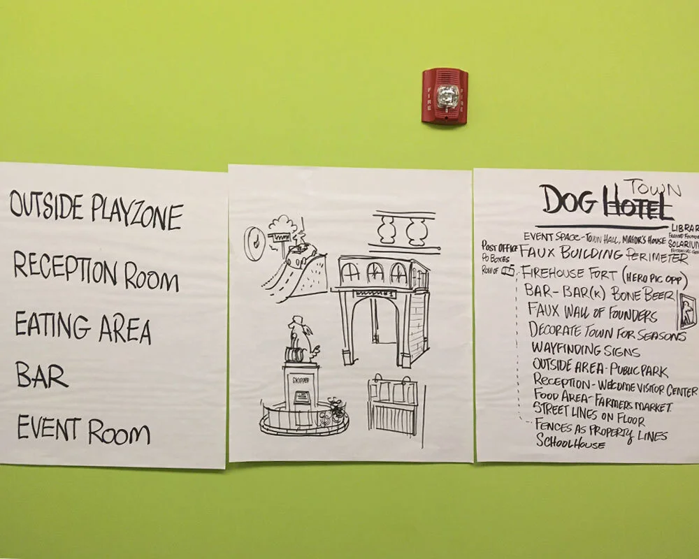
In our brainstorming workshop I taped up a handful of “starter themes” that we could riff around. I also posted up sheets to keep up on task – areas we’d need to consider, amenities and services offered, company mission, etc. It’s funny, but we sort of sputtered and stumbled around until we got to what was originally the Dog Hotel theme (remember, it was a kennel, too, so it made sense). Once we turned it into a town, it came to life in front of our eyes. It’s was really exciting!

The whole place would be filled with gags and little surprises. I especially like how the Firehouse is siren-free. Those clouds up there? I thought it’d be nice to do some sound baffling in a way that helped the story. :-)

Remember, it’s a town built by dogs for dogs. So the entrance is the town’s Tourist Center. You just walk your dog up that ramp to check you both in (you’re his/her guest, after all).. Once you’re checked in, you’re in the town square (complete with a stature of the founding pooch). From here you have a commanding view of the town. Hungry, visit the indoor-outdoor market where you’ll find snacks for dogs and humans.
I toured the space with the CEO and listened to her describe every detail, every wish, hope, and desire regarding the vision. Then I spent a couple of days coming up with some jumping-off points that we could talk around in a brainstorming workshop. And despite it being the dead of winter, we spent a couple few hours hammering out ideas in an unheated, on-site conference room. We filled the walls with good, bad, and ugly ideas until it was clear we had a winner.
The idea was simple. Create a town, founded by dogs, built by dogs, and governed by dogs (with assistance from their human partners). The space, as I said, was huge. If it was only filled with tables and chairs, it’d be overpowered by space, echoey and lame. Scale was our enemy. So I planned to fill the space with town buildings that would serve as little “forts'' to hang out in. A firehouse. An art museum. A town Hall of Fame. Since the town was built by dogs, everything from the signage to the tiniest bit of extra credit would be misspelled hilariously in enthusiastically sincere “dogese”. The entrance where you (human) and your Master (dog) checked in was the town’s Welcome Center (and, of course, Gift Shop). There was even a dog’s Farmers Market where all kinds of treats were sold (along with a human food food truck right outside the roll up garage door). My favorite part was the bar with the pub facade. You’d order drinks (including legit dog beverages) through the app and, when ready, you’d get a text. Not to pick up your order, but to FETCH it. And all of this detail came about in that two hour workshop including all the other ideas.
Knowing your audience and your service to them is important. But the story. Ugh, the story is the difference between being another dog bar and being something on a whole different level.

DAVE SOPP – Creative
Yep, that’s me. I’ve got over 20 years of marketing strategy, graphic design, advertising art direction, and illustration experience. Want to use some of it? Email me at dave@davesopp.com