Strategy > Branding
Downtown Mooresville is a special place. Its charm (and untapped potential) lured us away from San Francisco when we were looking for better schools and a less hectic lifestyle. We took a look at Downtown, found an old home a block and a half away, moved, set up shop in the old telegraph office along Broad Street across from the old train depot, and quietly kept doing what we were doing back in The City. Only this time, with a freight train passing by and blowing its whistle every day at 1pm. It was so loud you couldn’t plan any phone calls around that time slot. It was awesome (not sarcasm). The old Downtown was only a few blocks long on Main Street, and wore charming but warehousy treasures over its shoulder along Broad Street, too.
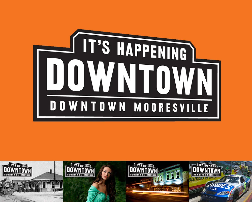
FINAL: The first thing we did was define Downtown Mooresville as, well, Downtown Mooresville. The final logo could easily represent Downtown’s railroad past, but also make sense with shops you’d find there (fashion, restaurants, bars, hairstylists, hardware, etc.), and event that would be held there. It had to play nice with everything you threw at it.
It’s hard to not meet people Downtown. Heck, most of them were neighbors as it turned out. One of those neighbors turned out to be Kim Atkins. She’d had successful career in the printing business and became a shop owner on Main Street. It didn’t work out. Rather than do what anyone would have done (curse Downtown and never return), she did the opposite and was elected the Executive Director of the Downtown Commission. Our boys went to the same elementary school and had become inseparable pals.
Downtown Mooresville was founded in 1873 along a rail line (yep, trains still use it!). In the 1960’s, Duke Power created the man-made Lake Norman while at the same time, the I77 was created to offer a faster way to motor to Charlotte down south, and Statesville up north. The lake was to the west of Downtown and offered about a jillion miles of lakefront property opportunity. The I77 freeway divided the town in more ways than one. Downtown was considered the poor side of Mooresville. Lake Norman (LKN) was where the money was. Hot-Cha!

BEFORE: Oh, there was clearly nothing happening Downtown when we started this project. Open shops had huge gaps of vacant, papered-over storefronts between them. That’s real bad for encouraging foot traffic and look at the mess. By code, closed businesses had to have their windows papered. So we had the idea to paper them with interesting facts about Downtown. It would pull people through to all the open shops, entertain and educate visitors, clean up the overall look of Downtown Mooresville, and cover up it’s vacancy problem. And, being black and white, it’d be affordable. So many problems solved with one easy solution!

BEFORE: The many brochures (and identities) of Downtown Mooresville, all in circulation at the same time when we started working with them.
Cut to modern times and it’s still the same. One side of Lake Norman has all the Red Robins, Super Targets, and Olive Gardens they can handle. While our side (I live in this part, remember) is a little weathered, but has all the heart and soul of what this town used to be. It didn’t help that Downtown was all but empty, lacking both shops and people. The most going concern though, was really going. Soirée was situated in a beautifully restored building in the center of Downtown and was a destination on any night of the week. The problem was, the few shops and business Downtown were never open when Soirée was pulling in the public. Worse yet, the town was so divided that (and I’m not exaggerating here), 85% of the fancy people on the Lake side didn’t even know Downtown existed!

FINAL: The first step – getting our house in order. With some selective photography we presented the Downtown we wanted people to see. All beautiful old buildings and historic charm. We dressed up Main Street with some handsome, attention-getting, hard-working street banners, nailed down our identity and made ONE exciting brochure.
Sorry. Lots of backstory, but it’s super important (especially if you’re a small town in a similar situation). Downtown was quiet, but not dead. They launched a VERY aggressive event schedule to get folks over the I77 to our side, but they didn’t really have a brand to hang it all upon. Some merchants were calling Downtown “the Dirty Mo” on their social media. Some called it “DoMo” (Downtown Mooresville). Messaging was all over the place and none of it was cohesive or sticking. So Kim asked us for ideas on what to do.
The first thing I recommended was nixing the idea of a clever name altogether. People didn’t even know there WAS an old Downtown in Mooresville. Calling it fancy things would just confuse the issue. It was Downtown Mooresville, so just let it be Downtown Mooresville. You can always make a fun nickname later. They brought us on for branding Downtown and the next thing I did was lie through my teefs.
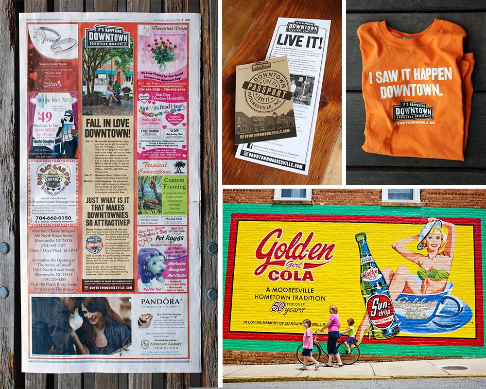
FINAL: Next it was time to promote Downtown as a destination. Clockwise from the left: 1. By working closely with the pubs we advertised in, we were able to create uniquely branded templates. 2. Our award-winning program to celebrate fans of Downtown Mooresville. 3. Our first piece of Downtown merch. 4. We created a photobank of amazing images that we could use to show folks what we saw in Downtown Mooresville.
Downtown was tired and mostly empty, but not dead. And with a roster of new events, we had to make it seem like there was a secret party going on over here that the Lake people weren’t privy to. In a nod to our railroad history, I designed a vintage/modern logo lockup with the tag line, It’s Happening Downtown. And that was the big lie. Sort of. It was GOING to happen, it just hadn’t actually happened yet. Operation “Fake It ‘Till You Make It” was in full effect. We started running monthly event ads in the local papers. We installed street banners, made bar coasters, put up signage at our local ballpark. We started doing spreads with an event calendar in the local magazines. We rebuilt the website. We got on social media. All the stuff you need to do before we got really creative.

FINAL: From 2009 to 2017 we’d spread the word about Downtown Mooresville. Clockwise from top left: 1. The website we designed for Downtown. 2, One of many posters we did to promote their crazy amount of fun events. 3. A magazine ad designed to introduce newcomers to Downtown. 4. One of many little quarter page newspaper ads promoting monthly events Downtown.
For example, we made calling cards for Downtown merchants and employees to hand out to other shop and restaurant owners whenever they happened to find themselves in a business they wished was Downtown. A bakery, a great Indian restaurant, that kind of thing. It said, “If you’re reading this, your business should be Downtown.” One the back was an invitation to call Kim Atkins to discuss retail opportunities. OMG, even if you weren’t looking to relocate, it sure made it look like shit was going down in Downtown Mooresville. Super buzz worthy, and it worked. Despite our launching during a recession (always fun), within a year, Charlotte was airing a live prime time news segment about Downtown’s revitalization. Finally, it really was happening Downtown. Lie turned truth.
We’d go on to make fun event posters, TV spots, and even more special little programs. Our custom-made Downtownie™ loyalty program would win an Innovation award from the State of North Carolina. Best of all, Main Street filled up. At its zenith, it reached 95% occupancy. Morning, noon, or night, people were coming to see what was Happening Downtown.

DAVE SOPP – Creative
Yep, that’s me. I’ve got over 20 years of marketing strategy, graphic design, advertising art direction, and illustration experience. Want to use some of it? Email me at dave@davesopp.com


