How a Simple Plan Can Go So Wrong, and So Right.

Design > Product

I know I say this a lot, but making things is hard. There are lots of moving parts to get right, no matter what it is. If you’re a small business, you’re likely struggling to bring it in for a manufacturing cost you can afford, and with a retail price your customer can afford. Not to mention, I’ve had a lot of things come from the factory damaged (it happens) which is a double whammy because you have lost capital plus lost sales opportunity. Because of that, I’m always looking for a way to make things that would eliminate the likelihood of disaster, or to roll with it (like Mysterio did).

I decided on a plush project. It would be one form factor; two different sizes. It would have a flat front, a flat continuous side panel, and a flat back. It’d be made of canvas, filled with fluff and a layer of beans at the bottom so the doll would stand on its own. Easy, right? The fun part would be designing characters on this plush blank canvas. I’ve always been a big fan of art toys. Take Frank Kosik’s Labbit series or the Dunny characters, for example. So smart and simple, and endlessly fun. I’d call my art plush project, Stuf.

FINAL: This is the plush line I created called Stuf. Simple dolls with bean bases (so they stand on their own). Art toys that kids could use as playthings, puppets, or pals. Simple, clean, bright, and fun.

FINAL: This is the plush line I created called Stuf. Simple dolls with bean bases (so they stand on their own). Art toys that kids could use as playthings, puppets, or pals. Simple, clean, bright, and fun.

EARLY: I hit on the shape I wanted for all the Stuf dolls to share and here’s a little peek at some of the sketch work. I made paper models (complete with fill) to see if they had the physical presenceI wanted them to have. Yeah, I’m weird that way.…

EARLY: I hit on the shape I wanted for all the Stuf dolls to share and here’s a little peek at some of the sketch work. I made paper models (complete with fill) to see if they had the physical presenceI wanted them to have. Yeah, I’m weird that way. I started off thinking I just wanted to make really graphic little characters, but it soon grew to all kinds o possibilities.

EARLY: OMFG. I designed the simplest thing ever so I’d avoid any production disasters. What I got was the exact opposite. Look, I’m good at specing out product for factories (US and overseas).. I was thorough with the instructions for what I wanted …

EARLY: OMFG. I designed the simplest thing ever so I’d avoid any production disasters. What I got was the exact opposite. Look, I’m good at specing out product for factories (US and overseas).. I was thorough with the instructions for what I wanted (lower right corner). But if it could go wrong it did. The shape, fabric, color, structure…UGH. With my detailed instructions I even included the paper doll shot from above. They assumed I wanted puffy faces sewn on. < sigh >

I didn’t have a lot of money to invest in Stuf. And this plush wasn’t even something that fit with everything else I was designing for Wrybaby. So it was a creative experiment, for sure. I had to begin by getting manufacturing costs, and then from there, work out what I could do. For example, I’d initially wanted to make every doll different. Just create a lot of fun art pieces that would live under a brand story. Once the costs came in, Kelly and I figured we’d be better off creating a handful of Stuf “families” instead. That way each family could be a story, and the likelihood of success was higher overall. Why? Because if I created, say, 20 of one-off Stuf characters, what if people LOVED three and they sold out? I’d be stuck with 17 slow sellers and no way of re-investing in the three that worked. Get it? If you group families, there’s an incentive for people to buy multiple pieces in a family they’re drawn to. I’ll come back to this later.

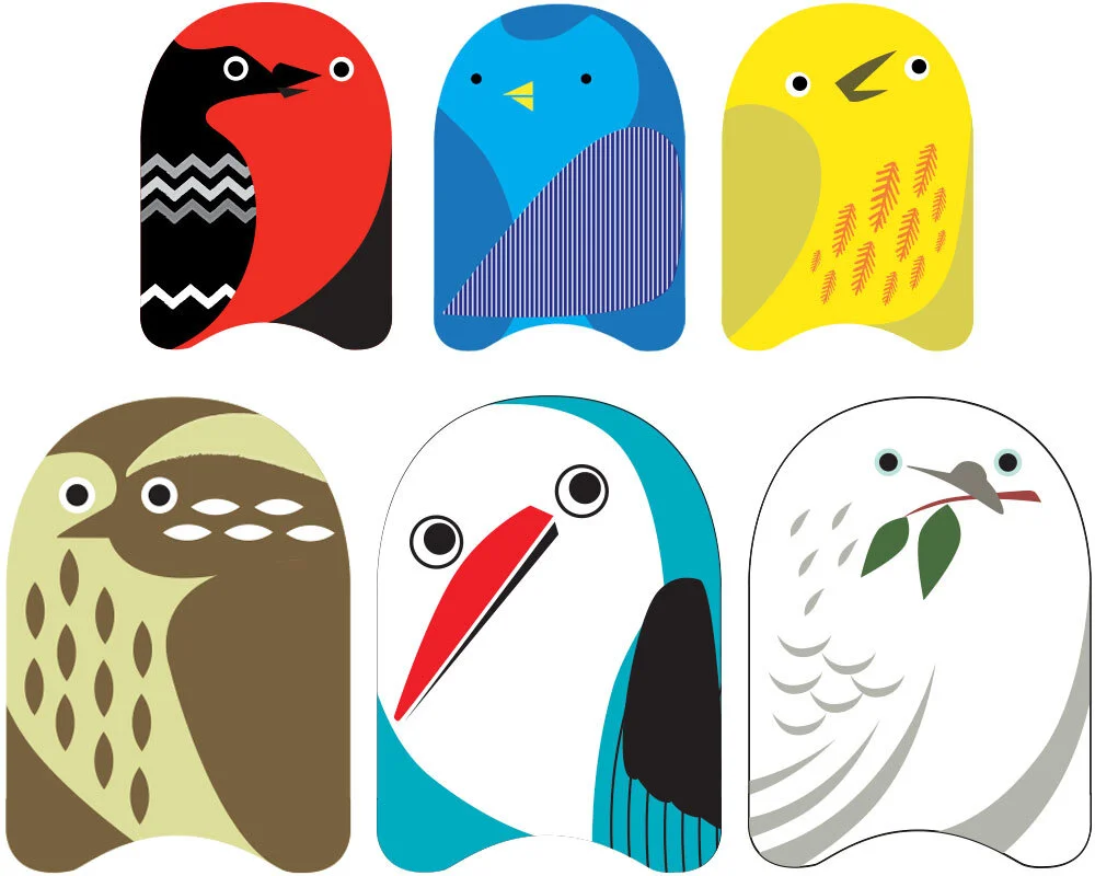
Anyhoo, it worked out that we’d make 4 Stuf families. Each made up of 4 small dolls and one big Stuf doll. You should see all the preliminary sketches I did (so many!). It was a blast, but I really wanted to make them all. The two deciding factors for the themes we went with were: current trends; and our instinct for what we knew would be attractive to Wrybaby’s wholesale clients. Pirate Stuf, Bird Stuf, and Robot Stuf were an easy leap for stores. We went with Developmental Stuf because it was a link to Wrybaby’s parenting wheelhouse. Think of it as a safety move. If the others didn’t work, at least there was a solid baby offering.

FINAL: A closer look at Pirate Stuf. I gave each pirate his (or her) own little character attributes for kids to build on. A parent once called me to say her son, who’s afraid of the water, found great comfort in his Shaggy Dan. Honestly, that alone…

FINAL: A closer look at Pirate Stuf. I gave each pirate his (or her) own little character attributes for kids to build on. A parent once called me to say her son, who’s afraid of the water, found great comfort in his Shaggy Dan. Honestly, that alone made all the Stuf headaches worth it to me. Oh, and Pirate Sue really IS nothin’ but trouble! Hahaha

FINAL: Some Stuf dolls shared pattern on the back, but had extra credit on the side panels, like Circus and Robot Stuf. I especially like how the rosy=cheeked lion sits on a little performance pedestal.

FINAL: Some Stuf dolls shared pattern on the back, but had extra credit on the side panels, like Circus and Robot Stuf. I especially like how the rosy=cheeked lion sits on a little performance pedestal.

FINAL: We pulled everything along with Stuf’s clean “European art toy” aesthetic through to it’s website and retail packaging. We made plaques for each Stuf family that made them look so special on retail shelving. And later we’d even build wood and…

FINAL: We pulled everything along with Stuf’s clean “European art toy” aesthetic through to it’s website and retail packaging. We made plaques for each Stuf family that made them look so special on retail shelving. And later we’d even build wood and canvas backdrops for each Stuf family.

FINAL: Yep! I made Stuf backpacks! The funnest part was the side water bottle pockets. The Owl’s pocket said SEEDS, and the Circus Elephant’s pocket said…wait for it…PEANUTS! Of course. :-)

FINAL: Yep! I made Stuf backpacks! The funnest part was the side water bottle pockets. The Owl’s pocket said SEEDS, and the Circus Elephant’s pocket said…wait for it…PEANUTS! Of course. :-)

We’d thought of every little thing except one. That the factory would fuck us. Oh boy, did they ever. We were working with a liason in the states who touted Gap experience and pull with a factory who was rich with Disney experience. As simple as this project was, it was a complete shock when the complete Stuf shipment arrived and only 25% of it could be sold. Yeah. While the samples they sent for approval were great, the final dolls were misprinted, sewn terribly, and…grimy. It looked like they ran the fabric over with a greasy forklift before sewing them. Not to ruin the story, but it’s important to expect the best and plan for the worst. No matter how much you try to avoid trouble, it’s inevitable in one way or another. 

But as they say, the show must go on. We had to really make sure our sellable 25% s-o-l-d. So we kept to our plan and did something you’d think we would have rethought considering the circumstances. I’ve written about how we built a snooty art brand for Stuf to live under. It was like a high-end art gallery that was only open by appointment and never answered the phone or returned calls. Hilarious and, as it turned out, hilariously effective. Stuf would soon be sold in major art museums across the country from SF MOMA to NY MOMA (you can see the complete list here).

Stuf sold through that first terrible shipment and we were able to find a new factory to make a disaster-free second round. Encouraged by Stuf’s success, we designed Stuf backpacks and we added hand-made wood and canvas backdrops for playtime with each Stuf family. OMG, the trade show booth that I designed for Stuf is still one of the best booths I’ve ever done. But that’s a whole other story.

DAVE SOPP – Creative

Yep, that’s me. I’ve got over 20 years of marketing strategy, graphic design, advertising art direction, and illustration experience. Want to use some of it? Email me at dave@davesopp.com
 

How to Make an Efficient, Effective First Impression.

Design > Website

Web design is a discipline that I can’t say is a focus of mine. BUT! And this is, as the kids say, a big but – I can do it, and do it pretty well. Case in point, the project I did to rebrand American Greeting Properties (AGP). They had confidence problems and we “re-skinned” them to fix it. The backbone of that effort was their website. Look, a website is all about organization and the hierarchy of information. For AGP they needed their homepage to be a gateway to a world of creativity. Their objective wasn’t to collect leads, sell product, or even a service. It just had to inform and make a desired impression. Not to downplay this, there was a LOT of impression to change, in the process. The website also had to tie together a lot of disparate assets and present them under a unified umbrella. So, not easy.

FINAL: The home page for American Greetings Properties.

FINAL: The home page for American Greetings Properties.

FINAL: Clicking an area of the map (or in the legend) would bring a pop-up of everything you needed to know about each property.

FINAL: Clicking an area of the map (or in the legend) would bring a pop-up of everything you needed to know about each property.

FINAL: I’d designed and illustrated all the infographics for each properties detail page. This was a ton of work, but also a ton of fun.

FINAL: I’d designed and illustrated all the infographics for each properties detail page. This was a ton of work, but also a ton of fun.

FINAL: Here’s what clicking ABOUT US would bring you.

FINAL: Here’s what clicking ABOUT US would bring you.

FINAL: How mobile would work along with a little secondary navigation idea that didn’t make it. Once the island drawing was finalized, I made a topographical rendering of it complete with a handy chart of who lived at what elevations. Hahaha.

FINAL: How mobile would work along with a little secondary navigation idea that didn’t make it. Once the island drawing was finalized, I made a topographical rendering of it complete with a handy chart of who lived at what elevations. Hahaha.

I worked with an internal team who included a developer, so whatever I designed was sure to be actually possible to create. I’m a realist and won’t work under any other circumstances. Who wants to do a bunch of work and have it be impossible to implement? So we all decided on a simple structure. A home page base would present the entire site map (see what I did there?). Clicking a character would bring up a light box panel of information that would deliver everything (plus infographics) they needed to know. We created a format where a LOT of information could be conveyed in the most condensed form possible, without making anyone want to kill themselves. Easy.

DAVE SOPP – Creative

Yep, that’s me. I’ve got over 20 years of marketing strategy, graphic design, advertising art direction, and illustration experience. Want to use some of it? Email me at dave@davesopp.com


How to Turn a Total Shit Show Into a Winner.

Strategy > Branding

Despite the title, this is the funnest (I know, but I made it a word) project I’ve ever worked on. A lot of what makes marketing great (and great marketing) is what happens behind the scenes. Like, how did we involve the client, the CEO, the employees in the process? Or, what obstacles did we have to overcome aside from winning the business? So read on and tell me...what was there not to love about this project from the outset? 

FINAL: The first salvo in a campaign designed to convince people to love the communications company they loved to hate.

FINAL: The first salvo in a campaign designed to convince people to love the communications company they loved to hate.

Three town governments in North Carolina overpaid, substantially ($80,000,000), for a local communications company that was failing in every aspect of the word. The public didn’t get to vote on the action (which they surely would not have done). Nope, the town officials just decided to buy it with taxpayer bonds, and did it. The result was an incredibly bitter, prolonged public comeuppance. The public rallied behind “The government shouldn’t own a communications company!” and before long almost everyone in office was out, out, out. Everyone was replaced by angry electeds who agreed with the angry public that this cable company was bad, bad news. They all wanted out of the deal, but the damage had already been done. They were stuck with a financial burden they couldn’t get out of. That thing was called MI-Connection, with the MI being a lame combination of Mecklenburg and Iredell county initials that nobody, even to this day, can agree on how to pronounce – MY Connection or EM - EYE Connection? Oh, and even if you knew the initials, good luck finding the hyphenated URL. Sad Face Emoji.

But, incredibly, it was kind of an understandable decision to buy the thing. I mean, it’s not like it was done on a whim. Despite the three towns being about 10-20 minutes north of the banking explosion called Charlotte, and populating themselves at an extremely rapid pace, this area was severely under serviced. Heck, if Mooresville, Davidson, and Cornelius didn’t lay fiber and string cable themselves, no one else was motivated to do it. Even though there were three competitors in the market (Windstream, Time Warner, and Dish), these big out-of-town corporations just weren’t investing in this area. Honestly, why should they? So how else could a town (or three) attract residents and businesses so they can grow if they could offer Internet? Before they were (mostly) drummed out of office, the commissioners did one smart thing – they found someone with big telecom experience who could turn the ship around (provided he could stop it from burning even closer to the waterline).

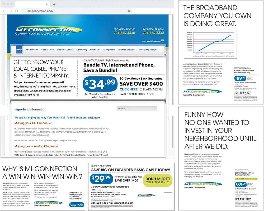
BEFORE: What MI-Connection was putting out there before we cleaned up their act.

BEFORE: What MI-Connection was putting out there before we cleaned up their act.

In stepped David Auger, CEO. David had incredible experience in telecom, was an ex-Time Warner executive, a marketing aficionado and a lovely man. Sharp as a tack, too. He had MI-Connection lay low for a year, advertising little, assessing the damage, and building a sharp, experienced Board of Directors. Now, here was his (and the town’s, after all they were the owners) core dilemma:

If no one subscribed to MI-Connection’s services (Video, Internet, and Phone), then the whole thing would collapse. So how do you make people love the communications company they LOVE to hate? 

My first meeting about MI-Connection was actually with the newly elected Mayor of Mooresville, Miles Atkins. The Town of Mooresville (TOM) was the biggest investor of the three in MI-Connection and Mr. Atkins was the one official who, as commissioner, was a lone voice against buying the business. For a whole year since the purchase, both the press and citizens scorched MI-Connection as an $80,000,000 socialist pariah. But Mayor Atkins had a different perspective. While he opposed the purchase, he could see that we were all stuck with it, no matter what. And by not using it to its fullest advantage, our three towns would not only be shooting themselves in the face, but also lose out on what owning a local communications company could mean to our communities. To his thinking (and it was smart), we all owned this thing – so let’s make the most of it. Mayor Atkins set up a meeting with David Auger and he gave us his perspective. In the year he’d been restructuring, there was actually good news. Lots of it. Mr. Auger was able to shore up the company and even quietly implement some programs to aid the communities who owned the company – free services to non-profits who helped local underprivileged families, free Wi-Fi for underprivileged local students, and more. Also, subscribership was up. The cable company everyone thought was a failure had begun to do better. Way better.

FINAL: We didn’t have to play by any rules but our own. So to convince people our story was worth hearing, we opened up a conversation via all outlets. The website got cleaned up, the ads were bold and in-your face, but communicating SO much better.…

FINAL: We didn’t have to play by any rules but our own. So to convince people our story was worth hearing, we opened up a conversation via all outlets. The website got cleaned up, the ads were bold and in-your face, but communicating SO much better. I devised a template for the direct mail, too. Way more professional using nothing but what was there all along.

FINAL: Some more print and some online that was really fun to write. SUPER click-baity and led you to a landing page that would clear things up pretty quick (and encourage a phone call to MI-Connection).

FINAL: Some more print and some online that was really fun to write. SUPER click-baity and led you to a landing page that would clear things up pretty quick (and encourage a phone call to MI-Connection).

Obviously, there was a communication problem (amazing how it’s always the culprit, right?) between the communications company and the public. From the outset, officials never conveyed effectively to the public why they were buying this thing. So once it was said and done, the nay-sayers were in control of the narrative. A year of zero self-defense didn’t help matters. What was needed was a little public education. Not subtle, but a giant baseball bat to the noggin.

We called the launch “Straight Talk”, which was exactly what it was. No false posturing, no flamboyance, no marketing speak. We listened to the positive things David and his team had achieved and telegraphed it all straight to the public with full page print, direct mail, local cinema ads, and local online banners every week for 13 weeks. MI-Connection launched out of nowhere with an incredibly tough offense. This local cable company that you, personally, have a stake in is not only beneficial to your life here, but doing rather well. The messaging was raw, compelling, steeped in common sense, and it was all true. And at that breakneck pace, the haters had a hard time trolling our positive, provable messages.

Design-wise, my hands were tied by the existing brand (and its terrible website, name, logo, etc. You can read about how we changed that here), but I was able to rework what existed into a clean, blunt instrument of education that was hard to ignore. This launch campaign ended up being MI-Connection’s steady messaging for 7 years of solid growth. That is, until it became profitable enough to get out from underneath the tainted shadow of the old brand. That’s where the real fun (and success) began.

DAVE SOPP – Creative

Yep, that’s me. I’ve got over 25 years of marketing strategy, graphic design, advertising art direction, and illustration experience. Want to use some of it? Email me at dave@davesopp.com


How to Fake It 'Till You Make It.

Strategy > Branding

Downtown Mooresville is a special place. Its charm (and untapped potential) lured us away from San Francisco when we were looking for better schools and a less hectic lifestyle. We took a look at Downtown, found an old home a block and a half away, moved, set up shop in the old telegraph office along Broad Street across from the old train depot, and quietly kept doing what we were doing back in The City. Only this time, with a freight train passing by and blowing its whistle every day at 1pm. It was so loud you couldn’t plan any phone calls around that time slot. It was awesome (not sarcasm). The old Downtown was only a few blocks long on Main Street, and wore charming but warehousy treasures over its shoulder along Broad Street, too. 

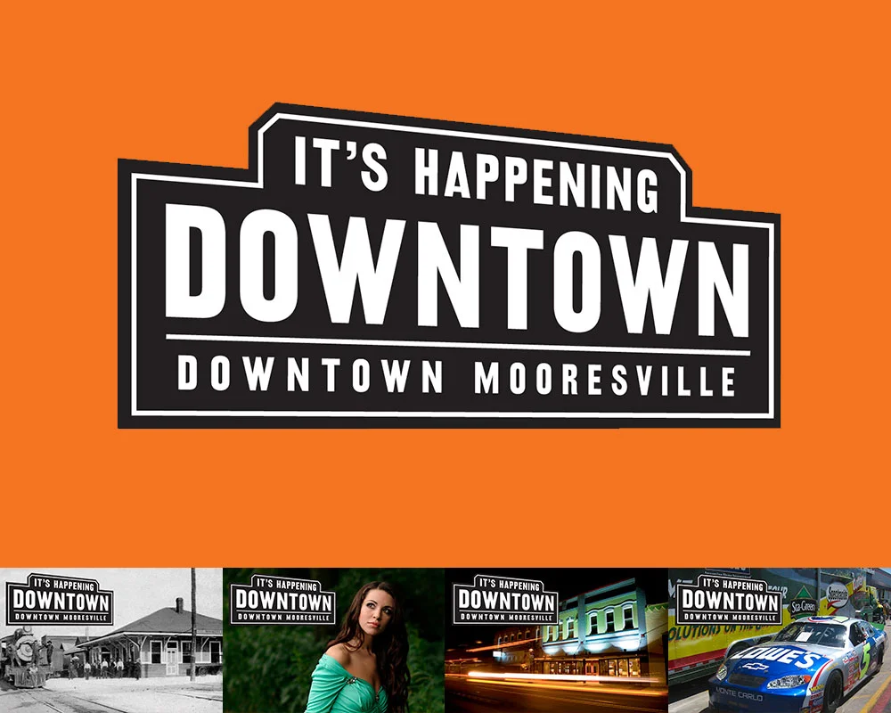
FINAL: The first thing we did was define Downtown Mooresville as, well, Downtown Mooresville. The final logo could easily represent Downtown’s railroad past, but also make sense with shops you’d find there (fashion, restaurants, bars, hairstylists, …

FINAL: The first thing we did was define Downtown Mooresville as, well, Downtown Mooresville. The final logo could easily represent Downtown’s railroad past, but also make sense with shops you’d find there (fashion, restaurants, bars, hairstylists, hardware, etc.), and event that would be held there. It had to play nice with everything you threw at it.

It’s hard to not meet people Downtown. Heck, most of them were neighbors as it turned out. One of those neighbors turned out to be Kim Atkins. She’d had successful career in the printing business and became a shop owner on Main Street. It didn’t work out. Rather than do what anyone would have done (curse Downtown and never return), she did the opposite and was elected the Executive Director of the Downtown Commission. Our boys went to the same elementary school and had become inseparable pals.

Downtown Mooresville was founded in 1873 along a rail line (yep, trains still use it!). In the 1960’s, Duke Power created the man-made Lake Norman while at the same time, the I77 was created to offer a faster way to motor to Charlotte down south, and Statesville up north. The lake was to the west of Downtown and offered about a jillion miles of lakefront property opportunity. The I77 freeway divided the town in more ways than one. Downtown was considered the poor side of Mooresville. Lake Norman (LKN) was where the money was. Hot-Cha!

BEFORE: Oh, there was clearly nothing happening Downtown when we started this project. Open shops had huge gaps of vacant, papered-over storefronts between them. That’s real bad for encouraging foot traffic and look at the mess. By code, closed busi…

BEFORE: Oh, there was clearly nothing happening Downtown when we started this project. Open shops had huge gaps of vacant, papered-over storefronts between them. That’s real bad for encouraging foot traffic and look at the mess. By code, closed businesses had to have their windows papered. So we had the idea to paper them with interesting facts about Downtown. It would pull people through to all the open shops, entertain and educate visitors, clean up the overall look of Downtown Mooresville, and cover up it’s vacancy problem. And, being black and white, it’d be affordable. So many problems solved with one easy solution!

BEFORE: The many brochures (and identities) of Downtown Mooresville, all in circulation at the same time when we started working with them.

BEFORE: The many brochures (and identities) of Downtown Mooresville, all in circulation at the same time when we started working with them.

Cut to modern times and it’s still the same. One side of Lake Norman has all the Red Robins, Super Targets, and Olive Gardens they can handle. While our side (I live in this part, remember) is a little weathered, but has all the heart and soul of what this town used to be. It didn’t help that Downtown was all but empty, lacking both shops and people. The most going concern though, was really going. Soirée was situated in a beautifully restored building in the center of Downtown and was a destination on any night of the week. The problem was, the few shops and business Downtown were never open when Soirée was pulling in the public. Worse yet, the town was so divided that (and I’m not exaggerating here), 85% of the fancy people on the Lake side didn’t even know Downtown existed!

FINAL: The first step – getting our house in order. With some selective photography we presented the Downtown we wanted people to see. All beautiful old buildings and historic charm. We dressed up Main Street with some handsome, attention-getting, h…

FINAL: The first step – getting our house in order. With some selective photography we presented the Downtown we wanted people to see. All beautiful old buildings and historic charm. We dressed up Main Street with some handsome, attention-getting, hard-working street banners, nailed down our identity and made ONE exciting brochure.

Sorry. Lots of backstory, but it’s super important (especially if you’re a small town in a similar situation). Downtown was quiet, but not dead. They launched a VERY aggressive event schedule to get folks over the I77 to our side, but they didn’t really have a brand to hang it all upon. Some merchants were calling Downtown “the Dirty Mo” on their social media. Some called it “DoMo” (Downtown Mooresville). Messaging was all over the place and none of it was cohesive or sticking. So Kim asked us for ideas on what to do.

The first thing I recommended was nixing the idea of a clever name altogether. People didn’t even know there WAS an old Downtown in Mooresville. Calling it fancy things would just confuse the issue. It was Downtown Mooresville, so just let it be Downtown Mooresville. You can always make a fun nickname later. They brought us on for branding Downtown and the  next thing I did was lie through my teefs.

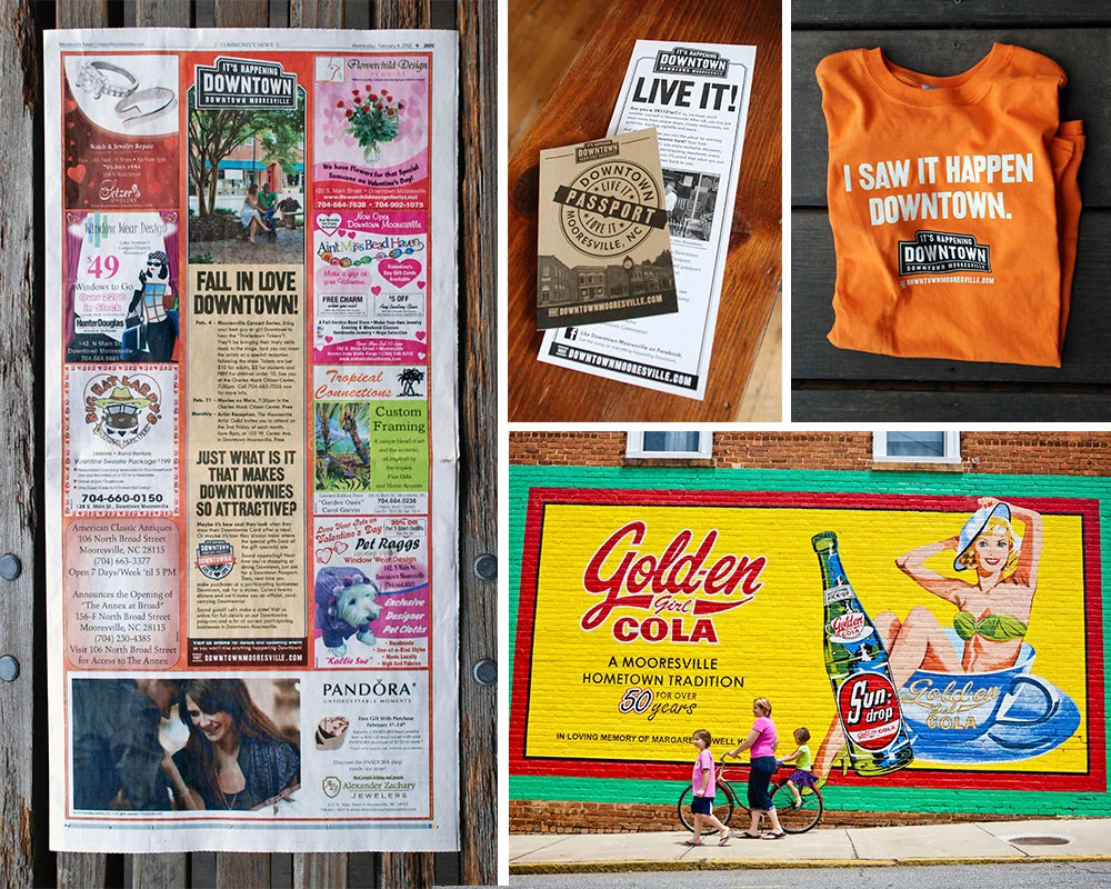
FINAL: Next it was time to promote Downtown as a destination. Clockwise from the left: 1. By working closely with the pubs we advertised in, we were able to create uniquely branded templates. 2. Our award-winning program to celebrate fans of Downtow…

FINAL: Next it was time to promote Downtown as a destination. Clockwise from the left: 1. By working closely with the pubs we advertised in, we were able to create uniquely branded templates. 2. Our award-winning program to celebrate fans of Downtown Mooresville. 3. Our first piece of Downtown merch. 4. We created a photobank of amazing images that we could use to show folks what we saw in Downtown Mooresville.

Downtown was tired and mostly empty, but not dead. And with a roster of new events, we had to make it seem like there was a secret party going on over here that the Lake people weren’t privy to. In a nod to our railroad history, I designed a vintage/modern logo lockup with the tag line, It’s Happening Downtown. And that was the big lie. Sort of. It was GOING to happen, it just hadn’t actually happened yet. Operation “Fake It ‘Till You Make It” was in full effect. We started running monthly event ads in the local papers. We installed street banners, made bar coasters, put up signage at our local ballpark. We started doing spreads with an event calendar in the local magazines. We rebuilt the website. We got on social media. All the stuff you need to do before we got really creative.

FINAL: From 2009 to 2017 we’d spread the word about Downtown Mooresville. Clockwise from top left: 1. The website we designed for Downtown. 2, One of many posters we did to promote their crazy amount of fun events. 3. A magazine ad designed to intro…

FINAL: From 2009 to 2017 we’d spread the word about Downtown Mooresville. Clockwise from top left: 1. The website we designed for Downtown. 2, One of many posters we did to promote their crazy amount of fun events. 3. A magazine ad designed to introduce newcomers to Downtown. 4. One of many little quarter page newspaper ads promoting monthly events Downtown.

For example, we made calling cards for Downtown merchants and employees to hand out to other shop and restaurant owners whenever they happened to find themselves in a business they wished was Downtown. A bakery, a great Indian restaurant, that kind of thing. It said, “If you’re reading this, your business should be Downtown.” One the back was an invitation to call Kim Atkins to discuss retail opportunities. OMG, even if you weren’t looking to relocate, it sure made it look like shit was going down in Downtown Mooresville. Super buzz worthy, and it worked. Despite our launching during a recession (always fun), within a year, Charlotte was airing a live prime time news segment about Downtown’s revitalization. Finally, it really was happening Downtown. Lie turned truth.

We’d go on to make fun event posters, TV spots, and even more special little programs. Our custom-made Downtownie™ loyalty program would win an Innovation award from the State of North Carolina. Best of all, Main Street filled up. At its zenith, it reached 95% occupancy. Morning, noon, or night, people were coming to see what was Happening Downtown.

dave_bug.jpg

DAVE SOPP – Creative

Yep, that’s me. I’ve got over 20 years of marketing strategy, graphic design, advertising art direction, and illustration experience. Want to use some of it? Email me at dave@davesopp.com


How to Be Creative for Creatives.

Strategy > Branding

It all started at the big annual toy show in NY, the International Toy Fair. I was there representing Wrybaby and started up a convo in the Wrybaby booth with a nice guy who turned out to be from American Greetings. I don’t even know how we got to it, but he mentioned that they were looking for a way to do something that I can’t write about here (ask me in person and maybe I’ll tell you). I said I had an idea that would work perfectly for that. After the show, I pitched my idea to his boss over the phone. He was the head of American Greetings Properties (AGP). AGP managed licensing for all of American Greetings’ legacy properties like Hollie Hobbie, Care Bears, Madballs, Strawberry Shortcake etc. But they also thought up lots of new stuff, too. They were creating properties to develop themselves or to pitch to companies like Disney and Nickelodeon, and that’s why they took an interest in our idea. It was really out-of-the-box. So the head of AGP loved what we presented and said he wanted to make this idea happen with us. He flew down to visit our office in Mooresville, then he invited us for what would be a super weird visit to the AG mothership in Cleveland (ask me in person and I’ll tell you all about it). Then he dumped us into a really shitty negotiation process with AG’s entertainment lawyers in LA where they continuously threatened to steal our idea outright. Super hardball shitty. I told the lawyers that they and AGP could, literally, to go fuck themselves and hung up on them. And then the AGP boss asked us to rebrand them. Well, first he asked us to design a fun corporate team-building program for the department. And then he asked us to rebrand them. How freaking weird is that!?

FINAL: The whole idea was based on the home page. An island fantasy land of AGP properties where all the dispirit characters could live in harmony. You can check out the website design deets and see bigger pictures here.

FINAL: The whole idea was based on the home page. An island fantasy land of AGP properties where all the dispirit characters could live in harmony. You can check out the website design deets and see bigger pictures here.

BEFORE: This was AGP’s home page when I was brought on. You can see what they tried to do from the start – create a fun-but-not-too-fun envelope that can hold variously styled characters from the 70’s to today (the properties slugged along as a slid…

BEFORE: This was AGP’s home page when I was brought on. You can see what they tried to do from the start – create a fun-but-not-too-fun envelope that can hold variously styled characters from the 70’s to today (the properties slugged along as a slide show). So, done, right? Sort of. The problem was that it didn’t set AGP up as the creative all-stars they were. It was just a generic box of characters you either knew or didn’t.

And we did it. Which was even weirder. But all of the (very real) unpleasantness aside, it was a cool project and they paid us what we were worth <shrug>. Chalk it up to me always rooting for the underdogs, I guess. Which, despite all the success and billions of dollars they generated, AGP and the team that supported it deserved more respect. We got to meet all the crazy-talented artists and writers on our visit and they seemed like normal, good people. Remember, AGP might be pushing a lot of old brands, but they were also in the business of thinking up of a lot of new, exciting characters and shows. The problem was, when the studios saw they were hearing a pitch from AGP, they thought a couple of corporate grandpas would be shuffling in to show them some old Holly Hobbie shit. The AGP boss wanted to change that perception.

COMPS: Some (not all) of the ideas we presented in the first round to AGP. Each idea included whatever it took to get the concept across. So some ideas came tight with taglines attached. Some were just rough sketches. Clockwise from top left: 1. Fre…

COMPS: Some (not all) of the ideas we presented in the first round to AGP. Each idea included whatever it took to get the concept across. So some ideas came tight with taglines attached. Some were just rough sketches. Clockwise from top left: 1. Freshen up the old characters and spice up the new by presenting each character’s personality in a modern way. 2. Incorporate the characters into a graphic envelope (the safest idea, just in case they freak out over the others), 3. Explore exciting new worlds with AGP. Visit planets and discover unique characters. 4. The world of AGP as an island inhabited by strange, sweet, wonderful, and exotic characters.

American Greetings, duh, already has a brand. We were just giving the one department a new look. We started calling it a “restaging,” because we had to use the AG logo lockup unmolested in anything we did. So the first thing we did was present a whole mess of concepts (from tight to super sketchy) to hang their new skin on. These guys were all artists (and all WAY better than me), so we knew that they’d get what we meant if we showed them loose drawings. We showed them all kinds of directions they could go to solve their problem (as we do for every project). For example, there was one idea about how creative the team in the department was, and all the crazy things that happened in their building on the steady. We’d do a lot of videos, social media (with a focus on Linkdin), email newsletters to the industry, etc. The employees would get a chance to be stars and use their awesome talents to help promote their common cause. I only mention this so you can get an idea of how different each idea was. What they chose was way different. The idea was to refresh the old stuff, pull the new stuff into the spotlight, and bring all the properties together as one. Instead of being the keepers of the old that sometimes had new ideas, AGP would represent a big fun world of full of creative ideas. We’d just take “legacy” out of the conversation altogether.

FINAL: Every pop-up on the AGP website, in every category, would include a strip of bright, clever, modern infographics. One trivia block in each strip would be animated, too, leaving the visitor with a ton of tiny positive impressions of how amazin…

FINAL: Every pop-up on the AGP website, in every category, would include a strip of bright, clever, modern infographics. One trivia block in each strip would be animated, too, leaving the visitor with a ton of tiny positive impressions of how amazing these properties are, no matter how dated they seemed to you before.

FINAL: We pulled the map theme across everything from their massive trade show booth (back wall pictured above) to Powerpoint presentations. We also gave their team a host of logo lockups they could use wherever in the future. All predesigned and re…

FINAL: We pulled the map theme across everything from their massive trade show booth (back wall pictured above) to Powerpoint presentations. We also gave their team a host of logo lockups they could use wherever in the future. All predesigned and ready to go go go.

The final execution would all bloom (see what I did there?) from a new home page featuring a fanciful, illustrated map of an island filled with AGP’s properties. Visitors would click on any of the characters for a pop-up filled with info on that property along with its licensing opportunities. Kelly and I came up with a ton of fun taglines to support this idea, and they picked our favorite in the end – Happiness Happens Here. As they created new properties, we’d just add ‘em to the island. Once the site as approved and in production, I took the island I’d illustrated and pulled the concept through everything from their giant trade show booth to PowerPoint templates for presentations. The whole thing was modern, unconventional, bright and fun. Just the way AGP wanted to be thought of.

dave_bug.jpg

DAVE SOPP – Creative

Yep, that’s me. I’ve got over 20 years of marketing strategy, graphic design, advertising art direction, and illustration experience. Want to use some of it? Email me at dave@davesopp.com