How to Be One of the Cool Kids.

Design > Trade Show Booth

This booth! Hahaha. The Stuf brand was snooty as all get out. It was acting like a spoiled, high-end art studio and its big debut in its own show booth had to be amazing. I love planning out trade show booths. I mean, I hate it and love it. My process is ridiculous, so you’ll see why. I’m sort of a control freak. And, I’m not very spacial. Like, I can’t really tell, just off the top of my head, how to fill a 10’ x 10’ space with displays and furniture and chairs without it being all crowded and shitty. I need to cheat to find that out.

The Stuf booth had to be amazing, sure. But the brand was so clean, and white, and simple that it couldn’t be a circus (even though that was one of the Stuf families). Definitely, the figures needed to stand out. I started with some booth sketches and ended up with an idea of what I wanted to do. Then I moved onto Illustrator to create a floor plan to 1/4 scale. Then I’d do wall plans to scale. Then, yep, I print them out and build a small 1/4 model of the booth, complete with tiny hand-build shelving and furniture. I know what you’re thinking and, yes, I’m a total freak. But wait. There’s more. I populate it with little people to scale and then shoot it, so I can see what it’s like to be IN THE TINY BOOTH.

FINAL: For Stuf’s premier booth at NYIGF, I wanted to build a world a booth that would blow people away while not overshadowing the product. Entering the cloud-world of Stuf, you’re treated to a museum-like experience.

FINAL: For Stuf’s premier booth at NYIGF, I wanted to build a world a booth that would blow people away while not overshadowing the product. Entering the cloud-world of Stuf, you’re treated to a museum-like experience.

BEFORE: Can you believe this is what our space was when we got there? The design section had wood walls instead of the pipe-and-drape you’d get in less fancy parts of the show. I knew we’d have stable walls before I started designing for it and it’s…

BEFORE: Can you believe this is what our space was when we got there? The design section had wood walls instead of the pipe-and-drape you’d get in less fancy parts of the show. I knew we’d have stable walls before I started designing for it and it’s the only way we could have done what we did.

COMPS: An early sketch that I took to Adobe Illustrator to work out. It didn’t work out. It’d have been cool, but I didn’t think anyone would want to come into the booth through such a narrow entrance. Especially the top part. But the idea of a semi…

COMPS: An early sketch that I took to Adobe Illustrator to work out. It didn’t work out. It’d have been cool, but I didn’t think anyone would want to come into the booth through such a narrow entrance. Especially the top part. But the idea of a semi-enclosed space was interesting. So I scaled everything back to end up with the clouds. Because they were all white and the booth was white, I thought they’d be less intimidating. They’d become sort of visible but invisible. To test it out, I’d have to make a scale model because I’m weird like that. Also, I love that tie.

COMPS: Proof positive. My model really helped me understand the space, figure out how I’d attach the clouds to the walls, and managed my expectations. Then I could get down to speccing out the details to give to the guys I hired to make the clouds f…

COMPS: Proof positive. My model really helped me understand the space, figure out how I’d attach the clouds to the walls, and managed my expectations. Then I could get down to speccing out the details to give to the guys I hired to make the clouds for me. They had to be light (and on the cheap) so I ended having them cut out of thin sheets of PVC. Then they’d just bend ‘em where I needed a tab to screw them in.

FINAL: A look at our hardcover application to get into the snooty design section of the show. That’s a picture of my model in the book. I hadn’t made the booth yet, but wanted to convince them it was real, it was cool, and it was ready to bring to N…

FINAL: A look at our hardcover application to get into the snooty design section of the show. That’s a picture of my model in the book. I hadn’t made the booth yet, but wanted to convince them it was real, it was cool, and it was ready to bring to NY. Kelly’s standing outside the Stuf booth just as we started setting it up. And finally here’s my model shot again along side the real deal. Expectations managed! Hahahaha. It kind of creeps me out how similar they are, but that’s says a lot about thinking shit through. Or about how much I hate surprises.

The best part of this was the clouds. The front of the booth would be framed in clouds, as if they were parting to let you in. Directly behind the clouds, a bright white booth where the only color was the color of the Stuf dolls. It made a HUGE impact. The trick with bringing Stuf to trade shows wasn’t the booth, though. It was getting in at all. Because Stuf belonged in the Design category, and that category is as snooty as the fake art brand we’d created. The design sections of trade shows are juried. You have to submit pictures of your booth and your brand and your products, and then they decide if you’re one of the cool kids or not. And of course Stuf didn’t actually have the booth ready to go yet (I wasn’t going to pay to manufacture it, if I wasn’t going to get in). So that’s where making a scale model maybe wasn’t such a crazy thing to do after all?

We made a hardcover book of the Stuf brand, and we sent that as our application! Yeah, INSTEAD of the actual application. Who does that?! Of course we got in because of it. I’ve written about what a disaster our first shipment of Stuf dolls turned out to be, and this booth was sort of a similar tale. As simple as we designed it, it took FOREVER to set up. We thought it might take a few hours – screw in a bunch of shelves, screw in the clouds, rub down some type, how hard can it be? It took us 7 hours to set up. And when you believe it’ll take 3, but instead it takes 7, it’s mental torment. But the final product was worth it. 

DAVE SOPP – Creative

Yep, that’s me. I’ve got over 20 years of marketing strategy, graphic design, advertising art direction, and illustration experience. Want to use some of it? Email me at dave@davesopp.com
 

How Honesty Isn’t Always the Best Policy.

Strategy > Sales

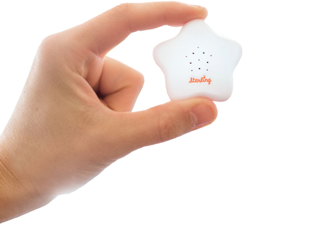
Before I came on board, VersaMe, makers of early education technology, had brought on an expensive big box rep group with great credentials. Turned out they sucked for lots of reasons, but they managed to arrange a phone call with a buyer form Barnes & Noble while I was in California and so I took the call with co-founder and CFO, Nicki Boyd. We did our thing and at the end, the buyer was still on the fence when she asked, “Are you going to be at ABC next week?” “Of course we are,” I said. “I’ll get you the booth number later today.” She said, “Fine, I’ll come by your booth Friday afternoon at 2 to take a closer look at the Starling.” We hung up the phone and I looked at Nicki and said, “Guess what? We’re going to the ABC show.

ABC SHOW: Mmmmmm. Vegas convention center. Soak it in.

ABC SHOW: Mmmmmm. Vegas convention center. Soak it in.

Of course we had NO plans to go to ABC. Nicki didn’t even know what it was. But I did. ABC is the huge annual, baby gear trade show in Vegas for wholesale buyers big and small. I’ve done ABC multiple times in the past for Wrybaby. Booth space typically starts at around $5,000 for the three and a half day show. That doesn’t count your airfare, lodging, and food. Nor does it include what it costs to have a decent presence there. And if your product is a high-tech baby gadget, don’t even go if you’re only going to use what they supply you for $5K, $10K, or even $15k: plain industrial carpet; two folding chairs; dark blue fire-retardant curtains as your walls; a plastic trash can; and a white plastic sign hanging from the curtains with your company name and booth number printed in Helvetica Regular. No, you’ve got to either spend $$$$ or $$ and be clever. We had to do the latter. Because this was a one off show for us. Of course we wanted to be in a big box store, but at the time we were really trying to make a connection with consumers on our own. We weren’t focused on a wholesale strategy. So it was worth the gamble to go and make our Barnes & Noble meeting, but we’d also have the chance of meeting other relevant big box buyers (Target, Buy Buy Baby, etc.). Not to mention all the indie mom and pop buyers.

ABC SHOW: Welcome to the show. Here’s what you get for all that $$$! Now to paint some lips on this pig.

ABC SHOW: Welcome to the show. Here’s what you get for all that $$$! Now to paint some lips on this pig.

This post isn’t about booth design. Because our booth ended up being the least expensive version of what it would take to pass for looking like we had advanced tech to offer, that we knew what we were doing, and that we had done shows before. All were important bars to meet for any exhibitor. OK, I’ve gone this far, so I’ll give you some quick exhibitor tips for going on the cheap. Get a pop-up display to use as your back wall and get a snazzy, eye-catching graphic wrap made for it. After 8 years of doing big shows twice a year for Wrybaby, I had never used a pop-up (I always had those spaces custom built), but for VersaMe I used monsterdisplays.com. They were affordable, fast, and the quality was great. Still, that solution alone is pretty lame. You gotta spice it up with furniture. Don’t rent tables and chairs from the show. It’s expensive and they look like shit. Find an IKEA nearby and go buy the small tables and chairs you need there. Also, if you’re going to display a product, get some shelving there, too. Oh, and some accent rugs for color. Then get an Uber and take it all to the convention center and start building. In the end you’ll have something that’s somewhat unique, eye-catching (if you bought the right stuff) and a step or two above being a basic bitch. Your booth neighbors will also not hate you.

ABC SHOW: A quick Uber to IKEA and we’re in business. A table set in company colors (YAY IKEA) for our big Barnes & Noble meeting (and whoever else we’d be talking to)!

ABC SHOW: A quick Uber to IKEA and we’re in business. A table set in company colors (YAY IKEA) for our big Barnes & Noble meeting (and whoever else we’d be talking to)!

Anyhoo, we made it there. Our lodging was an AirBnB apartment in a dingy mixed-use building behind the convention center, whose retail anchor was a psychic. The dark halls smelled strongly of heavily seasoned fried foods. It was amazing. We got our goods at IKEA, built them all night, arrived for the first morning of the show...and waited.

We made contact with interesting folks big and small (a lot of ABC is meeting buyers, then closing sales after the show). We also got to practice the pitch, refining it here and there for everyone who stopped (and there were a lot). Finally, the moment of truth – our Barnes and Noble buyer arrived. We went through our pitch as she stood looking looked at the display we’d set up. The Starling was out of its box perched in front of a pyramid of the packaging behind it. As I talked, I saw she was looking hard at the packaging. She asked a lot of smart questions, and then things went quiet. She was still looking at the packaging when she said, “I feel like It’s not ready yet. Let’s stay in touch.” She thanked us and she was gone. We’d taken a chance and it didn’t pay off.

ABC SHOW: Here are some very real, very terrifying things one could purchase at the ABC Show. Don’t ask me why. They were in a catalog I found near a trash can by the bathrooms. I wondered if this company also had a pending meeting with our Barnes &…

ABC SHOW: Here are some very real, very terrifying things one could purchase at the ABC Show. Don’t ask me why. They were in a catalog I found near a trash can by the bathrooms. I wondered if this company also had a pending meeting with our Barnes & Noble buyer.

After the show, I followed-up with the buyers we met. Especially our Barnes and Noble friend. I wrote that it was great to meet her and I totally understand her assessment that we weren’t ready for prime time yet. In fact, I forgot to mention to her that we’d heard that before, and we were just wrapping up a redesign of the packaging. I was getting some final mockups next week, and when I did, I’d send some photos over to her. Of course, there was no redesign underway. So now I had a week (including the weekend) to redesign the packaging. I threw myself into a full study on the project and got founder approval. I’d still heard nothing back from the buyer, so I kept cranking. I printed designs and built fake boxes, photographed them, and sent them off to the buyer. Again, I heard nothing back. For weeks. She didn’t reply to my follow-ups. I was bummed. We took another chance and that didn’t work, either.

Three weeks later I got an email out-of-the-blue from Barnes and Noble. It was a PO from their purchasing department with instructions on how to register as a vendor. They wanted 500 units for a test run in a few stores. We did it! It all worked! Except, wait, was it because of the packaging? Because it would take time to print the new sleeves for reals and get 500 existing boxes unwrapped and repackaged. I wrote to ask if they expected the new packaging. I wrote everyone – buyer, purchasing, underlings, interns. No one would get back to me. So, we shipped the order in the old packaging.

I wish this story ended with something cool, like, “They sold out in minutes and the buyer took us out for a fancy dinner and we swapped stories and laughed all night long”. But what happened is usually what happens when you’re a small business working with a behemoth. We heard nothing. As a vendor you get sales information every week. Or at least you’re supposed to. We didn’t for a really long time, so I wrote to everyone in the organization to fix it. Finally, months later, I got a spreadsheet from them and the total units on hand were incorrect, and sales were listed as none. We asked which stores they were in, and they couldn’t say. After a while, I had to turn my attentions elsewhere. About 6 months later I got an email from Barnes & Noble’s purchasing dept. They were planning a reorder, and they wanted to know if we had enough units in stock. I couldn’t believe it. I wrote back again and again, saying yes – we were ready to go. Then I got an email alerting me that there was a new buyer. So I called her to say we were so excited to supply her with more Starlings, and she said, “Oh, we have no intention of ordering more Starlings.” I never heard from them again. And that, my friends is how most big box adventures end with a 😐.

DAVE SOPP – Creative

Yep, that’s me. I’ve got over 20 years of marketing strategy, graphic design, advertising art direction, and illustration experience. Want to use some of it? Email me at dave@davesopp.com


How to Be Creative for Creatives.

Strategy > Branding

It all started at the big annual toy show in NY, the International Toy Fair. I was there representing Wrybaby and started up a convo in the Wrybaby booth with a nice guy who turned out to be from American Greetings. I don’t even know how we got to it, but he mentioned that they were looking for a way to do something that I can’t write about here (ask me in person and maybe I’ll tell you). I said I had an idea that would work perfectly for that. After the show, I pitched my idea to his boss over the phone. He was the head of American Greetings Properties (AGP). AGP managed licensing for all of American Greetings’ legacy properties like Hollie Hobbie, Care Bears, Madballs, Strawberry Shortcake etc. But they also thought up lots of new stuff, too. They were creating properties to develop themselves or to pitch to companies like Disney and Nickelodeon, and that’s why they took an interest in our idea. It was really out-of-the-box. So the head of AGP loved what we presented and said he wanted to make this idea happen with us. He flew down to visit our office in Mooresville, then he invited us for what would be a super weird visit to the AG mothership in Cleveland (ask me in person and I’ll tell you all about it). Then he dumped us into a really shitty negotiation process with AG’s entertainment lawyers in LA where they continuously threatened to steal our idea outright. Super hardball shitty. I told the lawyers that they and AGP could, literally, to go fuck themselves and hung up on them. And then the AGP boss asked us to rebrand them. Well, first he asked us to design a fun corporate team-building program for the department. And then he asked us to rebrand them. How freaking weird is that!?

FINAL: The whole idea was based on the home page. An island fantasy land of AGP properties where all the dispirit characters could live in harmony. You can check out the website design deets and see bigger pictures here.

FINAL: The whole idea was based on the home page. An island fantasy land of AGP properties where all the dispirit characters could live in harmony. You can check out the website design deets and see bigger pictures here.

BEFORE: This was AGP’s home page when I was brought on. You can see what they tried to do from the start – create a fun-but-not-too-fun envelope that can hold variously styled characters from the 70’s to today (the properties slugged along as a slid…

BEFORE: This was AGP’s home page when I was brought on. You can see what they tried to do from the start – create a fun-but-not-too-fun envelope that can hold variously styled characters from the 70’s to today (the properties slugged along as a slide show). So, done, right? Sort of. The problem was that it didn’t set AGP up as the creative all-stars they were. It was just a generic box of characters you either knew or didn’t.

And we did it. Which was even weirder. But all of the (very real) unpleasantness aside, it was a cool project and they paid us what we were worth <shrug>. Chalk it up to me always rooting for the underdogs, I guess. Which, despite all the success and billions of dollars they generated, AGP and the team that supported it deserved more respect. We got to meet all the crazy-talented artists and writers on our visit and they seemed like normal, good people. Remember, AGP might be pushing a lot of old brands, but they were also in the business of thinking up of a lot of new, exciting characters and shows. The problem was, when the studios saw they were hearing a pitch from AGP, they thought a couple of corporate grandpas would be shuffling in to show them some old Holly Hobbie shit. The AGP boss wanted to change that perception.

COMPS: Some (not all) of the ideas we presented in the first round to AGP. Each idea included whatever it took to get the concept across. So some ideas came tight with taglines attached. Some were just rough sketches. Clockwise from top left: 1. Fre…

COMPS: Some (not all) of the ideas we presented in the first round to AGP. Each idea included whatever it took to get the concept across. So some ideas came tight with taglines attached. Some were just rough sketches. Clockwise from top left: 1. Freshen up the old characters and spice up the new by presenting each character’s personality in a modern way. 2. Incorporate the characters into a graphic envelope (the safest idea, just in case they freak out over the others), 3. Explore exciting new worlds with AGP. Visit planets and discover unique characters. 4. The world of AGP as an island inhabited by strange, sweet, wonderful, and exotic characters.

American Greetings, duh, already has a brand. We were just giving the one department a new look. We started calling it a “restaging,” because we had to use the AG logo lockup unmolested in anything we did. So the first thing we did was present a whole mess of concepts (from tight to super sketchy) to hang their new skin on. These guys were all artists (and all WAY better than me), so we knew that they’d get what we meant if we showed them loose drawings. We showed them all kinds of directions they could go to solve their problem (as we do for every project). For example, there was one idea about how creative the team in the department was, and all the crazy things that happened in their building on the steady. We’d do a lot of videos, social media (with a focus on Linkdin), email newsletters to the industry, etc. The employees would get a chance to be stars and use their awesome talents to help promote their common cause. I only mention this so you can get an idea of how different each idea was. What they chose was way different. The idea was to refresh the old stuff, pull the new stuff into the spotlight, and bring all the properties together as one. Instead of being the keepers of the old that sometimes had new ideas, AGP would represent a big fun world of full of creative ideas. We’d just take “legacy” out of the conversation altogether.

FINAL: Every pop-up on the AGP website, in every category, would include a strip of bright, clever, modern infographics. One trivia block in each strip would be animated, too, leaving the visitor with a ton of tiny positive impressions of how amazin…

FINAL: Every pop-up on the AGP website, in every category, would include a strip of bright, clever, modern infographics. One trivia block in each strip would be animated, too, leaving the visitor with a ton of tiny positive impressions of how amazing these properties are, no matter how dated they seemed to you before.

FINAL: We pulled the map theme across everything from their massive trade show booth (back wall pictured above) to Powerpoint presentations. We also gave their team a host of logo lockups they could use wherever in the future. All predesigned and re…

FINAL: We pulled the map theme across everything from their massive trade show booth (back wall pictured above) to Powerpoint presentations. We also gave their team a host of logo lockups they could use wherever in the future. All predesigned and ready to go go go.

The final execution would all bloom (see what I did there?) from a new home page featuring a fanciful, illustrated map of an island filled with AGP’s properties. Visitors would click on any of the characters for a pop-up filled with info on that property along with its licensing opportunities. Kelly and I came up with a ton of fun taglines to support this idea, and they picked our favorite in the end – Happiness Happens Here. As they created new properties, we’d just add ‘em to the island. Once the site as approved and in production, I took the island I’d illustrated and pulled the concept through everything from their giant trade show booth to PowerPoint templates for presentations. The whole thing was modern, unconventional, bright and fun. Just the way AGP wanted to be thought of.

dave_bug.jpg

DAVE SOPP – Creative

Yep, that’s me. I’ve got over 20 years of marketing strategy, graphic design, advertising art direction, and illustration experience. Want to use some of it? Email me at dave@davesopp.com