How to Make the Best of What You’re Given.

Advertising > Print

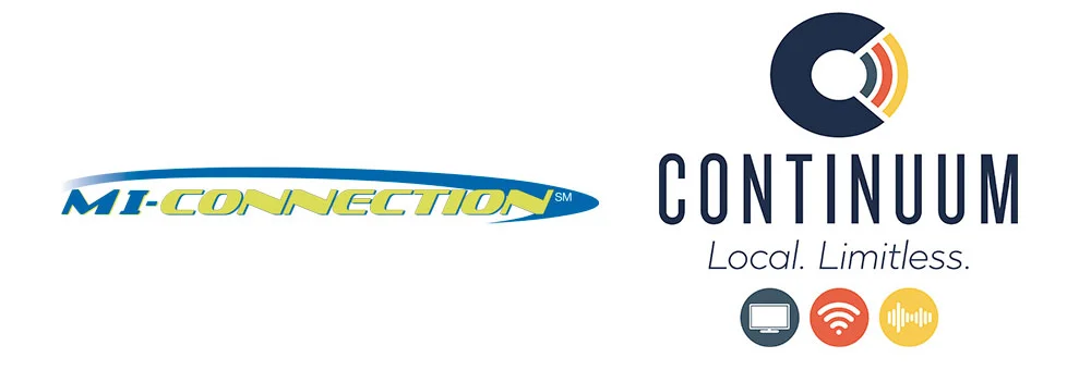
I’d worked with this client for more than 8 years, and I’m still not sure where this brand originally came from. No one wants to take ownership of it, and you can guess why. It was a bear to deal with. If you read the strategy involved in this, you know all the baggage that came with it. So to be clear up front – not my logo, not my fonts, not my colors.

FINAL: The ads were clean, crisp, and clear. A total about-face from what existed before. And a HUGE step in making this communications company look like they knew what they were doing. And we didn’t have to spend a dime on photos, new logos, new co…

FINAL: The ads were clean, crisp, and clear. A total about-face from what existed before. And a HUGE step in making this communications company look like they knew what they were doing. And we didn’t have to spend a dime on photos, new logos, new colors, or nuthin’.

The first thing to do when life gives you a dog’s breakfast of a brand that you can’t change is to make the best of it. Look, it may be terrible, but it’s what they had and what people knew, so I took a deep breath and got to molding it to our purpose. I started by ejecting all the communication company visual cliches because everyone knew MI-Connection was a cable, Internet, and phone provider. Why punish the people further with stock photos of perfect families laughing at their laptops and plasma TVs? The images were a waste of time, money, and an excellent way to blend in with everything else in the recycling bin. Besides, junk like that is only useful as a last refuge when you don’t have any kind of story to tell. Think about that when you get your next Spectrum mailer.

We, on the other hand, had a really good story to tell. This is rare, so we took full advantage. Because we were the community-owned little underdog, we could say things the big out-of-town players couldn’t. And say them we did – in a way they couldn’t. We were free to launch all the broadsides we wanted at the competition because they were too big to bother fighting little ol’ us. It was so fun writing these things. And boy, did it get attention. After all, what the heck kind of communications company does ads like this!?

BEFORE: See? A little taste of what I had to work with coming on to the business.

BEFORE: See? A little taste of what I had to work with coming on to the business.

FINAL: More ads from the launch along with some online stuff we did that was really fun. Super click-baity and led to a landing page that answered the mystery and called for a sale.

FINAL: More ads from the launch along with some online stuff we did that was really fun. Super click-baity and led to a landing page that answered the mystery and called for a sale.

FINAL: The best part about this is saying things that only a local provider could say. Mr. Burnett was a real guy (actually my neighbor) and he (and all his friends) were blown away that his personal grievance would be publicly addressed in all the …

FINAL: The best part about this is saying things that only a local provider could say. Mr. Burnett was a real guy (actually my neighbor) and he (and all his friends) were blown away that his personal grievance would be publicly addressed in all the newspapers. It was so freeing to be able to do stuff like that and have it work!

I gotta admit that at first I insisted on doing the whole brand re-launch for MI-Connection with just the headline, copy and logo. No offer. Hey, I’m an art director and that’s what we do. But the CMO talked me down to reality. And she was right – it was a retail business. So I redesigned how the offer was laid out so that it played a supporting role to the brand messaging. Both are given virtually equal weight depending on what the reader is drawn to – message or price. In the end I was so happy with it, that I kept that format when we did the big rebranding later on.

I think my favorite thing about this project is that we didn’t have to do a lot of heavy lifting to stand out in a big way. In fact, we stripped everything down so far that the ads were even cheaper to produce, which let us do even more messaging. All while making a huge impact.

DAVE SOPP – Creative

Yep, that’s me. I’ve got over 20 years of marketing strategy, graphic design, advertising art direction, and illustration experience. Want to use some of it? Email me at dave@davesopp.com


How to Design Way More Than a Loyalty Program.

Design > Logos

This little program we developed solved a whole bunch of problems for Downtown Mooresville. If you want to know the strategic nitty gritty, you can get it here, but I wanted to run though some detail on the actual pieces real quick. Downtown never had any money to spend. So aside from being strategically versatile, the production of the materials had to be super cheap.

FINAL: Logos designed for the Downtownie program. One for each of the three stages of participation.

FINAL: Logos designed for the Downtownie program. One for each of the three stages of participation.

I knew all this going into Downtown’s logo design and that’s part of why I kept it black and white to begin with. But that came in super handy for the Passport part of this program. I developed a special little passport stamp with a mark featuring the Downtown logo socked into it, and we were off. The Passport had to be cheap to print and durable enough to be carried around in someone’s purse or pocket for a while (while the user collected stickers) and to eventually survive being mailed. So, heavy chip board and one-color printing fit perfectly with the brand and gave it a throw-weight that made it hipster high-design. The stickers?  Avery label sheets (no special die cutting) and an identifying icon for each type of business you’d visit Downtown {event, shopping, food, drink, services}. Oh, and every Passport came with a half-page flyer (economical!) which explained the program to each target audience – Live It (people who lived within walking distance), and Love It (people who loved driving across town to visit).

FINAL: Our award-winning Downtownie program starts here, with a special passport that you’d fill with stickers from businesses and events in Downtown Mooresville.

FINAL: Our award-winning Downtownie program starts here, with a special passport that you’d fill with stickers from businesses and events in Downtown Mooresville.

FINAL: Collect all the stickers and mail your Passport in. You’ll get this fun little package from Mooresville’s Downtown Commission making you an official, card-carrying Downtownie! Complete with a nifty decal for your car.

FINAL: Collect all the stickers and mail your Passport in. You’ll get this fun little package from Mooresville’s Downtown Commission making you an official, card-carrying Downtownie! Complete with a nifty decal for your car.

FINAL: Teamwork makes the dream work. Literally. The back of the Downtownie card told members to look for participating shops via window signs Downtown. Getting a HUGE chunk of Downtown businesses to participate was instrumental to the Downtownie pr…

FINAL: Teamwork makes the dream work. Literally. The back of the Downtownie card told members to look for participating shops via window signs Downtown. Getting a HUGE chunk of Downtown businesses to participate was instrumental to the Downtownie program’s success. The icing on the cake was winning an innovation award from the North Carolina Main Street Center.

The card itself was a very simple thing and I used the Downtown photo collage I built for the website to try and make it look exciting. The back was a hoot to write though. I developed separate logos for both the Downtownie car decal (which you’d receive when you got your card in the mail), and for the merchant window stickers. I wanted the systems logos to look like the kind of logos you’d see attached to a City or State welcome sign. You know what I mean, all the Kiwanis shields and stuff. Sort of official looking. The merchant window clings we did were big, too. As in LARGE. You couldn’t miss ‘em, even from the street. Hahaha. We also made some little register signs in case store employees forgot to tell customers about the program. I really do think we thought of everything.

Downtown Mooresville’s Executive Director still has every Passport that was ever mailed in to her. They’re in a big box in her terrible office (she’ll laugh when she reads that) and she always loved looking through them. There was so much to learn by how people placed their stickers and what they wrote in their passports. Even how they mailed them in was fascinating. One Passport was all but laminated with layered strips of Scotch tape. It was so personal. People really invested time in becoming Downtownies.

DAVE SOPP – Creative

Yep, that’s me. I’ve got over 20 years of marketing strategy, graphic design, advertising art direction, and illustration experience. Want to use some of it? Email me at dave@davesopp.com


How to Fake It 'Till You Make It.

Strategy > Branding

Downtown Mooresville is a special place. Its charm (and untapped potential) lured us away from San Francisco when we were looking for better schools and a less hectic lifestyle. We took a look at Downtown, found an old home a block and a half away, moved, set up shop in the old telegraph office along Broad Street across from the old train depot, and quietly kept doing what we were doing back in The City. Only this time, with a freight train passing by and blowing its whistle every day at 1pm. It was so loud you couldn’t plan any phone calls around that time slot. It was awesome (not sarcasm). The old Downtown was only a few blocks long on Main Street, and wore charming but warehousy treasures over its shoulder along Broad Street, too. 

FINAL: The first thing we did was define Downtown Mooresville as, well, Downtown Mooresville. The final logo could easily represent Downtown’s railroad past, but also make sense with shops you’d find there (fashion, restaurants, bars, hairstylists, …

FINAL: The first thing we did was define Downtown Mooresville as, well, Downtown Mooresville. The final logo could easily represent Downtown’s railroad past, but also make sense with shops you’d find there (fashion, restaurants, bars, hairstylists, hardware, etc.), and event that would be held there. It had to play nice with everything you threw at it.

It’s hard to not meet people Downtown. Heck, most of them were neighbors as it turned out. One of those neighbors turned out to be Kim Atkins. She’d had successful career in the printing business and became a shop owner on Main Street. It didn’t work out. Rather than do what anyone would have done (curse Downtown and never return), she did the opposite and was elected the Executive Director of the Downtown Commission. Our boys went to the same elementary school and had become inseparable pals.

Downtown Mooresville was founded in 1873 along a rail line (yep, trains still use it!). In the 1960’s, Duke Power created the man-made Lake Norman while at the same time, the I77 was created to offer a faster way to motor to Charlotte down south, and Statesville up north. The lake was to the west of Downtown and offered about a jillion miles of lakefront property opportunity. The I77 freeway divided the town in more ways than one. Downtown was considered the poor side of Mooresville. Lake Norman (LKN) was where the money was. Hot-Cha!

BEFORE: Oh, there was clearly nothing happening Downtown when we started this project. Open shops had huge gaps of vacant, papered-over storefronts between them. That’s real bad for encouraging foot traffic and look at the mess. By code, closed busi…

BEFORE: Oh, there was clearly nothing happening Downtown when we started this project. Open shops had huge gaps of vacant, papered-over storefronts between them. That’s real bad for encouraging foot traffic and look at the mess. By code, closed businesses had to have their windows papered. So we had the idea to paper them with interesting facts about Downtown. It would pull people through to all the open shops, entertain and educate visitors, clean up the overall look of Downtown Mooresville, and cover up it’s vacancy problem. And, being black and white, it’d be affordable. So many problems solved with one easy solution!

BEFORE: The many brochures (and identities) of Downtown Mooresville, all in circulation at the same time when we started working with them.

BEFORE: The many brochures (and identities) of Downtown Mooresville, all in circulation at the same time when we started working with them.

Cut to modern times and it’s still the same. One side of Lake Norman has all the Red Robins, Super Targets, and Olive Gardens they can handle. While our side (I live in this part, remember) is a little weathered, but has all the heart and soul of what this town used to be. It didn’t help that Downtown was all but empty, lacking both shops and people. The most going concern though, was really going. Soirée was situated in a beautifully restored building in the center of Downtown and was a destination on any night of the week. The problem was, the few shops and business Downtown were never open when Soirée was pulling in the public. Worse yet, the town was so divided that (and I’m not exaggerating here), 85% of the fancy people on the Lake side didn’t even know Downtown existed!

FINAL: The first step – getting our house in order. With some selective photography we presented the Downtown we wanted people to see. All beautiful old buildings and historic charm. We dressed up Main Street with some handsome, attention-getting, h…

FINAL: The first step – getting our house in order. With some selective photography we presented the Downtown we wanted people to see. All beautiful old buildings and historic charm. We dressed up Main Street with some handsome, attention-getting, hard-working street banners, nailed down our identity and made ONE exciting brochure.

Sorry. Lots of backstory, but it’s super important (especially if you’re a small town in a similar situation). Downtown was quiet, but not dead. They launched a VERY aggressive event schedule to get folks over the I77 to our side, but they didn’t really have a brand to hang it all upon. Some merchants were calling Downtown “the Dirty Mo” on their social media. Some called it “DoMo” (Downtown Mooresville). Messaging was all over the place and none of it was cohesive or sticking. So Kim asked us for ideas on what to do.

The first thing I recommended was nixing the idea of a clever name altogether. People didn’t even know there WAS an old Downtown in Mooresville. Calling it fancy things would just confuse the issue. It was Downtown Mooresville, so just let it be Downtown Mooresville. You can always make a fun nickname later. They brought us on for branding Downtown and the  next thing I did was lie through my teefs.

FINAL: Next it was time to promote Downtown as a destination. Clockwise from the left: 1. By working closely with the pubs we advertised in, we were able to create uniquely branded templates. 2. Our award-winning program to celebrate fans of Downtow…

FINAL: Next it was time to promote Downtown as a destination. Clockwise from the left: 1. By working closely with the pubs we advertised in, we were able to create uniquely branded templates. 2. Our award-winning program to celebrate fans of Downtown Mooresville. 3. Our first piece of Downtown merch. 4. We created a photobank of amazing images that we could use to show folks what we saw in Downtown Mooresville.

Downtown was tired and mostly empty, but not dead. And with a roster of new events, we had to make it seem like there was a secret party going on over here that the Lake people weren’t privy to. In a nod to our railroad history, I designed a vintage/modern logo lockup with the tag line, It’s Happening Downtown. And that was the big lie. Sort of. It was GOING to happen, it just hadn’t actually happened yet. Operation “Fake It ‘Till You Make It” was in full effect. We started running monthly event ads in the local papers. We installed street banners, made bar coasters, put up signage at our local ballpark. We started doing spreads with an event calendar in the local magazines. We rebuilt the website. We got on social media. All the stuff you need to do before we got really creative.

FINAL: From 2009 to 2017 we’d spread the word about Downtown Mooresville. Clockwise from top left: 1. The website we designed for Downtown. 2, One of many posters we did to promote their crazy amount of fun events. 3. A magazine ad designed to intro…

FINAL: From 2009 to 2017 we’d spread the word about Downtown Mooresville. Clockwise from top left: 1. The website we designed for Downtown. 2, One of many posters we did to promote their crazy amount of fun events. 3. A magazine ad designed to introduce newcomers to Downtown. 4. One of many little quarter page newspaper ads promoting monthly events Downtown.

For example, we made calling cards for Downtown merchants and employees to hand out to other shop and restaurant owners whenever they happened to find themselves in a business they wished was Downtown. A bakery, a great Indian restaurant, that kind of thing. It said, “If you’re reading this, your business should be Downtown.” One the back was an invitation to call Kim Atkins to discuss retail opportunities. OMG, even if you weren’t looking to relocate, it sure made it look like shit was going down in Downtown Mooresville. Super buzz worthy, and it worked. Despite our launching during a recession (always fun), within a year, Charlotte was airing a live prime time news segment about Downtown’s revitalization. Finally, it really was happening Downtown. Lie turned truth.

We’d go on to make fun event posters, TV spots, and even more special little programs. Our custom-made Downtownie™ loyalty program would win an Innovation award from the State of North Carolina. Best of all, Main Street filled up. At its zenith, it reached 95% occupancy. Morning, noon, or night, people were coming to see what was Happening Downtown.

dave_bug.jpg

DAVE SOPP – Creative

Yep, that’s me. I’ve got over 20 years of marketing strategy, graphic design, advertising art direction, and illustration experience. Want to use some of it? Email me at dave@davesopp.com


How to Plan for Every Little Thing.

Design > Identity

Here’s how long I’ve been in the business: rebranding projects would start with the logo and follow with the stationery. Hahahahaha! Remember stationery? No? Ahem. Well, it’s still useful. It is! Ok, what’s most useful now is your email signature, and the way your company’s bill looks, and the envelope that carries it. That’s right, the junk drawer of identity. But it’s super important! Because any of those things can be the loose thread in the sweater. Someone in billing gets the idea to pull on a thread and everything unravels. I’m not being dramatic. I’ve seen it happen. Lots.

FINAL: Yep! Paper stationery! Business cards! Envelopes! They won’t die and they aren’t going away! What was once the most important piece of communication for a company has become the graphic designers junk drawer of to-do’s. But you gotta do it be…
FINAL: This whole project had to be done as economically as possible for a lot of reasons. So a clean look worked well in more ways than I thought then we got to the fleet graphics. I worked with the wrap company to design these things for maximum g…

FINAL: This whole project had to be done as economically as possible for a lot of reasons. So a clean look worked well in more ways than I thought then we got to the fleet graphics. I worked with the wrap company to design these things for maximum gangability in printing.

That’s why we were sure to have plans for the junk drawer stuff when we rebranded Continuum. We wrapped all our rules up in a detailed book of design guidelines so that any other vendor or employee could refer to it if they got the hankering (and preferably, permission) to make some Continuum materials on their own.

Fleet and building signage are far from junk drawer material because they’re so visible, but it’s a specialized use of the new identity. Do you know what it costs to wrap a van? It’s crazy expensive! And Continuum had 60+ various vehicles that needed to be rebranded. So I teamed with the signage company they picked so I could design graphics in a way that would let the printer gang up the job, maximizing the wrap material to its fullest. It helped a LOT to have a clean, white identity, letmetellyou . It was a bear to figure out, but fun at the same time. And guess what? The less wrap material you have on a vehicle, the longer it’ll last. The vans were all stripped and detailed (to get rid of ghosting from the old brand), and redressed in their fancy new graphics. Two years on they still look as good as new.

FINAL: While the building now looks WAY better than it did, I wish the graphic service bands weren’t so boring and straight on the building. I had comps of the bands organically swirling and looping their way across the building, but everyone wanted…

FINAL: While the building now looks WAY better than it did, I wish the graphic service bands weren’t so boring and straight on the building. I had comps of the bands organically swirling and looping their way across the building, but everyone wanted to play it safe. It also made it cheaper to have it painted. Those blue marks on my mock-up up top are to show stupid town planning that we were complying with a signage code that said we could only use 20% of the buildings surface.

Continuum’s HQ (formerly MI-Connection) was always kind of a dump. Situated in a virtual hole next to a tall railroad berm, you couldn’t really see it from the main road. They’d had a tall pole with a tiny lit rectangular sign atop.  We had to ask Mooresville’s planning department to replace it with something a little taller. They said no. So we tore the sign pole down completely and turned the whole building into a sign. Fuck you, planning! We painted the whole building a bright, clean white which made it WAY more visible to traffic. And the existing architectural lighting made the thing glow like a shiny new Apple store at night. 

dave_bug.jpg

DAVE SOPP – Creative

Yep, that’s me. I’ve got over 20 years of marketing strategy, graphic design, advertising art direction, and illustration experience. Want to use some of it? Email me at dave@davesopp.com


How to Rebrand a Company and Make Your Trademark Lawyer Happy.

Design > Logos

MI-Connection, our small, local cable, Internet, and voice client, needed to rebrand with a new name and logo that projected authority and reliability. Our competition were all well-known, out-of-town players: Time Warner, Dish, and Windstream – big and personality-less, it was still a no-brainer they could handle your personal and/or professional digital life. Plus, everyone already knew them.

Discovering a name that is appropriate for a business AND sounds super cool is, well, hard. What’s harder is clearing your super-cool-sounding, appropriate name with legal. Obviously, you can’t start with legal, so you have to have fun thinking of a lot of names, knowing that most of them will go straight into your trademark lawyer’s trash can. To help us spread our thinking out, I made a little graph to work to. 

FINAL: Here’s where we finally ended up! I love the branding process because when the thinking is right, and the work is both responsible and good, you can’t lose no matter what logo the client chooses in the end. I had no idea we’d end up here unti…

FINAL: Here’s where we finally ended up! I love the branding process because when the thinking is right, and the work is both responsible and good, you can’t lose no matter what logo the client chooses in the end. I had no idea we’d end up here until we suddenly did. Everyone’s input really put a lot of confidence behind the final final because everyone had ownership.

IMPORTANT GRAPH: So simple, yet pretty useful! On the far left you’ll find names like COMNET or TELEWEB. Stuff that you’ll never get legal clearance for. On the far right you’ll have names like NIMBL or ZING. Crazy names that no one would pick for a…

IMPORTANT GRAPH: So simple, yet pretty useful! On the far left you’ll find names like COMNET or TELEWEB. Stuff that you’ll never get legal clearance for. On the far right you’ll have names like NIMBL or ZING. Crazy names that no one would pick for a communications company. What we wanted (and where we’d end up) is to be just to the left of the “Legal Gold” line in the middle.

On the far left are names you’d expect a cable company to be called. On the far right are crazy ass names that don’t mean anything. Now, the further you get to the left, the more legal trouble you’re going to get into. Same as trying to buy a domain nowadays, it’s next to impossible because all the cool stuff is already taken by similar businesses. The more you go to the right, the more you’re clear with legal because at the far end, these words are silly or completely made-up. Tech-startups thrive in this area with all their misspellings and chicanery. We needed to be in the middle-left. We weren’t a crazy little startup. We needed weight, authority, and familiarity. We started with 300 contenders and it was (painfully) narrowed to 10 before we flung them to our amazing attorney. Three survived and after a few rounds of visual concept boards, we had a winner we felt did the job – Continuum. As we saw it, that’s where your digital life thrived – in the Continuum. We were invisibly working to keep you connected to all the extremes in your life – Work and Play, Family and Friends, Sports and News...and everything in between. The only question was, and this is terrible but true, would people be able to read it and say it? It has two “U”’s after all. So we went out and filmed local folks from the three towns reading the word off a card. They did great, the board was convinced, off we went.

COMP: Once a winning name popped out of legal (Continuum), I could get to work designing marks for it. These are from the first round of black and white ideas. Early on we thought we’d need the name to be Continuum Network, so that’s why you see the…

COMP: Once a winning name popped out of legal (Continuum), I could get to work designing marks for it. These are from the first round of black and white ideas. Early on we thought we’d need the name to be Continuum Network, so that’s why you see the “N” in some of these. In the end we decided against it. I still like all of these except the pixelated C on the bottom row. The head of tech at Continuum said it looked like bad reception and we said, “Damn. Good point!”

COMPS: A look at some of the logotype ideas we presented. In the end we nixed this direction altogether because I was nervous about ending up with a problem we had with the old MI-Connection logo – it was so long and skinny that it needed to be real…

COMPS: A look at some of the logotype ideas we presented. In the end we nixed this direction altogether because I was nervous about ending up with a problem we had with the old MI-Connection logo – it was so long and skinny that it needed to be really big all the time to be legible. Even thought the one on the bottom right is not as long as the rest, it’s complicated with the dots, so same problem.

Continuum’s logo had to do the same thing the name did: project strength and more than a little corporate backbone. It had to look reliable like it’s got big money behind it, but somehow a be a little, I don’t know...quirky? We presented a LOT of logo / logotype options. All in black and white at first so we could concentrate on how their form alone made us feel. Narrow it down to three and add some color for each.Then the favorite color pallet on all three logos. The three go off to legal, and one came out a winner. The C with the radiating, Wi-Fi-like bands wasn’t the most out-of-the-box idea, but man, it worked so hard doing what we needed done. Especially the familiarity part. It doesn’t take a genius to see that phone service isn’t very important to folks, cable is tanking fast, and Internet is still the future. So if you take away anything from this logo, it should be that we supply Internet. But the bands are different colors, and each color represents a service we provide. And those service icons are locked up with our logo. And eventually, after enough exposure, we’d be able to use just the C at times to communicate our brand, which will be kind of cool. 

COMP: Once we decided on a short list of logos, in come the colors, along with some idea of how it would all live in the wild. A word about color – it had a job to do as well. Because the name and logo was corporate and reliable.and the messaging wo…

COMP: Once we decided on a short list of logos, in come the colors, along with some idea of how it would all live in the wild. A word about color – it had a job to do as well. Because the name and logo was corporate and reliable.and the messaging would push “we’re local”, we needed our color palette to be the bridge between those two things. The colors had to say, we’re respectable, but uniquely different.

BEFORE AND AFTER: On the left is the old logo and to the right is the new brand we created, name and all. I’d had to work with the old logo for years and it was such a pain. There were no variations of it. Not even an all-white knocked out version! …

BEFORE AND AFTER: On the left is the old logo and to the right is the new brand we created, name and all. I’d had to work with the old logo for years and it was such a pain. There were no variations of it. Not even an all-white knocked out version! So everywhere we used it had to be on a super light color and it had to have LOTS of horizontal room if it was going to be big enough to be read. I was sure to design some flexibility in the new brand I created.

COMP: This is how what we now call the “service bands” could work in the future – playfully weaving in out of our ordinary lives. Quietly busy in the background keeping us connected to the things that are important to us.

COMP: This is how what we now call the “service bands” could work in the future – playfully weaving in out of our ordinary lives. Quietly busy in the background keeping us connected to the things that are important to us.

I mentioned above that in the Continuum was where our digital lives flow. Through this, and the color-coded services, we got a fun little bonus idea: Why not illustrate the services we provide as bands flowing through the air around us? We explored all kinds of fun ways to use this graphic in the ads (you can see those here) and it gave us an extra bit of brand imagery that we could either pull forward or drop back in the future.

dave_bug.jpg

DAVE SOPP – Creative

Yep, that’s me. I’ve got over 20 years of marketing strategy, graphic design, advertising art direction, and illustration experience. Want to use some of it? Email me at dave@davesopp.com


How to Be Creative for Creatives.

Strategy > Branding

It all started at the big annual toy show in NY, the International Toy Fair. I was there representing Wrybaby and started up a convo in the Wrybaby booth with a nice guy who turned out to be from American Greetings. I don’t even know how we got to it, but he mentioned that they were looking for a way to do something that I can’t write about here (ask me in person and maybe I’ll tell you). I said I had an idea that would work perfectly for that. After the show, I pitched my idea to his boss over the phone. He was the head of American Greetings Properties (AGP). AGP managed licensing for all of American Greetings’ legacy properties like Hollie Hobbie, Care Bears, Madballs, Strawberry Shortcake etc. But they also thought up lots of new stuff, too. They were creating properties to develop themselves or to pitch to companies like Disney and Nickelodeon, and that’s why they took an interest in our idea. It was really out-of-the-box. So the head of AGP loved what we presented and said he wanted to make this idea happen with us. He flew down to visit our office in Mooresville, then he invited us for what would be a super weird visit to the AG mothership in Cleveland (ask me in person and I’ll tell you all about it). Then he dumped us into a really shitty negotiation process with AG’s entertainment lawyers in LA where they continuously threatened to steal our idea outright. Super hardball shitty. I told the lawyers that they and AGP could, literally, to go fuck themselves and hung up on them. And then the AGP boss asked us to rebrand them. Well, first he asked us to design a fun corporate team-building program for the department. And then he asked us to rebrand them. How freaking weird is that!?

FINAL: The whole idea was based on the home page. An island fantasy land of AGP properties where all the dispirit characters could live in harmony. You can check out the website design deets and see bigger pictures here.

FINAL: The whole idea was based on the home page. An island fantasy land of AGP properties where all the dispirit characters could live in harmony. You can check out the website design deets and see bigger pictures here.

BEFORE: This was AGP’s home page when I was brought on. You can see what they tried to do from the start – create a fun-but-not-too-fun envelope that can hold variously styled characters from the 70’s to today (the properties slugged along as a slid…

BEFORE: This was AGP’s home page when I was brought on. You can see what they tried to do from the start – create a fun-but-not-too-fun envelope that can hold variously styled characters from the 70’s to today (the properties slugged along as a slide show). So, done, right? Sort of. The problem was that it didn’t set AGP up as the creative all-stars they were. It was just a generic box of characters you either knew or didn’t.

And we did it. Which was even weirder. But all of the (very real) unpleasantness aside, it was a cool project and they paid us what we were worth <shrug>. Chalk it up to me always rooting for the underdogs, I guess. Which, despite all the success and billions of dollars they generated, AGP and the team that supported it deserved more respect. We got to meet all the crazy-talented artists and writers on our visit and they seemed like normal, good people. Remember, AGP might be pushing a lot of old brands, but they were also in the business of thinking up of a lot of new, exciting characters and shows. The problem was, when the studios saw they were hearing a pitch from AGP, they thought a couple of corporate grandpas would be shuffling in to show them some old Holly Hobbie shit. The AGP boss wanted to change that perception.

COMPS: Some (not all) of the ideas we presented in the first round to AGP. Each idea included whatever it took to get the concept across. So some ideas came tight with taglines attached. Some were just rough sketches. Clockwise from top left: 1. Fre…

COMPS: Some (not all) of the ideas we presented in the first round to AGP. Each idea included whatever it took to get the concept across. So some ideas came tight with taglines attached. Some were just rough sketches. Clockwise from top left: 1. Freshen up the old characters and spice up the new by presenting each character’s personality in a modern way. 2. Incorporate the characters into a graphic envelope (the safest idea, just in case they freak out over the others), 3. Explore exciting new worlds with AGP. Visit planets and discover unique characters. 4. The world of AGP as an island inhabited by strange, sweet, wonderful, and exotic characters.

American Greetings, duh, already has a brand. We were just giving the one department a new look. We started calling it a “restaging,” because we had to use the AG logo lockup unmolested in anything we did. So the first thing we did was present a whole mess of concepts (from tight to super sketchy) to hang their new skin on. These guys were all artists (and all WAY better than me), so we knew that they’d get what we meant if we showed them loose drawings. We showed them all kinds of directions they could go to solve their problem (as we do for every project). For example, there was one idea about how creative the team in the department was, and all the crazy things that happened in their building on the steady. We’d do a lot of videos, social media (with a focus on Linkdin), email newsletters to the industry, etc. The employees would get a chance to be stars and use their awesome talents to help promote their common cause. I only mention this so you can get an idea of how different each idea was. What they chose was way different. The idea was to refresh the old stuff, pull the new stuff into the spotlight, and bring all the properties together as one. Instead of being the keepers of the old that sometimes had new ideas, AGP would represent a big fun world of full of creative ideas. We’d just take “legacy” out of the conversation altogether.

FINAL: Every pop-up on the AGP website, in every category, would include a strip of bright, clever, modern infographics. One trivia block in each strip would be animated, too, leaving the visitor with a ton of tiny positive impressions of how amazin…

FINAL: Every pop-up on the AGP website, in every category, would include a strip of bright, clever, modern infographics. One trivia block in each strip would be animated, too, leaving the visitor with a ton of tiny positive impressions of how amazing these properties are, no matter how dated they seemed to you before.

FINAL: We pulled the map theme across everything from their massive trade show booth (back wall pictured above) to Powerpoint presentations. We also gave their team a host of logo lockups they could use wherever in the future. All predesigned and re…

FINAL: We pulled the map theme across everything from their massive trade show booth (back wall pictured above) to Powerpoint presentations. We also gave their team a host of logo lockups they could use wherever in the future. All predesigned and ready to go go go.

The final execution would all bloom (see what I did there?) from a new home page featuring a fanciful, illustrated map of an island filled with AGP’s properties. Visitors would click on any of the characters for a pop-up filled with info on that property along with its licensing opportunities. Kelly and I came up with a ton of fun taglines to support this idea, and they picked our favorite in the end – Happiness Happens Here. As they created new properties, we’d just add ‘em to the island. Once the site as approved and in production, I took the island I’d illustrated and pulled the concept through everything from their giant trade show booth to PowerPoint templates for presentations. The whole thing was modern, unconventional, bright and fun. Just the way AGP wanted to be thought of.

dave_bug.jpg

DAVE SOPP – Creative

Yep, that’s me. I’ve got over 20 years of marketing strategy, graphic design, advertising art direction, and illustration experience. Want to use some of it? Email me at dave@davesopp.com