HOW TO MAKE FRAME-BY-FRAME ANIMATION A VIABLE OPTION.

I’ve long loved animation and I have a weird, rich history of not ever getting to do it. Like, really do it. This from the guy who, in dot-com’s infancy, was the ONLY ART DIRECTOR IN SAN FRANCISCO WHO KNEW HOW TO MAKE AN ANIMATED GIF. True story.

When I was studying marketing at the Art Center College of Design in the super late 80’s a Hollywood production company (in an hilariously Cohen-brother-style meeting on Sunset Blvd.) invited me to be a part of a breakthrough, episodic animation project for adults that eventually became some dumb show about a guy named Homer and his weird family who lived someplace called Springfield. If you ever run into me, ask me about this experience because it’s super funny (sometimes I think I dreamt it).

The very first animation I did for Kelly’s marriage book, Hey, I Love You…. The hardest part was building the end title with the book closing. I knew it would be, so I made it so I could swap out the art and use the base animation as a template for every video after.

Once I figured out the basics, it was time to play with more layers, masking and more complicated animations.

Eventually I added unique title art to the front of each new video and kept pushing myself to do more complex scenes.

With all the booty shaking, this was the most detail I put into one of these animated shorts. And the most adventurous transition (to the dropped penny) I’d attempted.

Since the brand calls for stylish simplicity, you’d have to really be paying attention to see that the clip that begins at 00:22 is the most complex frame-by-frame animation so far. Can you guess why?

Soon after, Dick Clark Productions (another funny story) asked me to turn a comic series I’d won an award for in LA into commercial bumpers for a season of American Bandstand. I gave them an enthusiastic “YES” despite not knowing at ALL how I’d actually fucking deliver (it was the late 80’s and we didn’t even have clamshell phones yet for God’s sake!). Shit, I was still in school and only 19, for crying out loud, but I was all about it! When they said it’d be a great unpaid project on my resume, I bounced.

I’ve actually been creeping up on real animation for a bit. In 2017 I created a polished series of successful animated videos for a tech startup by supplying layered illustration files to a talented, local After Effects animator. Then I started a series of time-lapse illustrations that I made for Mr. Dave’s Best. Drawn in real-time, all one take.

But my real opportunity came when I got to promote the marriage book my wife had been contracted to write for Hachett – Hey, I Love You… To research her concept, Kelly had been interviewing all kinds of couples to learn more about all kinds of marriage experiences – the good, the bad, and, yeah, the sometimes terrible. Since I’d designed and illustrated her book to be as unisex and inclusive as possible, Kelly had a cool idea to set those candid insights to stylistic animation that would be right on brand.

Once animations were done, they were easily converted to animated gifs. Like this endless sharing of Hey, I Love You…

SImple, yes. Pain in the ass, not really. What I love about conceptual animation is that your can do a lot with little when you put a little thought into it beforehand.

Simple, yes. Pain the ass, also yes. But I do love this tedious-to-execute animated gif of the endless search for love. This was a part of the puck to fill Giphy with our cute little animations.

This concept for this animation was pretty simple so it had to get juiced up with some slightly difficult renderings of the word bubbles and the chair bounce on the refresh. Not hard, but nice thinking, I think. haha.

Frame-by-frame, onion skinning, multiple layers, Procreate, and my left hand – all in one photo. But this is what goes into every sequence on this page (and more on the Hey, I Love You… Vimeo channel.

The process wasn’t much different than the video work I did on those earlier tech-startup videos. I’d discovered the Procreate illustration app for those and it was a short leap to teach myself how to use its ridiculously simple animation assist to onion-skin myself to frame-by-frame-glory. Trying to do a whole video in one file was technically impossible anyway due to file size limitations which is fine because it would also have been an unworkable hellscape of layers to deal with. So I animated all the scenes as short clips. Once I had a scene down, I exported it as an mp4 file thatI then pulled into Adobe Premiere. There I could loop, extend, or slow, depending on how the VO timing worked out. And if I ran into trouble, I’d just zip back to the iPad to quickly animate a filler sequence or fix bugs in the scenes. Easy squeezy. 

Soon we had over 40 short animations for Hey, I Love You… And there’s more in production. It’s funny to watch my progress as I became more comfortable through experience. And the best part is that since I did all the animations as individual sequences, now we can mix and match previous work to make new narratives in just minutes. Or animated gifs of those scenes. Despite having so many options to economically repurpose the work into the future, I still prefer animating new ideas since I figured out how to do it so easily!

DAVE SOPP – Creative

Yep, that’s me. I’ve got over 20 years of marketing strategy, graphic design, advertising art direction, and illustration experience. Want to use some of it? Email me at dave@davesopp.com
 

HOW TO DRAW OVER 300 ILLUSTRATIONS FOR A 258 PAGE BOOK THAT'S NOT EVEN A PICTURE BOOK.

My wife wrote a book called, Hey, I Love You… and she asked me to design it. Then she asked me to illustrate it. It’s in the contract with our publisher. They paid me in the advance to do 50 illustrations for the book. Well, they paid Kelly to have me do the work. Hahaha. Anyhoo, you know how many illustrations I did for the book? Over 100. And that’s why I like being a strategic designer who can draw. I didn’t HAVE to overdeliver because it’s my wife’s project. I did it because it simply HAD to be done. I’ll explain.

Hey, I Love You… by Kelly Sopp. Illustrations (so many illustrations) by me, Dave Sopp. This is an early drawing I made for the Hey, I Love You… website because we didn’t have an actual copy of the book to show off. Hey, we still don’t!

Hey, I Love You… by Kelly Sopp. Illustrations (so many illustrations) by me, Dave Sopp. This is an early drawing I made for the Hey, I Love You… website because we didn’t have an actual copy of the book to show off. Hey, we still don’t!

Kelly’s book is beautiful. Hey, I Love You… gives couples practical marriage wisdom, and an effortless way to exchange heartfelt words that need to be said, or unsaid, or aren’t said often enough. It’s so unique. Not just because of the way you use it or how anyone who’s married can find incredible value in it. It’s unique in the space of Relationships and Marriage. Have you ever looked in that section? It’s D-E-P-R-E-S-S-I-N-G. It’s mostly for people trying to fix what’s very broke or, in the dustier lower shelves, trying to teach people how to NOT get into that situation in the first place. Kelly’s book tackles all that (and more) handily and expertly, but in such a refreshingly positive way. This is starting to sound like I’m the president of her fan club (I am, but I’m also the president of every businesses fan club on this site), but it’s important because when you illustrate a book, it’s not about your talents. It’s all about the content.

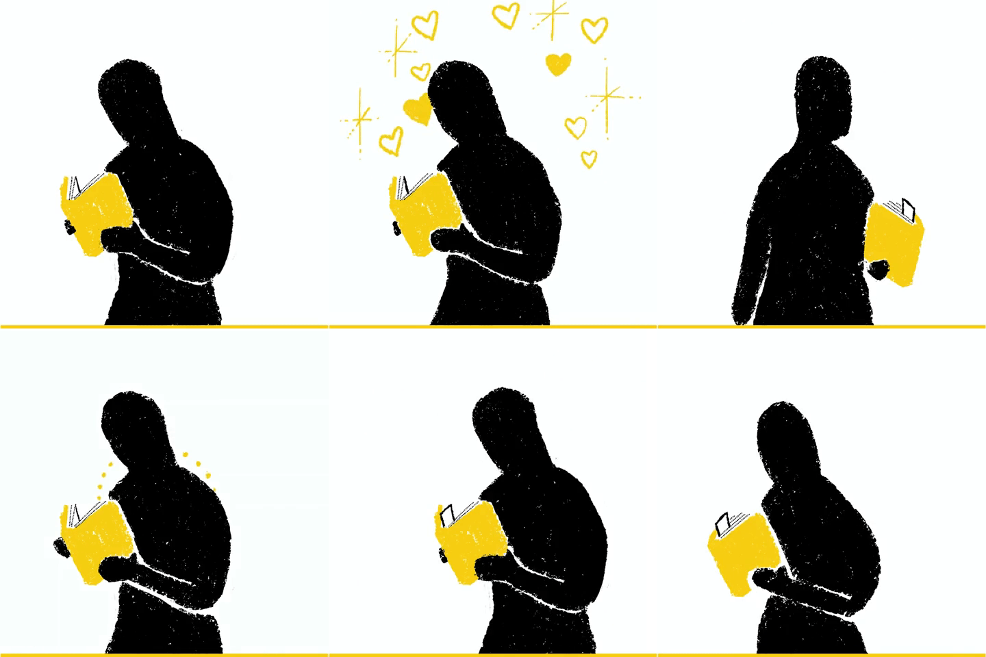
Didn’t I just say that I don’t have a sample of the book? I don’t. So I did that Illustration to use while I made my own dummy! I’m like that. Anyhoo, now you get to see what the book design looks like. Super airy and light. That yellow is so bright and happy and positive (just like the writing.). Below are some illustrations of how the book works – “it puts the bookmark in the book.” (Sorry, Silence of the Lambs joke).

Didn’t I just say that I don’t have a sample of the book? I don’t. So I did that Illustration to use while I made my own dummy! I’m like that. Anyhoo, now you get to see what the book design looks like. Super airy and light. That yellow is so bright and happy and positive (just like the writing.). Below are some illustrations of how the book works – “it puts the bookmark in the book.” (Sorry, Silence of the Lambs joke).

I’ve collected my favorites (but not all my favorites) to share. The book is so light and bright and airy, so the illustrations really needed to just be seasoning for the words Kelly wrote. I chose a loose style using the colors we already established in designing the book together. The drawings are cute and happy, but still rough around the edges and almost sketchy, just like my marriage. Kidding! Just seeing if you’re paying attention.

I’ve collected my favorites (but not all my favorites) to share. The book is so light and bright and airy, so the illustrations really needed to just be seasoning for the words Kelly wrote. I chose a loose style using the colors we already established in designing the book together. The drawings are cute and happy, but still rough around the edges and almost sketchy, just like my marriage. Kidding! Just seeing if you’re paying attention.

I tried to keep everything as simple as possible at every level. I use three brushes: Rough Crayon, Tight Crayon (for any type), and Messy Dotted. There are only three colors: White, Yellow, and Black. Even conceptually I tried to be super simple without being lazy. I mention that the Life Preserver was an easy out, but I tried to at least make it look really interesting. And it turned out to be one of my favs.

I tried to keep everything as simple as possible at every level. I use three brushes: Rough Crayon, Tight Crayon (for any type), and Messy Dotted. There are only three colors: White, Yellow, and Black. Even conceptually I tried to be super simple without being lazy. I mention that the Life Preserver was an easy out, but I tried to at least make it look really interesting. And it turned out to be one of my favs.

d_blog_hily_illust_04.jpg

In this case, the content is composed of two parts. The first is an introduction to the book to explain it (it’s that unique) and give you an entertaining breakdown of tried and true marriage best practices. The second part is the bulk of the book - bookmarkable spreads that convey your romantic thoughts, encouraging words, mild concerns, deepest worries, and your most sincere apologies. That’s a lot of emotional content, right? Sound kind of heavy? Well, it IT IS! And that was what made it so tricky.

The Hey, I Love You… bookmarkables are divided into five categories. The first two, Romance and Encouragement, were super easy and fun. Then it started getting challenging. I feel like such a baby even writing that because you honestly, have NO idea how much thought and research went into the writing of this book. For example, consider this spread: I’m Worried About You. / It seems like you might be having a tough time right now. Want to talk about it? While the sentiment is clear, it’s also intentionally vague. Because this bookmark may be appropriate for someone who’s going through a really hard project at work as well as someone who might be suffering from deep depression. The overall tone of the book is upbeat, but it’s not tone deaf. As a person who identifies as “married for more than 25 years”, I’ve (we’ve) experienced a lot of the experiences in this book. So what would you illustrate to represent that bookmarkable message?

Did it just get moodier in here? The romantic and encouraging illustrations were really fun, but every relationship has its ups and downs. And as much as this marriage book is about the good times, it’s responsible enough to get you through the bad. I explain how bad in this post, and that illustration is bottom center.
d_blog_hily_illust_07.jpg

For every message in the book, I had to put myself in the shoes of the bookmarker AND the recipient in both the most mild of circumstance AND the most dire. All the while I had to keep with the book’s upbeat voice and palette. For example,“I’m Worried About You.”. For this I illustrated a door outlined in white in a very dark room. Under the door there’s a bright yellow light showing from the other side. From other side comes a bright, hopeful love note that travels a playful path into the room. Fine for anyone who’s just sort of shut off emotionally from their loved one and open to interpretation by the recipient to speak to just how dark that room is that they’re holed up in. See what I mean?

Of course, not everything in the book called for something this heavy. Even in the serious parts. If you know me, you know I can’t stand an easy way out. But for a small part of this assignment, the easy way out led to more time and effort to tackle the harder stuff. “Maybe We Can Learn a Lesson in This.” = Graduation cap. “I Will Never Give Up on You.” = Life Preserver. Not lazy. Just accurate, appropriate, and efficient to tackle the harder spreads. Besides, remember what I said about the book not being about the illustrations? It’s true. They were always meant to be seasoning for the content.

At this writing, I’m still making more and more drawings. Once we sent the final files to our publisher, there was the website and all the marketing materials to produce. Right now I’m at over 300 unique illustrations for this project. This isn’t even counting the animated book trailers and animated gifs viewed by over 3 million on GIPHY. I hope there’s even more to add to this story when the book is available October 5. If you want to be in the loop, subscribe to the Hey, I Love You…Newsletter. If you preorder the book before October 5, you’ll get a cool little Sneak Preview Gift. from Kelly and I :-)

DAVE SOPP – Creative

Yep, that’s me. I’ve got over 20 years of marketing strategy, graphic design, advertising art direction, and illustration experience. Want to use some of it? Email me at dave@davesopp.com
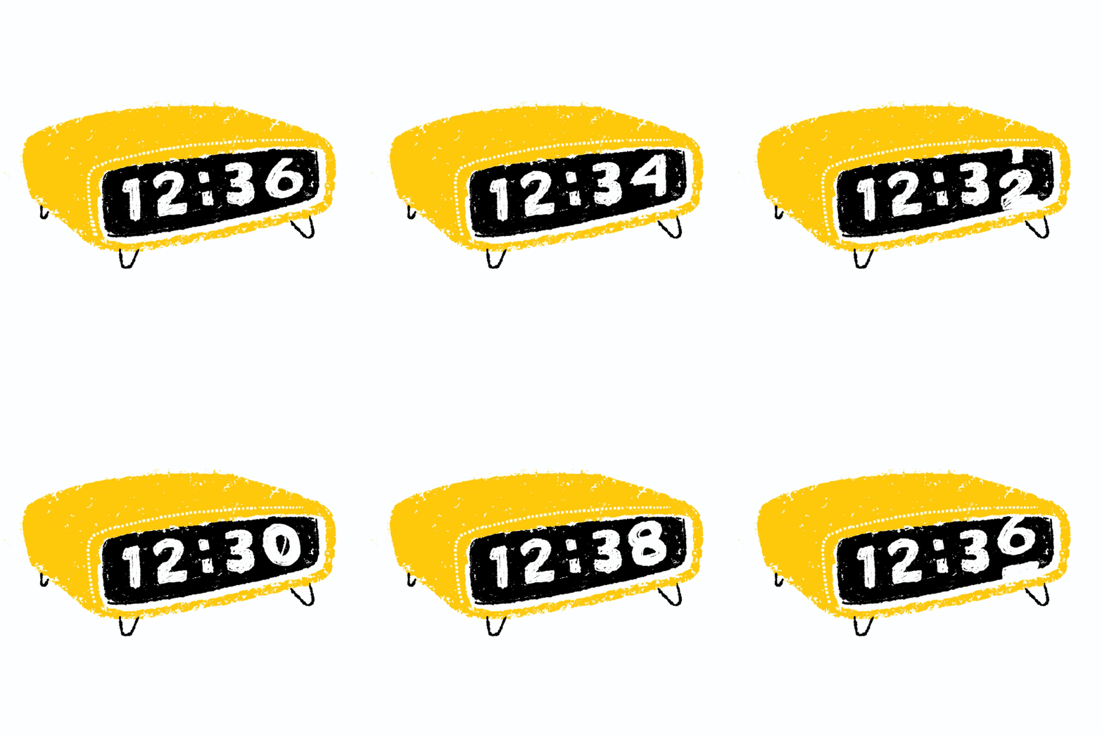
 

How to Not Really Animate Something.

Illustration > Mr. Dave’s Best

When I was a student at Art Center, a producer for Dick Clark Productions somehow got my number and called me up with a gig (I still don’t know how that even happened). He asked me if I could do some animation titles for American Bandstand. I said, “Yes, absolutely” (as I’m want to do) and of course I’d never animated anything before in my life. Luckily I had an out when he said he didn’t have any money to pay me but I’d be in the end credits. No. Thanks.

Anyway, I never did learn how to animate. I’ve come close by doing some TV spots in San Francisco with talented animation studios. I even sort of animated some low budget stuff for VersaMe and Continuum, but those weren’t the same as the real deal. But then I found that Procreate, my favorite tablet drawing app, had a feature that recorded your pen strokes while you drew! So when your drawing was done you’d have a time-lapse animation of your drawing...well, drawing itself. I know what you’re saying. “That’s not real animation either!” I know, but it’s closer? Hahaha.

Anyway it was fun to take that app feature and figure out how to use it in a unique way. I mean, you could just record yourself drawing a character or something, but in the end you just have that finished character or something. So I had the idea of doing a slow reveal. Where you really didn’t know what the drawing would be until the very end. Or maybe you’d know what it was, but you didn’t know why I drew it until the end.

I’d been putting a lot of creative energy into my Mr. Dave’s Best brand and I’d been sharing one theme a week on Mr. Dave’s Best Instagram account. I made these little videos the “Saturday Night Mystery Movie”, where I challenged viewers to try and guess the video topic before it was revealed at the end. Fun, right?

I’m sharing here a collection of my most favorite Mr. Dave videos. I don’t think any of these represent my best illustration work. Not at all. The whole thing was more of a conceptual piece. My challenge to myself was to get through each of these drawings quickly. I didn’t want the videos to be too long or illustrate themselves too fast. I also did each drawing in one take. Maybe this was just user error, but if you screw up a lot (like I do), it’ll totally mess up your video. And I was working with no previous sketch or practice at all. I was just banging them out. I exported the videos from Procreate to my Mac, where I’d pop them into Adobe Premiere for a quick edit and some title additions. The music is all SUPER public domain from a website I found filled with all kinds of terrible, scratchy, atrocities. Mostly a bunch of recordings of Edison (yeah, Thomas), recorded by Edison, telling terrible jokes. Anyway, I thought the clunky antique music fit well with my retro brand and bounced hard against my decidedly non-traditional themes. How many video topics can you guess before they end?

DAVE SOPP – Creative

Yep, that’s me. I’ve got over 20 years of marketing strategy, graphic design, advertising art direction, and illustration experience. Want to use some of it? Email me at dave@davesopp.com


How to Draw Yourself Out of Trouble.

Illustration > VersaMe

Being able to draw gets you out of a lot of sticky design situations. Maybe I lean on it too much, but if I need a technical illustration of a product I’m doing a brochure for, it’s easier for me to just whip one out myself without having to go find someone to do it, get an estimate, get an ok to spend the money, wait for them to fuck it up a couple of times before I like it and then get back to work. Who’s got time for that?

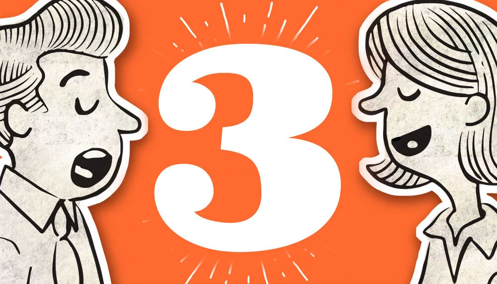
CHEATING: Yep. This is my animation cheat. Same head, different mouths. This is what I gave my talented After Effects friend so he could do the fake animations for our video.

CHEATING: Yep. This is my animation cheat. Same head, different mouths. This is what I gave my talented After Effects friend so he could do the fake animations for our video.

CHEATING: Same with this. I gave him a ton of different mouths for both characters so they’d look like they were blabbing.

CHEATING: Same with this. I gave him a ton of different mouths for both characters so they’d look like they were blabbing.

CHEATING: Same here. Below is all this cheating in action. :-)

CHEATING: Same here. Below is all this cheating in action. :-)

d_versame_illustration_04.jpg
d_versame_illustration_05.jpg

Being an illustrator also comes in handy getting ideas across. Fast. When I was working with VersaMe (they made the Starling early education wearable), I had LOTS of opportunities to put my drawings to work. I’d had to make a series of YouTube videos, from scratch, in about a week. So I figured out an idea that would work, populated the spots as much as I could with stock photos and then filled in the gaps by hand. The spots were heavy on After Effects (lots of stuff zooming in and out and such) so the drawings had to have a little extra something something to spice things up.

Oh, I’m no animator. I mean, I’d love to be, but I don’t have the time. So I faked it. I drew out tons of key frames and handed them over to my After Effects editor to do his magic with ‘em.

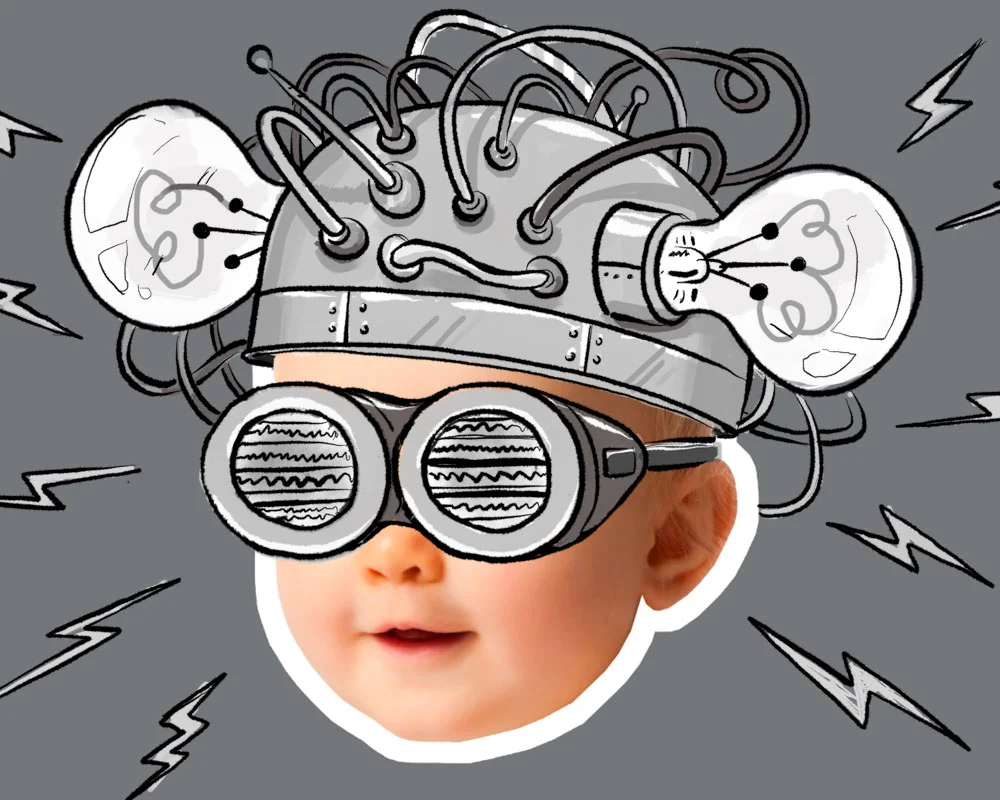
There were also a lot of technical drawings to be used in gif animations I’d end up building for onboarding tutorials. But the really fun stuff, personally, was concepting story ideas for an educational gaming app we were developing to tie into the Starling. We had a handful of story ideas that we wanted to test via Facebook ads. Really shoestring market research – the ad with the most clicks for more info was the theme that won. I’m a big fan of those old Bell Science Films, and I wished and wished that the child-brain-cross-section idea was the winner. It totally wasn’t. Mad Face Emoji!

dave_bug.jpg

DAVE SOPP – Creative

Yep, that’s me. I’ve got over 20 years of marketing strategy, graphic design, advertising art direction, and illustration experience. Want to use some of it? Email me at dave@davesopp.com


How to Make Cheap TV That’s Still Super Creative.

Advertising > Video

Commercials. Expensive to run, right? Not if you’re a cable company! It’s free! Run them across all channels whenever! Woo hoo! Oh, wait, but they’re expensive to make. Nope! Not if I’m making ‘em! Double Woo Hoo! Look, despite being able to run free media, Continuum was just a small communications company with a lot of expenses before paying for TV production. But doing TV was too good an opportunity for them to just dismiss it. Especially with all that free media at hand. So we set out to bring our brand to life through Adobe After Effects and and an first-time local voice talent.

A career preference for working for scrappy, low budget underdogs has taught me that you don’t need a lot of money to make a good tv spot (or video or whatever). You just need a good idea and a talent for using the resources at your disposal. The YouTube video work I’d done a year earlier for VersaMe racked up TREMENDOUS view through numbers, so why not double down on the formula for a cross-channel cable flight for our local communications company?

Remember, the Continuum name and logo was in charge of projecting “reliable” . Everything else was in charge of “local”. So we decided on this strategy: slick “animated” spots, with a folksy, homegrown VO, and a strong finish. Our voice talent was Tracy Bennett Smith, a charming banking professional with a distinctive accent and no VO experience whatsoever. How’d we find her? Soccer practice. Doesn’t get scrappier than that. For the After Effects work, we stuck with the talented Peter Baker, who’d done such amazing work on the VersaMe videos.

There was one more bit of creative strategy we applied. We decided to build the spots as bumpers. That means, as a viewer, you’d see a :15 Continuum spot at the start of the commercial break, then a bunch of national commercials before seeing another :15 second spot before your show started again. We used this format to make CLIFFHANGERS! OMG, it was so fun to write these. We’d set up a proposition at the beginning and pay it off at the end. It was fantastic. Nobody does that anymore, so it was great theater. They became sort of like little special station identification break-ins. Only fun.

We got to be our true southern selves and show off our local personality, all the while projecting a strong sense of reliability. More to the point, this showed people that we were a communications company you could actually, gulp, like?

DAVE SOPP – Creative

Yep, that’s me. I’ve got over 20 years of marketing strategy, graphic design, advertising art direction, and illustration experience. Want to use some of it? Email me at dave@davesopp.com


How to Give the People What They Want.

Illustration > Mysterio Predicts

I’m not Mysterio. Well, sometimes I had to be at trade shows. But I originally drew Mysterio with no thought of him being me. Some people also go to Zoltar, the mechanical mystic from the movie, Big. Nope. It’s funny that our collective image of exotic mentalists are all kinda the same guy. I’ve got that big, beautiful Taschen book of Magic and when you look through the history of magician-types, those guys are all doing the same look! For the branding work I did for Continuum (a communications company), I talk about avoiding cliches. But, honestly, sometimes you have to give the people what they expect if you want them to understand something. Oh, sorry, if you don’t know, Mysterio is a mystic who predicts your baby’s future on a little t-shirt. See? Totally appropriate and no way around it. I toyed with using a top hat instead of a turban, but he looked too Fred Astaire. Like he’d take your baby tap dancing.

FINAL: Mysterio…such a jerk. But being serious makes him believable. I didn’t really have a lot of reason to draw him outside his logo, but once in a while I needed him to have a body. You may say “lazy” but I thought it was funny to keep his logo h…

FINAL: Mysterio…such a jerk. But being serious makes him believable. I didn’t really have a lot of reason to draw him outside his logo, but once in a while I needed him to have a body. You may say “lazy” but I thought it was funny to keep his logo head exactly the same in any scenario. He’s so INTENSE! hahahah.

SKETCHES: In 2006 I started trying to figure out what Mysterio was going to look like. I distinctly remembering being bored in a trade show booth in San Francisco, so that’s why the three stacked sketches are so shitty. But that last one really seem…

SKETCHES: In 2006 I started trying to figure out what Mysterio was going to look like. I distinctly remembering being bored in a trade show booth in San Francisco, so that’s why the three stacked sketches are so shitty. But that last one really seemed to be the one, no? I remember I didn’t do that many before heading in that direction. The strip of heads up top was me working my way toward finish (far right). I’d never done shading like Mysterio seemed to demand (the etching style). It’s hard! Anyhoo, once I got to a finish I did there little extras for the packaging. In the beginning I softened Mysterio by saying he also sewed all the shirts himself.

EXTRAS: Once I got comfortable drawing in the Mysterio style, I started doing little extras here and there for customers. Here’s an early version of Mysterio’s origin story that I did as a free comic download. To the right are the Spirit Animals fro…

EXTRAS: Once I got comfortable drawing in the Mysterio style, I started doing little extras here and there for customers. Here’s an early version of Mysterio’s origin story that I did as a free comic download. To the right are the Spirit Animals from Mysterio’s free downloadable Cootie Catcher.

SKETCHES: Some early rough pencil sketches for Mysterio’s children’s book, A Future Just for You!

SKETCHES: Some early rough pencil sketches for Mysterio’s children’s book, A Future Just for You!

FINAL: Illustrated spreads from Mysterio’s picture book, A Future Just for You.

FINAL: Illustrated spreads from Mysterio’s picture book, A Future Just for You.

illust_mysterio_05.jpg

As the Joker once said, “Why so serious?” After all, it’s for a BABY. Exactly. I wanted Mysterio to look intense to add some gravitas to the thing. Look, imagine if he was some happy winking cartoon dude, it’d ruin the whole thing. The way he’s STARING, part of you has to wonder...will this prediction really come true? Also, this was made to be a baby shower gift. So it’s all theater when it’s opened in front of a party. Looks serious, ends up being ridiculous. Get it?

Still I had ideas on how to soften him up a bit. I had a whole backstory planned for him, like how he sewed the shirts himself and somehow imprinted the shirts with a blast from his eyes, but I never played it up. I once made a comic book about his origin story. It was an extra credit free download for a while at wrybaby.com. And, of course, I illustrated a children’s picture book about Mysterio’s powers. That really softened him up. I even brought him to life on Instagram for a while! Hahaha. In the end, I think I prefer him looking like his tagline description: Uncanny! Almost Scary!

DAVE SOPP – Creative

Yep, that’s me. I’ve got over 20 years of marketing strategy, graphic design, advertising art direction, and illustration experience. Want to use some of it? Email me at dave@davesopp.com


How to Achieve Good, Fast and Cheap.

Advertising > Video

They say it’s impossible. That you can only pick two. Want it fast and cheap? Well, it’s not going to be good. You get it. I do, too, and agreed with it until I figured out how to get all three at once.

VersaMe’s Starling was an amazing little piece of technology. If you haven’t read the strategy bit behind this, then take a few minutes and go for it. You’ll get the big picture. This part’s all about the YouTube videos we launched in support of a giant AdWords buy worth tens of thousands of dollars. And I only had two weeks to concept and produce video for it.

When pitching the Starling, there’s a lot to get across. We had to describe a wearable technology for early-learning that no one had ever seen before, and then explain the problem it solved to people who didn’t know the problem existed. Before I got involved, VersaMe had signed onto an expensive Google AdWords plan where Google would assign you a personal rep who’d not only set you up with their best practices for production on every front, but also do Google-y things in the background to maximize your kill count. First, I dove into the secret sauce they gave us on video production. What you see here follows EVERY one of Google’s recommendations to the letter.

They say if you don’t have anything to say, sing it. Well, if you have too much to say, sing it and add pyrotechnics, a chorus line, and maybe a donkey. That was the idea behind these spots. The Starling’s whole existence involved explaining some pretty dry early-education research. And, as I note in the strategy part, you couldn’t really prove any kind of results, because, well, the results would be intangible. Oh, it worked, or would work, based on decades of research, but not like a vacuum that could pick up a bowling ball. You couldn’t immediately see X affect Y. And remember, even though we were spending a lot of money on placement, production had to be done on a shoestring.

This is the fun part for me. No time and no money – so what can I bring to this party to help solve the problem, be on brand, and come in on no budget? It’s such a challenge! Hahaha. Oh, also, the spots had to really make a big impact. 

FINAL: One of my illustrations in the Brain Hacking spot. They go by so fast! See more of my illustrations for these spots here.

FINAL: One of my illustrations in the Brain Hacking spot. They go by so fast! See more of my illustrations for these spots here.

WORK: My professional storyboard style and OH! Hey, look! It’s me at VersaMe actually drawing the brain hacked baby! Yes, that tie does go with that shirt.

WORK: My professional storyboard style and OH! Hey, look! It’s me at VersaMe actually drawing the brain hacked baby! Yes, that tie does go with that shirt.

Luckily, I’s cans draws. In various styles, too. So I put together a kinetic, breathless campaign for the Starling that a talented After Effects editor I knew (Peter Baker with sound assistance from his partner Anthony Proctor) could hopefully put together quick. I boarded out the spots, then illustrated or scrounged up all the elements and laid them out in a super-detailed, layered Photoshop Tiff. The “animation” I illustrated frame by frame, and I included them as layers for Peter, too. My copywriting wife had the perfect voice for this, so we recorded her VO in a sound studio in Charlotte (Hi, Ground Crew!). Peter would get the VO and Tiff file and apply his After Effects wizardry. Then we’d make some adjustments, and send it off to Anthony for SFX additions and final mixing. In the end, each of these spots cost about $1,250 to produce.

Between following Google’s best practices, the frenetic pacing and the fun visuals, the view-through rates for this campaign were off the charts. After so many years in the business I’ve become more than a little cynical regarding praise from people who you’re paying tens of thousands to. Right? But our Google rep was legit blown away to the point where I didn’t think she thought these would do well at all! Of course we didn’t stop there. We started running these spots on every other platform, too. We also tried some tamer material too, but later on. It was more traditional tech/baby stuff that was soft and fuzzy and important sounding. The analytics on that weren’t as amazeballs in comparison to the fun stuff, which kind of surprised me. Oh, why don’t I also show you the stuff we did with social influencer and legit funny guy, DudeDad. He made some of his own videos, and you can see how someone else explains the Starling to parents.

DAVE SOPP – Creative

Yep, that’s me. I’ve got over 20 years of marketing strategy, graphic design, advertising art direction, and illustration experience. Want to use some of it? Email me at dave@davesopp.com


How to Market a Product No One’s Seen Before That Solves a Problem No One Knows About.

Strategy > Branding

OMG the world needs this early-development technology. I’m dead serious. But even though this revolutionary wearable looks simple, how it works is actually pretty complicated. And did I mention the results aren’t immediate? (Just wait, I’ll get there). But one thing is absolutely clear – the result of using this technology means your child will get a substantial educational head-start over his or her peers. That head-start begins in infancy, and keeps distancing your child ahead of others for life.

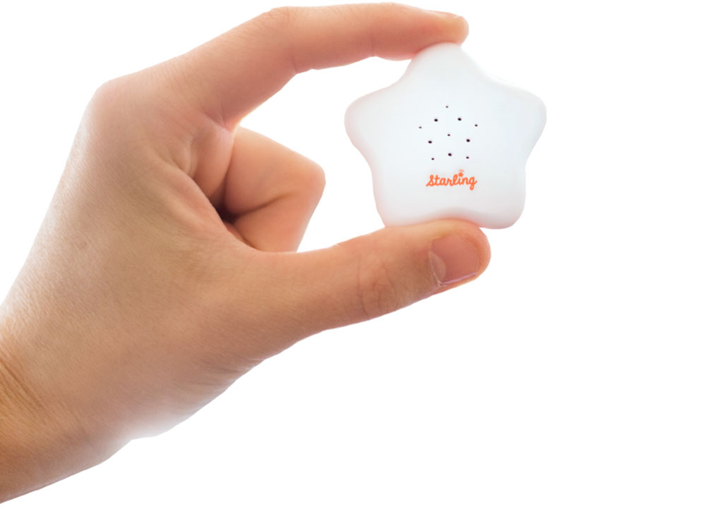
PRODUCT: This is the Starling. So tiny, so cute, so powerful.

PRODUCT: This is the Starling. So tiny, so cute, so powerful.

FINAL: One of the first things I made at Versame – a 6”x9” two-sided handout for parents touting the Starling’s benefits.

FINAL: One of the first things I made at Versame – a 6”x9” two-sided handout for parents touting the Starling’s benefits.

The great advantage of doing what I do at this point in my career is being able to choose the projects I work on, and the people I work with. I really liked the people at VersaMe before I even knew about the product. Chris and Jon, two of the company’s founders, contacted Kelly and I out of the blue. They had left Silicon Valley like we did, and now lived just a couple of towns down the I77, in Huntersville. They explained that they were fans of our parenting board book, Safe Baby Handling Tips. In fact, the bit about Playing with Baby was one of the early slides in their investor pitch for a startup they were launching with a third partner, Nicki “The Money” Boyd (the nickname I gave her). Nicki controlled the finances and managed the development team back in Redwood City, while the rest of the team worked out here in NC.

BEFORE AND AFTER: The original packaging on the left didn’t communicate the product or it’s value. My redesign on the right led with the value proposition and steadily unfolded the whole story in easy-to-digest snippets.

BEFORE AND AFTER: The original packaging on the left didn’t communicate the product or it’s value. My redesign on the right led with the value proposition and steadily unfolded the whole story in easy-to-digest snippets.

Kelly and I met Jon and Chris for coffee and they explained what they were making. They had a passion for early education and learning (it ran in their family). They knew that the education system was not only broken, but historically broken and getting worse. From studying years of scientific research they concluded the only way to nip the problem was, literally, in the bud. They sought to jump-start the learning process as early (and as correctly) as possible. This was the problem they worked on at Stanford and they already went through a successful round of funding. The hardware and development infrastructure was built, and they were about to launch on Kickstarter. The three had a lot of the planning done (and it was good) but they asked us on to help them out with tightening up the branding and early messaging. That’s when we learned all about the Starling.

The Starling was a beautifully designed, high-tech wearable for children 0-4 years old. When you clipped it to your child’s clothes, the Starling would count every word spoken to your baby throughout the day. It did this in virtual real-time, without recording, and sent the data to your phone with beautiful graphics telling you how many words your child heard that hour, that day, that month, that year. It let you set word count goals to challenge you every day. Anticipating how hard it can be to carry on a one-sided conversation (Chris and Jon were also parents), the app gave you fun daily prompts to help you keep talking to your baby at every occasion - in the car, during your afternoon run with the jog stroller, at bedtime, etc. Feeling competitive? There was even a leader board that you could use to see how much quality engagement you gave your child compared to other Starling parents. Amazing, right?

I bet I can guess what you’re thinking right now. “Why?”

Why all this technology to talk to a newborn? It’s not like I’m NOT going to say anything to my baby, so why all the extreme fuss? You’re not wrong to think that. But here’s a big fact – the more words you say to a child from 0-4 years old, the more likely they are to reach their full potential. And the “to” is super important. You can’t just talk “at” your child, like over your shoulder while you’re doing the dishes. No, doing that doesn’t work the same way. Think reading, with the child on your lap. Or telling a story while making lots of eye contact. There you go, that’s the right stuff. It’s about engagement. Feed a child’s brain enough words like this and soon you’ll find yourself with an early talker. Then while other babies are still learning to talk, yours is busy learning to read. Get it? And while other people’s kids are learning to read picture books, yours is reading chapter books. This goes on for their whole life!

FINAL: For professionals who already understood the importance of verbal communication, I created this “bookshure” to introduce them to a powerful new tool – the Starling.

FINAL: For professionals who already understood the importance of verbal communication, I created this “bookshure” to introduce them to a powerful new tool – the Starling.

But understand this – doing all this talking with engagement doesn’t mean every child can grow up to be Einstein. It’s all about maximizing your child’s genetic (not economic) potential. If it’s only within a child’s genetic capacity to be average smart, they’ll get there faster and stay there for life. This can make a huge difference to a child’s quality of life, considering where they could end up without the benefit of this help. And I can’t stress this enough – I’m talking about  ALL children. Not just poor children. Or special needs children. ALL CHILDREN. (If you’re a parent reading this, please note your feelings right now. I’ll get to them later). 

Finally, dear reader, here lies the rub. Look how long it took me to explain the Starling to you and the problem it solves. My expertise in working with clients in San Francisco was taking really complicated concepts and making them dead simple for a consumer (best example here). I worked on the Starling for two years and what you read above is the shortest I think I’ve ever gotten the complete pitch. So as a marketer, here are your options:

  1. Explain how The Starling works, and then explain why it solves an early-education problem you didn’t know existed

  2. Explain how you need to talk to your baby as much as possible from 0-4 years old, and then explain what the Starling is and how it could help you do that

You can’t do one (explain the Starling) without the other (how early development works). 

The three founders had become early-childhood experts, for real. And their research scientist, librarian, pediatrician, speech language pathologist, mentors and partners were all in touch on the regular, keeping tabs on the Starling’s progress and correcting messaging when necessary so that everything stayed absolutely factual. We needed to look like experts, but not scientists. The messaging had to be intriguing, inviting and fun – but not misleading or fantastical.

FINAL: A one-sheet for interested schools to get a little more detail on how the Starling can help their mission.

FINAL: A one-sheet for interested schools to get a little more detail on how the Starling can help their mission.

The Kickstarter launch was a success in that it did what we needed – raise as much awareness as cash. (As I said, VersaMe was already funded by an investment group). Our mailing list blossomed. Sales started coming in. But that’s when the real work began.

I’ve worked on big tech in San Francisco. A lot. Sun Microsystems, Borland, Sybase, Veritas, Dell, Adobe, blah blah blah. That’s not including all the dot coms. I was there for the first big boom, and the first big bust, working freelance for almost every agency in the City. Startups are different. It’s EXACTLY like in the show “Silicon Valley” (the first season, anyway). It’s crazy and confusing and exciting and hilarious and scary and frustrating and fun as hell. You’ll NEVER pack more work into a shorter span of time than when you work for a startup. Because even though we were focused on who we were, and which audience we were talking to, we were saying it all - in every conceivable way. And we had practically no budget to do it with. Even though there was $10M in seed money, you gotta watch like a hawk how you spend it (right, Nicki?). Because it’s only going to last so long. So we were begging, borrowing, and stealing while testing the messaging multiple time a day, every day, everywhere. And once we saw progress in any direction we’d run after it full speed.

There’s no way I can ever tell you everything we did. It was so much! But one of the first things  was to use everything that inspired the creation of the Starling to build a giant online resource center for new parents, filled with published studies that prove the benefits of direct, verbal communication. Then we published articles and how-to’s on our blog everyday giving tips on how (and why) to maximize your baby-talking skills. Our newsletters were going out weekly to new parents, filled with communication tips and info on developmental milestones. I found out that the founders had invested in a HUGE AdWords ad buy that included a lot of YouTube videos. I had two weeks to deliver finished product and there was nothing in the works. We set up tents in shopping malls and Nicki and I did the ABC show in Vegas (to have a meeting with Barnes & Noble, who said no, then inexplicably sent us a huge order two weeks later). We got into a hipster tech showroom in Silicon Valley. I totally redesigned the packaging. I made an online school for new parents. We developed a custom Reading App that you could use with the Starling. We hired influencers on social media. We created a mobile app game based on the Starling. We brought on a respected social media agency to give it a go. We. Tried. Everything.

WORK: And lots of it! This is probably about 2% of the things we did to position, explain, and sell the Starling. Clockwise from top left: Dumbing it down, we created multitudes of info-loaded landing online campaigns and landing pages, we created a…

WORK: And lots of it! This is probably about 2% of the things we did to position, explain, and sell the Starling. Clockwise from top left: Dumbing it down, we created multitudes of info-loaded landing online campaigns and landing pages, we created and ran an online school, we sent the founders to present at indie book stores, parenting groups, schools and libraries. I made a Starling Honors program for little students, we made an educational mobile game, we tried multitudes of simple online campaigns and landing pages, we gave away free information (so much free information), we changed the whole website, we started marketing the platform the Starling was built on, and we developed ridiculously complex email newsletters and campaigns.

Nothing worked. At least, not on the level we wanted it to. It was just too much for people to wrap their heads around. Most thought it was a great product...for terrible parents. And of course, THEY were all excellent parents. There’s actually a study that exists which found 90% of parents thought they were parenting in the 5th percentile of awesome parents. Which, of course, is mathematically impossible. So we pivoted to focus on Starling Partnersschools (public and private), libraries, speech pathologists, pediatrician clinics, non-profit organizations. Frankly, any group that already understood the importance of early learning. Most ended up being too outright dysfunctional, painfully slow to act, or too strapped for funds to make a difference to our bottom line. Our biggest success came from developing a program for libraries to loan Starlings out to patrons. We got ourselves into a lot of libraries but not enough, and not fast enough. In the end we had to stop. There was nothing left to try. This amazing technology is now in the hands of the scientific researchers who inspired it. They’re using it to further understand how we can make our children better, smarter, happier people. I’m 100,000% sure that someday you’ll see this product (or something like it) make a huge consumer splash in the future. Sometimes a good idea doesn’t make it simply because of something that no one can foresee or control  – timing.

DAVE SOPP – Creative

Yep, that’s me. I’ve got over 20 years of marketing strategy, graphic design, advertising art direction, and illustration experience. Want to use some of it? Email me at dave@davesopp.com


How to Get Personal.

Advertising > Video

Downtown Mooresville is full of remarkable people running remarkable businesses. We’d started, years ago, by convincing people that there actually WAS an historic Downtown in Mooresville. Then we told them about all the special events happening on the steady there. Then we told them about all the shopping, dining, and services that were available Downtown. Then we gave them access to private membership Downtown, and a fun way to engage with those businesses. And then we introduced folks to the people who made those businesses possible. It was personal, it was heartfelt, and it was really special. Despite there being no budget for a real crew or production, I loved this project.

Kelly and I made tiny documentaries that gave you a glimpse of each business owner’s personality, their passion, and their dream. We called the series “Discover Downtown”. And each video was promoted via Downtown’s social media, Downtownie newsletters, and the Downtown website. Each video was accompanied by a full length article on how these makers made their way to Downtown Mooresville. We did 10 of these before we ended it.

I wish we had better sound on a lot of these, but we did the best we could under the circumstances. It really was just a crew of two – me behind the camera and my copywriter wife running the interviews. I also edited. :-P But, hey. I still love these for the people who were kind enough to participate.

DAVE SOPP – Creative

Yep, that’s me. I’ve got over 20 years of marketing strategy, graphic design, advertising art direction, and illustration experience. Want to use some of it? Email me at dave@davesopp.com


How to Fake It 'Till You Make It.

Strategy > Branding

Downtown Mooresville is a special place. Its charm (and untapped potential) lured us away from San Francisco when we were looking for better schools and a less hectic lifestyle. We took a look at Downtown, found an old home a block and a half away, moved, set up shop in the old telegraph office along Broad Street across from the old train depot, and quietly kept doing what we were doing back in The City. Only this time, with a freight train passing by and blowing its whistle every day at 1pm. It was so loud you couldn’t plan any phone calls around that time slot. It was awesome (not sarcasm). The old Downtown was only a few blocks long on Main Street, and wore charming but warehousy treasures over its shoulder along Broad Street, too. 

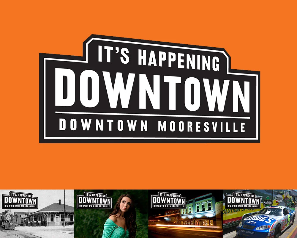
FINAL: The first thing we did was define Downtown Mooresville as, well, Downtown Mooresville. The final logo could easily represent Downtown’s railroad past, but also make sense with shops you’d find there (fashion, restaurants, bars, hairstylists, …

FINAL: The first thing we did was define Downtown Mooresville as, well, Downtown Mooresville. The final logo could easily represent Downtown’s railroad past, but also make sense with shops you’d find there (fashion, restaurants, bars, hairstylists, hardware, etc.), and event that would be held there. It had to play nice with everything you threw at it.

It’s hard to not meet people Downtown. Heck, most of them were neighbors as it turned out. One of those neighbors turned out to be Kim Atkins. She’d had successful career in the printing business and became a shop owner on Main Street. It didn’t work out. Rather than do what anyone would have done (curse Downtown and never return), she did the opposite and was elected the Executive Director of the Downtown Commission. Our boys went to the same elementary school and had become inseparable pals.

Downtown Mooresville was founded in 1873 along a rail line (yep, trains still use it!). In the 1960’s, Duke Power created the man-made Lake Norman while at the same time, the I77 was created to offer a faster way to motor to Charlotte down south, and Statesville up north. The lake was to the west of Downtown and offered about a jillion miles of lakefront property opportunity. The I77 freeway divided the town in more ways than one. Downtown was considered the poor side of Mooresville. Lake Norman (LKN) was where the money was. Hot-Cha!

BEFORE: Oh, there was clearly nothing happening Downtown when we started this project. Open shops had huge gaps of vacant, papered-over storefronts between them. That’s real bad for encouraging foot traffic and look at the mess. By code, closed busi…

BEFORE: Oh, there was clearly nothing happening Downtown when we started this project. Open shops had huge gaps of vacant, papered-over storefronts between them. That’s real bad for encouraging foot traffic and look at the mess. By code, closed businesses had to have their windows papered. So we had the idea to paper them with interesting facts about Downtown. It would pull people through to all the open shops, entertain and educate visitors, clean up the overall look of Downtown Mooresville, and cover up it’s vacancy problem. And, being black and white, it’d be affordable. So many problems solved with one easy solution!

BEFORE: The many brochures (and identities) of Downtown Mooresville, all in circulation at the same time when we started working with them.

BEFORE: The many brochures (and identities) of Downtown Mooresville, all in circulation at the same time when we started working with them.

Cut to modern times and it’s still the same. One side of Lake Norman has all the Red Robins, Super Targets, and Olive Gardens they can handle. While our side (I live in this part, remember) is a little weathered, but has all the heart and soul of what this town used to be. It didn’t help that Downtown was all but empty, lacking both shops and people. The most going concern though, was really going. Soirée was situated in a beautifully restored building in the center of Downtown and was a destination on any night of the week. The problem was, the few shops and business Downtown were never open when Soirée was pulling in the public. Worse yet, the town was so divided that (and I’m not exaggerating here), 85% of the fancy people on the Lake side didn’t even know Downtown existed!

FINAL: The first step – getting our house in order. With some selective photography we presented the Downtown we wanted people to see. All beautiful old buildings and historic charm. We dressed up Main Street with some handsome, attention-getting, h…

FINAL: The first step – getting our house in order. With some selective photography we presented the Downtown we wanted people to see. All beautiful old buildings and historic charm. We dressed up Main Street with some handsome, attention-getting, hard-working street banners, nailed down our identity and made ONE exciting brochure.

Sorry. Lots of backstory, but it’s super important (especially if you’re a small town in a similar situation). Downtown was quiet, but not dead. They launched a VERY aggressive event schedule to get folks over the I77 to our side, but they didn’t really have a brand to hang it all upon. Some merchants were calling Downtown “the Dirty Mo” on their social media. Some called it “DoMo” (Downtown Mooresville). Messaging was all over the place and none of it was cohesive or sticking. So Kim asked us for ideas on what to do.

The first thing I recommended was nixing the idea of a clever name altogether. People didn’t even know there WAS an old Downtown in Mooresville. Calling it fancy things would just confuse the issue. It was Downtown Mooresville, so just let it be Downtown Mooresville. You can always make a fun nickname later. They brought us on for branding Downtown and the  next thing I did was lie through my teefs.

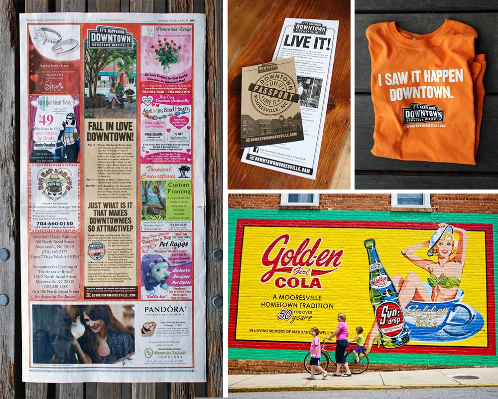
FINAL: Next it was time to promote Downtown as a destination. Clockwise from the left: 1. By working closely with the pubs we advertised in, we were able to create uniquely branded templates. 2. Our award-winning program to celebrate fans of Downtow…

FINAL: Next it was time to promote Downtown as a destination. Clockwise from the left: 1. By working closely with the pubs we advertised in, we were able to create uniquely branded templates. 2. Our award-winning program to celebrate fans of Downtown Mooresville. 3. Our first piece of Downtown merch. 4. We created a photobank of amazing images that we could use to show folks what we saw in Downtown Mooresville.

Downtown was tired and mostly empty, but not dead. And with a roster of new events, we had to make it seem like there was a secret party going on over here that the Lake people weren’t privy to. In a nod to our railroad history, I designed a vintage/modern logo lockup with the tag line, It’s Happening Downtown. And that was the big lie. Sort of. It was GOING to happen, it just hadn’t actually happened yet. Operation “Fake It ‘Till You Make It” was in full effect. We started running monthly event ads in the local papers. We installed street banners, made bar coasters, put up signage at our local ballpark. We started doing spreads with an event calendar in the local magazines. We rebuilt the website. We got on social media. All the stuff you need to do before we got really creative.

FINAL: From 2009 to 2017 we’d spread the word about Downtown Mooresville. Clockwise from top left: 1. The website we designed for Downtown. 2, One of many posters we did to promote their crazy amount of fun events. 3. A magazine ad designed to intro…

FINAL: From 2009 to 2017 we’d spread the word about Downtown Mooresville. Clockwise from top left: 1. The website we designed for Downtown. 2, One of many posters we did to promote their crazy amount of fun events. 3. A magazine ad designed to introduce newcomers to Downtown. 4. One of many little quarter page newspaper ads promoting monthly events Downtown.

For example, we made calling cards for Downtown merchants and employees to hand out to other shop and restaurant owners whenever they happened to find themselves in a business they wished was Downtown. A bakery, a great Indian restaurant, that kind of thing. It said, “If you’re reading this, your business should be Downtown.” One the back was an invitation to call Kim Atkins to discuss retail opportunities. OMG, even if you weren’t looking to relocate, it sure made it look like shit was going down in Downtown Mooresville. Super buzz worthy, and it worked. Despite our launching during a recession (always fun), within a year, Charlotte was airing a live prime time news segment about Downtown’s revitalization. Finally, it really was happening Downtown. Lie turned truth.

We’d go on to make fun event posters, TV spots, and even more special little programs. Our custom-made Downtownie™ loyalty program would win an Innovation award from the State of North Carolina. Best of all, Main Street filled up. At its zenith, it reached 95% occupancy. Morning, noon, or night, people were coming to see what was Happening Downtown.

dave_bug.jpg

DAVE SOPP – Creative

Yep, that’s me. I’ve got over 20 years of marketing strategy, graphic design, advertising art direction, and illustration experience. Want to use some of it? Email me at dave@davesopp.com


How to Turn Good Work Into Great Work.

Strategy > Branding

Stop right here. If you haven’t read about all the MI-Connection drama leading up to the complete rebranding of this company, you really need to catch up. Seriously, otherwise it’s like starting House of Cards from the middle.

FINAL: We had two objectives – look reliable and be local. The name, logo, and color palette were in charge of reliability. We even got a bonus graphic from the very definition of Continuum. The three color-coded services we offered are always seen …

FINAL: We had two objectives – look reliable and be local. The name, logo, and color palette were in charge of reliability. We even got a bonus graphic from the very definition of Continuum. The three color-coded services we offered are always seen looping effortlessly behind everything we do.

Caught up? Good. The tri-town-owned cable, Internet, and phone company, MI-Connection, was now doing great. The new advertising was doing well, subscribership was up, negative public opinion had all but subsided (except the die-hard trolls. Haters gonna hate), customer service had reached an all-time quality high and really, the only thing holding the company back was its old identity and all the baggage that came with it (see here). 

BEFORE: Look, I can’t knock this too much because I was the one responsible for cleaning this act up. Take a look at what it was before, for God’s sake. I got this brand cohesive visually, then spent years driving home the super tough messaging that…

BEFORE: Look, I can’t knock this too much because I was the one responsible for cleaning this act up. Take a look at what it was before, for God’s sake. I got this brand cohesive visually, then spent years driving home the super tough messaging that this company was NOT public enemy #1. This hard work worked hard to give us the opportunity to take this company to the next level.

There was a different vibe afoot at MI-Connection and it needed to be defined. Kelly and I worked up some market research with the CMO to find out what the townsfolk REALLY thought about their community-owned communications company. I’ve never been a big fan of focus groups. I’ve been in plenty. It’s expensive and they’re so easily manipulated by whoever is running them (the company who wants positive feedback, the agency who wants the opposite or whatever, etc.). So we launched a sincere, straightforward email questionnaire campaign (nothing fancy, just a Typeform thingy) across MI-Connection’s service footprint, steeling ourselves for the prospect of most everyone either not participating or just trolling us. We were surprised (in a good way). We had an 15% response rate and while a few were ALL CAPS TYPING CRAZY PEOPLE, we got a wealth of feedback from our survey. 

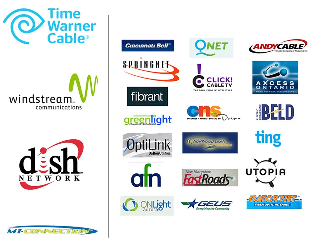
RESEARCH: Welcome to the world of shitty communication company logos. On the left, our regional competition of mostly giant out-of-town providers. And us at the bottom left there. The longest logo and therefore the smallest logo in the bunch. Does i…

RESEARCH: Welcome to the world of shitty communication company logos. On the left, our regional competition of mostly giant out-of-town providers. And us at the bottom left there. The longest logo and therefore the smallest logo in the bunch. Does it inspire faith in MI-Connection’s abilities? Nope. To the right I give you a smattering of what indie communications companies were up to across the US. Mostly a total shit storm except, in my opinion, ting and fibrant. And maybe Qnet. Clean and simple, sure, but seemingly reliable on logo design alone? Are they able to stand up against our list on the left? Dunno.

Ready for this? People didn’t care that MI-Connection was community owned. Despite the real promise that all eventual profits would be dedicated to buying more emergency services, playgrounds, etc., what people liked most was that MI-Connection was locally owned. Sure, the difference between the two is super microscopic, but it’s real. Because MI-Connection was owned by three towns, this made citizens share holders thus putting them in charge of how the company benefitted their communities. But they didn’t care about that (even though we were always super clear about it). Instead, they responded more positively to having a local alternative to the big providers, which MI-Connection was designed to be from the beginning. The other big takeaway from the survey? People also wanted to believe that their provider was capable and reliable (aka. Duh). We did extensive research into what other indies we’re doing to stand up to the big telecom companies. Turned out, not a lot.

FINAL: Is it just me, or does Continuum look more professional and reliable than Dish and Windstream? Not to be OFD (Own Favorite Designer), but doesn’t Continuum look at least competent in comparison to the other logos?

FINAL: Is it just me, or does Continuum look more professional and reliable than Dish and Windstream? Not to be OFD (Own Favorite Designer), but doesn’t Continuum look at least competent in comparison to the other logos?

Next we interviewed employees – with no management present, just Kelly and I, and them. What were they up against? What were they frustrated with? What were their ideas for big and small change? This was super valuable because when all the research was said and done, we presented more than a mere identity to the CEO. We presented a whole new company that would solve the problems we’d discovered. The CEO was on board, and as we explained to the Board of Directors, you can’t just put a new name on this thing and hope people forget what it was. To change perception, you have to change reality. They agreed, but I’ll always remember the words of encouragement the Chairman of MI-Connection’s Board gave me after that presentation. After everyone filed out of the room, he shook my hand, and smiling, said, “Don’t fuck it up”.

PROGRESS CHART: Rebranding a communications company from it’s name to an intern’s email signature can be, um, intimidating. I made this simple chart so the CEO and the board could clearly see the path from start to finish. In every one of the thousa…

PROGRESS CHART: Rebranding a communications company from it’s name to an intern’s email signature can be, um, intimidating. I made this simple chart so the CEO and the board could clearly see the path from start to finish. In every one of the thousands of presentations for each step, I’d use a marker to show where we were in the process. The far left is represents the 300+ names we’d whittle down to favorites, then to a few, then a winner. Then a ton of black and white logo ideas, color exploration, favorites, then final colors., Then we concept the materials with long lead times, while we explored fonts and taglines and stuff, and then on to advertising concepts and a final launch campaign. Everyone found this chart oddly comforting. Even me!

I built out a detailed plan of work and a timeline including the MANY presentations we’d have to make. We needed every commissioner, Mayor, Town Manager, PR folks, etc. to understand exactly why we were doing what we were doing (seriously, in the end we must have made somewhere around 35 presentations). We kicked things off with a broad naming exercise (about 300 name options), then narrowed that down to 10 to run by legal. That narrowed it down to 3 viable names that we presented on visual concept boards of how each name might be treated. Once we had a name approved, it was time to make it a logo. Remember, people want to believe their Internet provider is strong and reliable. That’s the job the name and logo had to do. A ton of more options, a dive into color palettes, and it’s all whittled down to one winner – Continuum.

BEFORE AND AFTER: Amazing how much a nice clean rebrand can improve a look, right? And it didn’t just make the fleet and the building look better. It made the people who work there feel better. Morale goes up, customer service goes up, business goes…

BEFORE AND AFTER: Amazing how much a nice clean rebrand can improve a look, right? And it didn’t just make the fleet and the building look better. It made the people who work there feel better. Morale goes up, customer service goes up, business goes up. What’s that old saying about raising all ships? That.

There was still one big job left, and that was to make our strong, reliable name look local and friendly. For that we drew inspiration from a different company altogether – Jet Blue. Yeah, the airline. Same kind of problem, really, if you think about it. Reliable, trustworthy name. Fun, un-corporate language, clever amenities and friendly customer service. Lot’s of cool, branded little programs and lots of fun, light icons. And instead of using the same old stock photos of families laughing on a couch in front of giant TV’s, we’d reflect the real, local people who are answering the phones and installing your routers. Honestly, you couldn’t do this if your employees didn’t care, and these people did. It IS the south, after all.

FINAL: We launched featuring employees in all our communications along with influential citizens from all three towns. I like to call this Guilty by Association: “If very outgoing, visible, respected people from my town are not only backing this com…

FINAL: We launched featuring employees in all our communications along with influential citizens from all three towns. I like to call this Guilty by Association: “If very outgoing, visible, respected people from my town are not only backing this company, but also publicly endorsing this company, well, it can’t be all THAT bad.” It worked. Eventually we were able to just stick to the heroes of local customer service and let them shine.

FINAL: Some of the advertising featuring the folks who made the Continuum’s promise of excellent, local customer service a reality.

FINAL: Some of the advertising featuring the folks who made the Continuum’s promise of excellent, local customer service a reality.

Finally, a tag line to wrap it all up with a bow. Kelly nailed it and I especially love hearing it at the end of every cross-channel TV spot we did, “We’re Local. We’re Limitless. We’re Continuum.” We set off a tease campaign a week early that made it look like a new provider was coming to town (more on that here), and on the big day we let the hounds loose with an education campaign for existing customers (we’re a new company now), and a proper launch to potential customers.

How did it end? Continuum ran this campaign for two years (at this writing it’s still going). In the first year they hired 6 more local customer care specialists and built out a bigger call center. In fact, it worked so well that the debt was starting to be paid down faster than anyone thought it would. Which is when they decided to sell it. Yep, they paid $80M for it and estimated they’d get $56M for it. They ended up getting $80M for it. I’d say it worked pretty well.

dave_bug.jpg

DAVE SOPP – Creative

Yep, that’s me. I’ve got over 20 years of marketing strategy, graphic design, advertising art direction, and illustration experience. Want to use some of it? Email me at dave@davesopp.com