There’s a story I love to tell, and I can’t remember who told me, but it goes like this – Pablo Picasso is walking through a park and a woman recognizes him and asks him to draw her portrait. He says, “Sure.” (Maybe in Spanish) and he starts sketching. A few minutes later, he hands her the drawing. It’s amazing. It captures the very essence of her character. Then he says, “That’ll be $5000, please.” The woman is dumbfounded. “$5,000!? But it only took you five minutes!”, she says. Picasso simply looks at her and says, “No, madam, it took me my whole life.”
Now, Pablo Picasso is known to have been kind of a jerk, and by most any definition, I’m no Picasso. Most creatives use this story to explain why experience should cost a lot. But I like to tell it to explain how quickly good work can be done by someone who knows what they’re doing. I typically work with clients in one of three ways – on retainer, on projects (short and long), and by the hour. And, unlike Picasso in that story, my hourly rate is not $60,000.

This is that dog bar thing I’m going to tell you about. The brainstorming workshop was so fun. We were just throwing out ideas and I was sketching them out like mad on a giant pad. At the end of a couple of hours the walls were FULL of these sheets and it was clear which one was the “winner”. A town for dogs, built by dogs. That’s why everything is spelled adorably wrong. On the right are my drawings for the architects and investors showing what “buildings” would occupy the enormous space.
My hourly rate is $120, which comes to $960 per day (8 hours). And, believe me, if I’m working hourly, I’m making the most of every minute. Truth be told, you’re not just buying just an hour of my attention because I’m not a robot who can turn off thinking about your challenge after 60 minutes. I love what I do, and I’m going to be thinking about your business while I’m at the gas station, while I’m in the shower (sorry, but it’s true), when I’m doing housework on the weekend, and when I’m sleeping. I’ve literally dreamt up solutions to projects before. How could I ever charge you for being interesting enough to not be able to think about!?
So what could I do for you in mere hours? Lots. I’m a bootstrapper’s delight. I had a client who wanted a theme for a dog bar and couldn’t afford much. I figured out that the most affordable way to go was to let me do a handful of hours of lead thinking and together we’d throw down for a couple of hours brainstorming ideas against that structure. In the end we nailed a direction with all the details, and for another handful of hours, I worked those details up into drawings and a presentation she could show her team, investors and architects. (Another benefit of being a strategist, designer, marketer, and illustrator). So those handfuls of hours resulted in the ability to fully explain and present an experience that didn’t exist before we started working together.
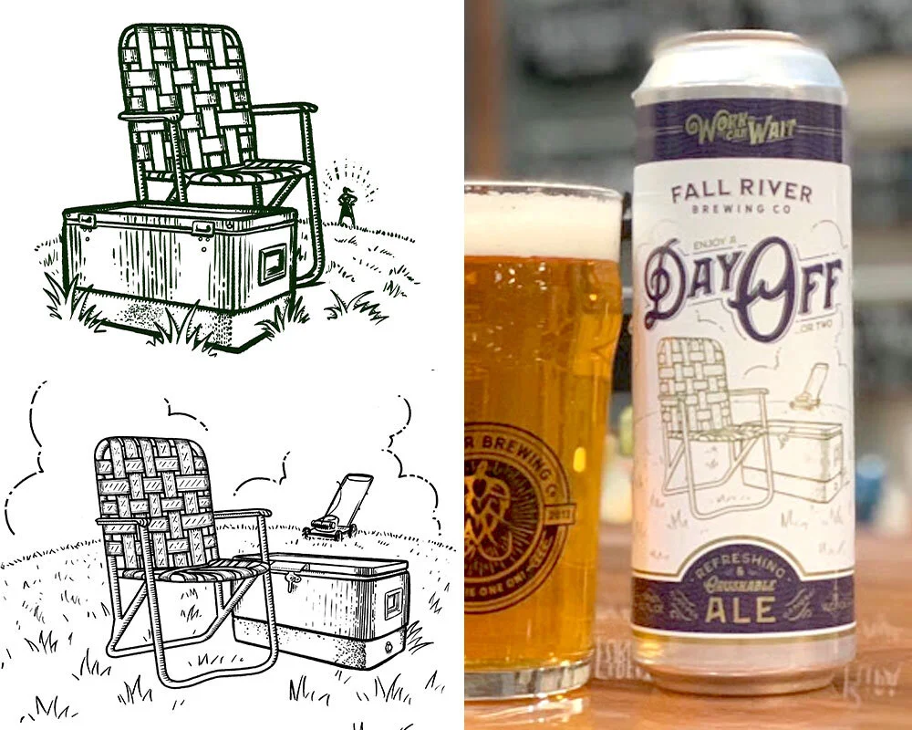
Another thing done in just a handful of hours. The designer knew he wanted a lawn chair and a cooler to represent a Day Off for Fall River Brewing. I threw some his way, he chose one, we refined it together (had to replace that angry lady in the background with an abandoned lawn mower), and a beautiful beer can was born! Go buy some!

Hey, look! More dog stuff! Same dog bar client, different thing. They wanted a new name and had a list of contenders but didn’t know how to proceed. Their budget didn’t allow for the process I apply to projects like this, so they bought a few hours to see what was possible. I sketched out a ton of possibilities that matched the nature of their business and offered some ideas they hadn’t thought of.
So what could you and I do in just one hour? Lots. Talk, for one. And by “talk” I mean YOU talk. I can listen to your hopes and dreams and recommend ways to get them into action. But I do more than listen well.
Strategy: Run your existing plan by me. Use me as a sounding board. Or tell me what your partners hate about your vision and I can advise you on a plan to compromise. Hire me to present your vision to the board. Or investors.
Design: Share challenges with product, packaging, sourcing, or sales materials. Hire me to design a poster or two for your event. Make your product instruction manual easier to follow. Clean up your brand identity a little. Make branded email signatures for everyone.
Advertising: I can do some creative writing for you. Maybe punch up some existing copy. Help you set a social media content schedule that makes sense for your brand and audience. I could lay out a template for your print or digital ads to occupy. Come up with a handful of taglines to consider.
Illustration: I could draw up some product ideas you’ve been kicking around. Or maybe do a few illustrative cartoons for a presentation you’re giving. I could create one-off illustrations for packaging, your blog or website, or even social media.
I’ll be honest here, most creatives with my experience don’t do hourly. But I love it because it’s the first step to great projects. Not for me, for you! Every hour we work together will get you closer to realizing the big goals you’re trying to achieve. And you don’t need Picasso for that.

DAVE SOPP – Creative
Yep, that’s me. I’ve got over 20 years of marketing strategy, graphic design, advertising art direction, and illustration experience. Want to use some of it? Email me at dave@davesopp.com