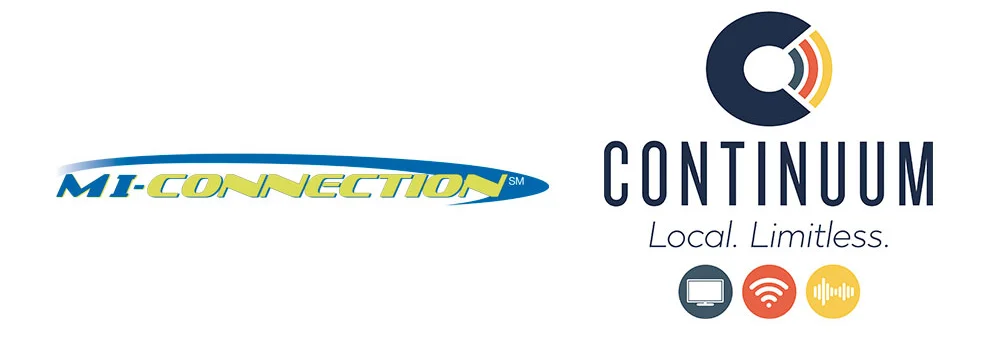
How to Make Cheap TV That’s Still Super Creative.

Advertising > Video

Commercials. Expensive to run, right? Not if you’re a cable company! It’s free! Run them across all channels whenever! Woo hoo! Oh, wait, but they’re expensive to make. Nope! Not if I’m making ‘em! Double Woo Hoo! Look, despite being able to run free media, Continuum was just a small communications company with a lot of expenses before paying for TV production. But doing TV was too good an opportunity for them to just dismiss it. Especially with all that free media at hand. So we set out to bring our brand to life through Adobe After Effects and and an first-time local voice talent.

A career preference for working for scrappy, low budget underdogs has taught me that you don’t need a lot of money to make a good tv spot (or video or whatever). You just need a good idea and a talent for using the resources at your disposal. The YouTube video work I’d done a year earlier for VersaMe racked up TREMENDOUS view through numbers, so why not double down on the formula for a cross-channel cable flight for our local communications company?

Remember, the Continuum name and logo was in charge of projecting “reliable” . Everything else was in charge of “local”. So we decided on this strategy: slick “animated” spots, with a folksy, homegrown VO, and a strong finish. Our voice talent was Tracy Bennett Smith, a charming banking professional with a distinctive accent and no VO experience whatsoever. How’d we find her? Soccer practice. Doesn’t get scrappier than that. For the After Effects work, we stuck with the talented Peter Baker, who’d done such amazing work on the VersaMe videos.

There was one more bit of creative strategy we applied. We decided to build the spots as bumpers. That means, as a viewer, you’d see a :15 Continuum spot at the start of the commercial break, then a bunch of national commercials before seeing another :15 second spot before your show started again. We used this format to make CLIFFHANGERS! OMG, it was so fun to write these. We’d set up a proposition at the beginning and pay it off at the end. It was fantastic. Nobody does that anymore, so it was great theater. They became sort of like little special station identification break-ins. Only fun.

We got to be our true southern selves and show off our local personality, all the while projecting a strong sense of reliability. More to the point, this showed people that we were a communications company you could actually, gulp, like?

DAVE SOPP – Creative

Yep, that’s me. I’ve got over 20 years of marketing strategy, graphic design, advertising art direction, and illustration experience. Want to use some of it? Email me at dave@davesopp.com
 

How to Look Socially Buttoned Up.

Advertising > Social Media

I don’t claim to be a social media expert. I get it, but I don’t love it. I just don’t have time for it with all the other stuff I do. Before we rebranded MI-Connection as Continuum, they didn’t have a social media presence. Heck, they could barely sustain a home page. So when Continuum sprang to life I added social media to our to-do list. Hey, I know enough to know it’s bad to not have a presence there at all. So I made it not a big deal. We set out a content agenda based on what subscribers would like to hear from their local video and Internet provider. 

d_blog_continuum_04_03_01.jpg
d_blog_continuum_04_03_02.jpg

Monday - Watch List: What’s new on cable this week?
Tuesday - Found Online: What’s cool on the Internet today?
Wednesday - In the Continuum: What’s going on behind the scenes at your friendly neighborhood communications provider (candid employee photos, news, etc.)
Thursday - Go Local: Guess which business (and Continuum customer) this is!
Friday - Continuous Choice: What’s playing On Demand this weekend?

It turned out to be really fun to build these, too. Because visually you can use all the TV and movie stuff you want. I developed (and personally maintain) a steady stream of helpful content in a tight, simple, sexy little template that looks great in our Instagram profile. I also get to be a little snarky and weird sometimes just to show that there’s a real person writing these, and not some service.

dave_bug.jpg

DAVE SOPP – Creative

Yep, that’s me. I’ve got over 20 years of marketing strategy, graphic design, advertising art direction, and illustration experience. Want to use some of it? Email me at dave@davesopp.com


How to Shoot Regular People.

Advertising > Photography

Regular people are hard to photograph. They’re nervous, self-conscious, and most have never been in a photographer’s studio before. Which is why we didn’t take Continuum’s employees to one. We made a pop-up studio in Continuum’s break room. The idea was to have everyone roll in one at a time, make them comfortable, take some shots and let them go before the next employee came in. It didn’t go like that. And thank goodness.

d_blog_continuum_04_02_02.jpg
d_blog_continuum_04_02_01.jpg
d_blog_continuum_04_02_03.jpg
d_blog_continuum_04_02_04.jpg

All these people actually LIKED each other, so in the end, it was like a party with folks hanging out for a bit after their turn to tease the next one up or try and make them laugh. It was a hoot. It also didn’t hurt to have local photographer, Jeremy Deal, behind the camera. I met Jeremy the way you meet most people in our small town. I needed a photographer for a Downtown Mooresville project and he was recommended by a frame shop owner on Main Street. I’ve shot with a lot of excellent photographers during my career in San Francisco, and I saw right away that Jeremy had chops I thought I’d never find here. Also he looks like Liev Schreiber, which is cool.

We shot everyone expressing a range of emotions, too. It was fun, and in the end we had a big bank of photos to use whether our communications were being sassy, competitive, mean to our competition, or friendly (of course). You’d think everyone would be super demanding about what photos we used, but surprisingly they trusted us to only use their best sides. Which we did. :-)

dave_bug.jpg

DAVE SOPP – Creative

Yep, that’s me. I’ve got over 20 years of marketing strategy, graphic design, advertising art direction, and illustration experience. Want to use some of it? Email me at dave@davesopp.com


How to Tell a Big Story in a Small Brochure.

Design > Brochures

Brochures are fun. I go on and on about how I like to solve multiple problems with one solution, and this kind of project really gives me the legroom to do that. We had just rebranded Continuum, and they wanted to go after more of their lucrative B2B business. So the first thing I did was get some one-on-one time with the sales team. Look, if you’re creating sales collateral, you have to get the reps involved no matter what. Number one, they’re the ones out there trying to make it work. And if they’re worth their salt, they’ll give you some great insights on how to help them. Number two, if you go off and make something in a vacuum, they’ll have no ownership of the final product and your beautiful work will never leave the box the printer shipped it in.

FINAL: The cover of Continuum’s business brochure. The purpose? Convince businesses that Continuum is a not just a local option, but an unexpectedly capable partner.

FINAL: The cover of Continuum’s business brochure. The purpose? Convince businesses that Continuum is a not just a local option, but an unexpectedly capable partner.

Robin and Tyler were great/super helpful. The net of the net was that none of the out-of-town competitors had to do anything to prove their worth. An endless churn of sales people dropped off rate cards and the business just made itself happen. Robin and Tyler had more work to do. A lot more. They had to tell them who Continuum was, and then convince them they were up to the task of handling their business critical services. They had to make a case that having a local provider was actually a really big advantage over going with any of those out-of-town providers. So this was the task. There were two tiers we had to communicate to – small businesses (nail salons, bars, restaurants), and big enterprise accounts (manufacturing, medical offices, business parks). We were budgeted for one collateral piece, for both.

FINAL: The first spread of Continuum’s business brochure introduces them (problem number 1 – who are you people?) as a local provider doing a lot to help local businesses. Lots of eye candy tell essentially this same story over and over (and over an…

FINAL: The first spread of Continuum’s business brochure introduces them (problem number 1 – who are you people?) as a local provider doing a lot to help local businesses. Lots of eye candy tell essentially this same story over and over (and over and over).

When I do a collateral project, every spread has to solve a problem. So, the number of problems determines the length of your brochure. Every brochure project is different but I tend to tackle each one in the same way – knowing nobody wants to read your brochure. So why do ‘em? Because it’s an excellent, super versatile tool. I’ll get to that in a minute. But really, no one wants to read these things. That’s why in each spread I try to focus on the main problem briefly, then pepper each spread with lots of pullouts, tidbits, graphics, photos and captions. Sometimes all these bits are unabashedly saying the same thing – the point I want you to take away from this spread. In other words, even if you just skim this thing you’ll pick up what I’m putting down. And all of it combines to reinforce the brand as reliable and strong, local and friendly, and more than capable of handling any size job.

FINAL: Second spread, second problem – Continuum may be local, but we’ve got incredibly talented, experienced people running this place. Remember, the logo assignment for this rebrand had to shout RELIABILITY. This spread had to back it up.

FINAL: Second spread, second problem – Continuum may be local, but we’ve got incredibly talented, experienced people running this place. Remember, the logo assignment for this rebrand had to shout RELIABILITY. This spread had to back it up.

FINAL: Ah, this spread is for the big boys. The enterprise business that’s going to have a LOT on the line with any provider. We had to prove we could speak their language. You want to talk about Dark Fiber, Colocation, and Ethernet Transport? Broth…

FINAL: Ah, this spread is for the big boys. The enterprise business that’s going to have a LOT on the line with any provider. We had to prove we could speak their language. You want to talk about Dark Fiber, Colocation, and Ethernet Transport? Brother, we can talk about that and more all day long.

FINAL: This spread is about not just supporting all kinds of business, but also being involved in the community. Because we’re real, local people.

FINAL: This spread is about not just supporting all kinds of business, but also being involved in the community. Because we’re real, local people.

The fun thing about this too is that when you give it to a small business owner, they see what you’re saying to way bigger customers. It’s sort of comforting to know that, 1) this company can more than handle my business, and 2) should I realize my dreams and expand, this is a provider worth sticking with.

So back to why, if no one’s going to read this, it’s still worth doing. Well, this one piece can be used in a LOT of different ways. The printed version of this piece became a great little book on what and who this rebranded company was. For example:

  • The CEO, Board of Directors, commissioners, mayors, town managers and PR folks who had to promote and defend this business could now be on the same page and speak the party line for everyone in the company and all the interested stakeholders

  • The sales team could use it as a walk-through of their pitch (which it really was, thanks to their involvement)

  • It’s a great quality leave behind, and as a mailing, it’s harder to throw away than, say, a giant rate card postcard. The piece says, “this is a quality piece and you’re worth having it.”

As a PDF it could be used as:

  • a sales email attachment

  • a free download on our website. Give us your email and we’ll tell you why your local choice is your best choice.

  • a free download in a social media campaign

  • a free download in a B2B html email campaign

Also, you could enlarge and print each spread to decorate the customer care office. Or hang ‘em up in the conference room. In the end, Continuum didn’t get the brochure they thought they needed. They got a lot more.

dave_bug.jpg

DAVE SOPP – Creative

Yep, that’s me. I’ve got over 20 years of marketing strategy, graphic design, advertising art direction, and illustration experience. Want to use some of it? Email me at dave@davesopp.com


How to Plan for Every Little Thing.

Design > Identity

Here’s how long I’ve been in the business: rebranding projects would start with the logo and follow with the stationery. Hahahahaha! Remember stationery? No? Ahem. Well, it’s still useful. It is! Ok, what’s most useful now is your email signature, and the way your company’s bill looks, and the envelope that carries it. That’s right, the junk drawer of identity. But it’s super important! Because any of those things can be the loose thread in the sweater. Someone in billing gets the idea to pull on a thread and everything unravels. I’m not being dramatic. I’ve seen it happen. Lots.

FINAL: Yep! Paper stationery! Business cards! Envelopes! They won’t die and they aren’t going away! What was once the most important piece of communication for a company has become the graphic designers junk drawer of to-do’s. But you gotta do it be…
FINAL: This whole project had to be done as economically as possible for a lot of reasons. So a clean look worked well in more ways than I thought then we got to the fleet graphics. I worked with the wrap company to design these things for maximum g…

FINAL: This whole project had to be done as economically as possible for a lot of reasons. So a clean look worked well in more ways than I thought then we got to the fleet graphics. I worked with the wrap company to design these things for maximum gangability in printing.

That’s why we were sure to have plans for the junk drawer stuff when we rebranded Continuum. We wrapped all our rules up in a detailed book of design guidelines so that any other vendor or employee could refer to it if they got the hankering (and preferably, permission) to make some Continuum materials on their own.

Fleet and building signage are far from junk drawer material because they’re so visible, but it’s a specialized use of the new identity. Do you know what it costs to wrap a van? It’s crazy expensive! And Continuum had 60+ various vehicles that needed to be rebranded. So I teamed with the signage company they picked so I could design graphics in a way that would let the printer gang up the job, maximizing the wrap material to its fullest. It helped a LOT to have a clean, white identity, letmetellyou . It was a bear to figure out, but fun at the same time. And guess what? The less wrap material you have on a vehicle, the longer it’ll last. The vans were all stripped and detailed (to get rid of ghosting from the old brand), and redressed in their fancy new graphics. Two years on they still look as good as new.

FINAL: While the building now looks WAY better than it did, I wish the graphic service bands weren’t so boring and straight on the building. I had comps of the bands organically swirling and looping their way across the building, but everyone wanted…

FINAL: While the building now looks WAY better than it did, I wish the graphic service bands weren’t so boring and straight on the building. I had comps of the bands organically swirling and looping their way across the building, but everyone wanted to play it safe. It also made it cheaper to have it painted. Those blue marks on my mock-up up top are to show stupid town planning that we were complying with a signage code that said we could only use 20% of the buildings surface.

Continuum’s HQ (formerly MI-Connection) was always kind of a dump. Situated in a virtual hole next to a tall railroad berm, you couldn’t really see it from the main road. They’d had a tall pole with a tiny lit rectangular sign atop.  We had to ask Mooresville’s planning department to replace it with something a little taller. They said no. So we tore the sign pole down completely and turned the whole building into a sign. Fuck you, planning! We painted the whole building a bright, clean white which made it WAY more visible to traffic. And the existing architectural lighting made the thing glow like a shiny new Apple store at night. 

dave_bug.jpg

DAVE SOPP – Creative

Yep, that’s me. I’ve got over 20 years of marketing strategy, graphic design, advertising art direction, and illustration experience. Want to use some of it? Email me at dave@davesopp.com


How and Why You Should Avoid Cliches.

Advertising > Print

So the new logo we made for Continuum projected communication company reliability, know-how and strength. But everything else had to communicate We’re your local choice.” Early on we thought about having the advertising feature well known locales around each town with our Continuum service bands flowing through and around them. I still think that would have been kinda cool, but in the end it was really problematic for one hilarious reason. Continuum’s footprint covered three towns that don’t necessarily like each other! Davidson thinks Mooresville is full of low-class hicks and Mooresville thinks Davidson is full of snooty buttholes. Nobody thinks about Cornelius. Crying laughing emoji.

FINAL: Folks, meed Amber, Steven, and Jorge. All real people making Continuum great on a daily basis. It was so fun to draw out everyone’s personalities you can see more from the shoot here.

FINAL: Folks, meed Amber, Steven, and Jorge. All real people making Continuum great on a daily basis. It was so fun to draw out everyone’s personalities you can see more from the shoot here.

HOW SHITTY IS THIS? Right? Yet communications companies persist in feeding us this crap. Oh, and yes, I stole this image so I could purposefully leave all the Shutterstock watermarks all over it. This is Continuum’s competition so the bar was set pr…

HOW SHITTY IS THIS? Right? Yet communications companies persist in feeding us this crap. Oh, and yes, I stole this image so I could purposefully leave all the Shutterstock watermarks all over it. This is Continuum’s competition so the bar was set pretty low to beat it. Trick is, how? What do you replace it with? Well, if you have a good story to tell, use that.

It all ended up working out for the best. We got to focus on what being local really meant, which was more than location. It was about familiarity. It was about being a company staffed with your neighbors. It was about proximity. If you had a problem, just call Amber. She’ll tell Jorge, and your problem will get fixed that day by someone who’s glad for your business. Heck, Leslie will even follow-up later with a phone call just to make sure you’re good.

And in the end that’s one of the reasons why we featured Continuum’s employees so prominently. But it wasn’t the only reason (and this is my favorite part about doing what I do). I don’t like solving one problem – I like solving all the problems with one solution. These employees were (and still are) lovely people. They’d been through a LOT of public scorn since the company was purchased and they deserved to be heroes for a change. Also, how do you differentiate yourself from the big, faceless, out-of-town providers? Put a face to your business. I love, love, love hearing stories about how Continuum’s employees get recognized in at the grocery store, or that someone’s girlfriend doesn’t want him in so many ads because all her friends’ hearts get sent aflutter. That tells me the ads are working AND that these folks are being rewarded for being awesome at work in a way they never were before. Win, win, win, win.

FINAL: Here are some print examples of how we used our fun employee photos. We also bought pre-movie slide show space at the local indie theater in Davidson. So imagine sitting there in your comfy chair and seeing your neighbor larger than life on t…

FINAL: Here are some print examples of how we used our fun employee photos. We also bought pre-movie slide show space at the local indie theater in Davidson. So imagine sitting there in your comfy chair and seeing your neighbor larger than life on the big screen? We made these folks celebrities and that turned them into brand ambassadors. I love how this one solution solved so many problems, including ones we hadn’t even thought of it solving.

And this brings me to measuring the success of a campaign. Go to any agency website and tell me if their ads did anything more that bring down CPCs or increase CTR. Good advertising should do more than you can ever measure.

dave_bug.jpg

DAVE SOPP – Creative

Yep, that’s me. I’ve got over 20 years of marketing strategy, graphic design, advertising art direction, and illustration experience. Want to use some of it? Email me at dave@davesopp.com


How to Rebrand a Company and Make Your Trademark Lawyer Happy.

Design > Logos

MI-Connection, our small, local cable, Internet, and voice client, needed to rebrand with a new name and logo that projected authority and reliability. Our competition were all well-known, out-of-town players: Time Warner, Dish, and Windstream – big and personality-less, it was still a no-brainer they could handle your personal and/or professional digital life. Plus, everyone already knew them.

Discovering a name that is appropriate for a business AND sounds super cool is, well, hard. What’s harder is clearing your super-cool-sounding, appropriate name with legal. Obviously, you can’t start with legal, so you have to have fun thinking of a lot of names, knowing that most of them will go straight into your trademark lawyer’s trash can. To help us spread our thinking out, I made a little graph to work to. 

FINAL: Here’s where we finally ended up! I love the branding process because when the thinking is right, and the work is both responsible and good, you can’t lose no matter what logo the client chooses in the end. I had no idea we’d end up here unti…

FINAL: Here’s where we finally ended up! I love the branding process because when the thinking is right, and the work is both responsible and good, you can’t lose no matter what logo the client chooses in the end. I had no idea we’d end up here until we suddenly did. Everyone’s input really put a lot of confidence behind the final final because everyone had ownership.

IMPORTANT GRAPH: So simple, yet pretty useful! On the far left you’ll find names like COMNET or TELEWEB. Stuff that you’ll never get legal clearance for. On the far right you’ll have names like NIMBL or ZING. Crazy names that no one would pick for a…

IMPORTANT GRAPH: So simple, yet pretty useful! On the far left you’ll find names like COMNET or TELEWEB. Stuff that you’ll never get legal clearance for. On the far right you’ll have names like NIMBL or ZING. Crazy names that no one would pick for a communications company. What we wanted (and where we’d end up) is to be just to the left of the “Legal Gold” line in the middle.

On the far left are names you’d expect a cable company to be called. On the far right are crazy ass names that don’t mean anything. Now, the further you get to the left, the more legal trouble you’re going to get into. Same as trying to buy a domain nowadays, it’s next to impossible because all the cool stuff is already taken by similar businesses. The more you go to the right, the more you’re clear with legal because at the far end, these words are silly or completely made-up. Tech-startups thrive in this area with all their misspellings and chicanery. We needed to be in the middle-left. We weren’t a crazy little startup. We needed weight, authority, and familiarity. We started with 300 contenders and it was (painfully) narrowed to 10 before we flung them to our amazing attorney. Three survived and after a few rounds of visual concept boards, we had a winner we felt did the job – Continuum. As we saw it, that’s where your digital life thrived – in the Continuum. We were invisibly working to keep you connected to all the extremes in your life – Work and Play, Family and Friends, Sports and News...and everything in between. The only question was, and this is terrible but true, would people be able to read it and say it? It has two “U”’s after all. So we went out and filmed local folks from the three towns reading the word off a card. They did great, the board was convinced, off we went.

COMP: Once a winning name popped out of legal (Continuum), I could get to work designing marks for it. These are from the first round of black and white ideas. Early on we thought we’d need the name to be Continuum Network, so that’s why you see the…

COMP: Once a winning name popped out of legal (Continuum), I could get to work designing marks for it. These are from the first round of black and white ideas. Early on we thought we’d need the name to be Continuum Network, so that’s why you see the “N” in some of these. In the end we decided against it. I still like all of these except the pixelated C on the bottom row. The head of tech at Continuum said it looked like bad reception and we said, “Damn. Good point!”

COMPS: A look at some of the logotype ideas we presented. In the end we nixed this direction altogether because I was nervous about ending up with a problem we had with the old MI-Connection logo – it was so long and skinny that it needed to be real…

COMPS: A look at some of the logotype ideas we presented. In the end we nixed this direction altogether because I was nervous about ending up with a problem we had with the old MI-Connection logo – it was so long and skinny that it needed to be really big all the time to be legible. Even thought the one on the bottom right is not as long as the rest, it’s complicated with the dots, so same problem.

Continuum’s logo had to do the same thing the name did: project strength and more than a little corporate backbone. It had to look reliable like it’s got big money behind it, but somehow a be a little, I don’t know...quirky? We presented a LOT of logo / logotype options. All in black and white at first so we could concentrate on how their form alone made us feel. Narrow it down to three and add some color for each.Then the favorite color pallet on all three logos. The three go off to legal, and one came out a winner. The C with the radiating, Wi-Fi-like bands wasn’t the most out-of-the-box idea, but man, it worked so hard doing what we needed done. Especially the familiarity part. It doesn’t take a genius to see that phone service isn’t very important to folks, cable is tanking fast, and Internet is still the future. So if you take away anything from this logo, it should be that we supply Internet. But the bands are different colors, and each color represents a service we provide. And those service icons are locked up with our logo. And eventually, after enough exposure, we’d be able to use just the C at times to communicate our brand, which will be kind of cool. 

COMP: Once we decided on a short list of logos, in come the colors, along with some idea of how it would all live in the wild. A word about color – it had a job to do as well. Because the name and logo was corporate and reliable.and the messaging wo…

COMP: Once we decided on a short list of logos, in come the colors, along with some idea of how it would all live in the wild. A word about color – it had a job to do as well. Because the name and logo was corporate and reliable.and the messaging would push “we’re local”, we needed our color palette to be the bridge between those two things. The colors had to say, we’re respectable, but uniquely different.

BEFORE AND AFTER: On the left is the old logo and to the right is the new brand we created, name and all. I’d had to work with the old logo for years and it was such a pain. There were no variations of it. Not even an all-white knocked out version! …

BEFORE AND AFTER: On the left is the old logo and to the right is the new brand we created, name and all. I’d had to work with the old logo for years and it was such a pain. There were no variations of it. Not even an all-white knocked out version! So everywhere we used it had to be on a super light color and it had to have LOTS of horizontal room if it was going to be big enough to be read. I was sure to design some flexibility in the new brand I created.

COMP: This is how what we now call the “service bands” could work in the future – playfully weaving in out of our ordinary lives. Quietly busy in the background keeping us connected to the things that are important to us.

COMP: This is how what we now call the “service bands” could work in the future – playfully weaving in out of our ordinary lives. Quietly busy in the background keeping us connected to the things that are important to us.

I mentioned above that in the Continuum was where our digital lives flow. Through this, and the color-coded services, we got a fun little bonus idea: Why not illustrate the services we provide as bands flowing through the air around us? We explored all kinds of fun ways to use this graphic in the ads (you can see those here) and it gave us an extra bit of brand imagery that we could either pull forward or drop back in the future.

dave_bug.jpg

DAVE SOPP – Creative

Yep, that’s me. I’ve got over 20 years of marketing strategy, graphic design, advertising art direction, and illustration experience. Want to use some of it? Email me at dave@davesopp.com


How to Turn Good Work Into Great Work.

Strategy > Branding

Stop right here. If you haven’t read about all the MI-Connection drama leading up to the complete rebranding of this company, you really need to catch up. Seriously, otherwise it’s like starting House of Cards from the middle.

FINAL: We had two objectives – look reliable and be local. The name, logo, and color palette were in charge of reliability. We even got a bonus graphic from the very definition of Continuum. The three color-coded services we offered are always seen …

FINAL: We had two objectives – look reliable and be local. The name, logo, and color palette were in charge of reliability. We even got a bonus graphic from the very definition of Continuum. The three color-coded services we offered are always seen looping effortlessly behind everything we do.

Caught up? Good. The tri-town-owned cable, Internet, and phone company, MI-Connection, was now doing great. The new advertising was doing well, subscribership was up, negative public opinion had all but subsided (except the die-hard trolls. Haters gonna hate), customer service had reached an all-time quality high and really, the only thing holding the company back was its old identity and all the baggage that came with it (see here). 

BEFORE: Look, I can’t knock this too much because I was the one responsible for cleaning this act up. Take a look at what it was before, for God’s sake. I got this brand cohesive visually, then spent years driving home the super tough messaging that…

BEFORE: Look, I can’t knock this too much because I was the one responsible for cleaning this act up. Take a look at what it was before, for God’s sake. I got this brand cohesive visually, then spent years driving home the super tough messaging that this company was NOT public enemy #1. This hard work worked hard to give us the opportunity to take this company to the next level.

There was a different vibe afoot at MI-Connection and it needed to be defined. Kelly and I worked up some market research with the CMO to find out what the townsfolk REALLY thought about their community-owned communications company. I’ve never been a big fan of focus groups. I’ve been in plenty. It’s expensive and they’re so easily manipulated by whoever is running them (the company who wants positive feedback, the agency who wants the opposite or whatever, etc.). So we launched a sincere, straightforward email questionnaire campaign (nothing fancy, just a Typeform thingy) across MI-Connection’s service footprint, steeling ourselves for the prospect of most everyone either not participating or just trolling us. We were surprised (in a good way). We had an 15% response rate and while a few were ALL CAPS TYPING CRAZY PEOPLE, we got a wealth of feedback from our survey. 

RESEARCH: Welcome to the world of shitty communication company logos. On the left, our regional competition of mostly giant out-of-town providers. And us at the bottom left there. The longest logo and therefore the smallest logo in the bunch. Does i…

RESEARCH: Welcome to the world of shitty communication company logos. On the left, our regional competition of mostly giant out-of-town providers. And us at the bottom left there. The longest logo and therefore the smallest logo in the bunch. Does it inspire faith in MI-Connection’s abilities? Nope. To the right I give you a smattering of what indie communications companies were up to across the US. Mostly a total shit storm except, in my opinion, ting and fibrant. And maybe Qnet. Clean and simple, sure, but seemingly reliable on logo design alone? Are they able to stand up against our list on the left? Dunno.

Ready for this? People didn’t care that MI-Connection was community owned. Despite the real promise that all eventual profits would be dedicated to buying more emergency services, playgrounds, etc., what people liked most was that MI-Connection was locally owned. Sure, the difference between the two is super microscopic, but it’s real. Because MI-Connection was owned by three towns, this made citizens share holders thus putting them in charge of how the company benefitted their communities. But they didn’t care about that (even though we were always super clear about it). Instead, they responded more positively to having a local alternative to the big providers, which MI-Connection was designed to be from the beginning. The other big takeaway from the survey? People also wanted to believe that their provider was capable and reliable (aka. Duh). We did extensive research into what other indies we’re doing to stand up to the big telecom companies. Turned out, not a lot.
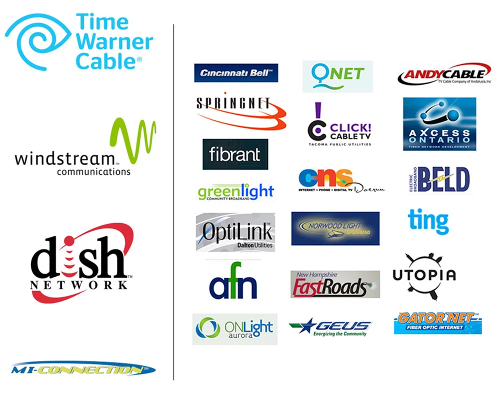
FINAL: Is it just me, or does Continuum look more professional and reliable than Dish and Windstream? Not to be OFD (Own Favorite Designer), but doesn’t Continuum look at least competent in comparison to the other logos?

FINAL: Is it just me, or does Continuum look more professional and reliable than Dish and Windstream? Not to be OFD (Own Favorite Designer), but doesn’t Continuum look at least competent in comparison to the other logos?

Next we interviewed employees – with no management present, just Kelly and I, and them. What were they up against? What were they frustrated with? What were their ideas for big and small change? This was super valuable because when all the research was said and done, we presented more than a mere identity to the CEO. We presented a whole new company that would solve the problems we’d discovered. The CEO was on board, and as we explained to the Board of Directors, you can’t just put a new name on this thing and hope people forget what it was. To change perception, you have to change reality. They agreed, but I’ll always remember the words of encouragement the Chairman of MI-Connection’s Board gave me after that presentation. After everyone filed out of the room, he shook my hand, and smiling, said, “Don’t fuck it up”.

PROGRESS CHART: Rebranding a communications company from it’s name to an intern’s email signature can be, um, intimidating. I made this simple chart so the CEO and the board could clearly see the path from start to finish. In every one of the thousa…

PROGRESS CHART: Rebranding a communications company from it’s name to an intern’s email signature can be, um, intimidating. I made this simple chart so the CEO and the board could clearly see the path from start to finish. In every one of the thousands of presentations for each step, I’d use a marker to show where we were in the process. The far left is represents the 300+ names we’d whittle down to favorites, then to a few, then a winner. Then a ton of black and white logo ideas, color exploration, favorites, then final colors., Then we concept the materials with long lead times, while we explored fonts and taglines and stuff, and then on to advertising concepts and a final launch campaign. Everyone found this chart oddly comforting. Even me!

I built out a detailed plan of work and a timeline including the MANY presentations we’d have to make. We needed every commissioner, Mayor, Town Manager, PR folks, etc. to understand exactly why we were doing what we were doing (seriously, in the end we must have made somewhere around 35 presentations). We kicked things off with a broad naming exercise (about 300 name options), then narrowed that down to 10 to run by legal. That narrowed it down to 3 viable names that we presented on visual concept boards of how each name might be treated. Once we had a name approved, it was time to make it a logo. Remember, people want to believe their Internet provider is strong and reliable. That’s the job the name and logo had to do. A ton of more options, a dive into color palettes, and it’s all whittled down to one winner – Continuum.

BEFORE AND AFTER: Amazing how much a nice clean rebrand can improve a look, right? And it didn’t just make the fleet and the building look better. It made the people who work there feel better. Morale goes up, customer service goes up, business goes…

BEFORE AND AFTER: Amazing how much a nice clean rebrand can improve a look, right? And it didn’t just make the fleet and the building look better. It made the people who work there feel better. Morale goes up, customer service goes up, business goes up. What’s that old saying about raising all ships? That.

There was still one big job left, and that was to make our strong, reliable name look local and friendly. For that we drew inspiration from a different company altogether – Jet Blue. Yeah, the airline. Same kind of problem, really, if you think about it. Reliable, trustworthy name. Fun, un-corporate language, clever amenities and friendly customer service. Lot’s of cool, branded little programs and lots of fun, light icons. And instead of using the same old stock photos of families laughing on a couch in front of giant TV’s, we’d reflect the real, local people who are answering the phones and installing your routers. Honestly, you couldn’t do this if your employees didn’t care, and these people did. It IS the south, after all.

FINAL: We launched featuring employees in all our communications along with influential citizens from all three towns. I like to call this Guilty by Association: “If very outgoing, visible, respected people from my town are not only backing this com…

FINAL: We launched featuring employees in all our communications along with influential citizens from all three towns. I like to call this Guilty by Association: “If very outgoing, visible, respected people from my town are not only backing this company, but also publicly endorsing this company, well, it can’t be all THAT bad.” It worked. Eventually we were able to just stick to the heroes of local customer service and let them shine.

FINAL: Some of the advertising featuring the folks who made the Continuum’s promise of excellent, local customer service a reality.

FINAL: Some of the advertising featuring the folks who made the Continuum’s promise of excellent, local customer service a reality.

Finally, a tag line to wrap it all up with a bow. Kelly nailed it and I especially love hearing it at the end of every cross-channel TV spot we did, “We’re Local. We’re Limitless. We’re Continuum.” We set off a tease campaign a week early that made it look like a new provider was coming to town (more on that here), and on the big day we let the hounds loose with an education campaign for existing customers (we’re a new company now), and a proper launch to potential customers.

How did it end? Continuum ran this campaign for two years (at this writing it’s still going). In the first year they hired 6 more local customer care specialists and built out a bigger call center. In fact, it worked so well that the debt was starting to be paid down faster than anyone thought it would. Which is when they decided to sell it. Yep, they paid $80M for it and estimated they’d get $56M for it. They ended up getting $80M for it. I’d say it worked pretty well.

dave_bug.jpg

DAVE SOPP – Creative

Yep, that’s me. I’ve got over 20 years of marketing strategy, graphic design, advertising art direction, and illustration experience. Want to use some of it? Email me at dave@davesopp.com