Design > Packaging
If you’re an entrepreneur reading this, let me tell you – packaging is as much the product as the product is the product. VersaMe’s founders had the Starling itself designed to perfection. A powerful wearable in a sleek, cute little device. Even the Starling’s dock was extra-credit handsome. But the product packaging was made before any of the messaging was solidified. So it went the Apple route – sparse and simple. Thing is, the Starling’s tech wasn’t as simple as printing “iPhone” on the lid. It was actually really hard to even explain what the Starling was. In fact, we’d struggle for two years with what to even call it. After all, VersaMe didn’t have the luxury of making their product and being able to say it was finished. Far from it. There were still bugs being fixed like crazy, software updates being slammed through, overseas suppliers to keep on top of, investors to update, and all kinds of other important things going on. I noted this issue with the packaging when I started working on the Starling’s Kickstarter launch, but it wasn’t high on my priorities for practical reasons (it was only sold online initially). Remaking the packaging is expensive and time-consuming and really wasn’t what anyone wanted to hear just weeks before the big launch.

FINAL: Packed full of useful info about both the product and the problem it’s meant to solve for you’re little one. Oh, and the asterisk in the headline? We were always extremely careful to not overpromise the product benefit and instead of walking back such a statement (which was scientifically true and proven anyway), we turned it to our advantage by referencing the study and pointing people to learn more at the VersaMe online research center I had built.
Eventually we’d get feedback on the current packaging that would push it up to the top of my list. The buyer at Barnes and Noble looked at the box and said flatly, “It’s not ready yet.” And she wasn’t all wrong. The product was good to go but the packaging would never sell it without someone standing there explaining it to you. I went to our local B&N and took a ton of photos of where the box would live. I even even snapped a few existing Starling boxes which I placed on the shelves to show the gang back at VersaMe how they really got swallowed up. These are important steps that should A) be implemented before you even start sketching ideas for a package, and B) demonstrate to a client why their current packaging isn’t working. We all agreed it was missing a lot of curb appeal so how could we compete there?
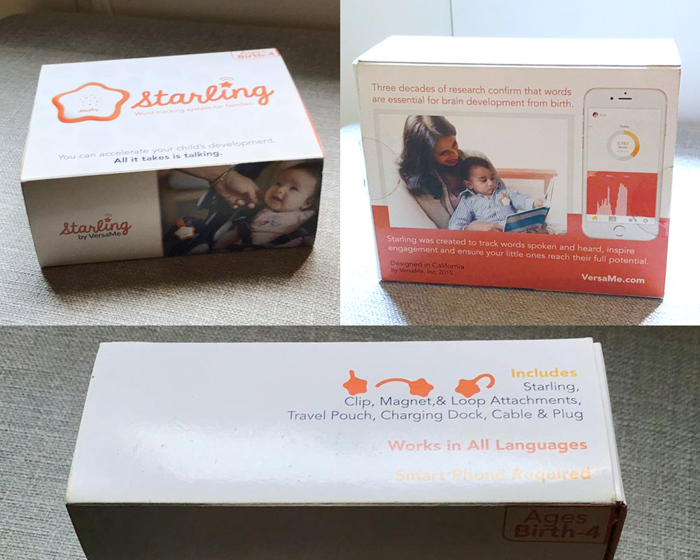
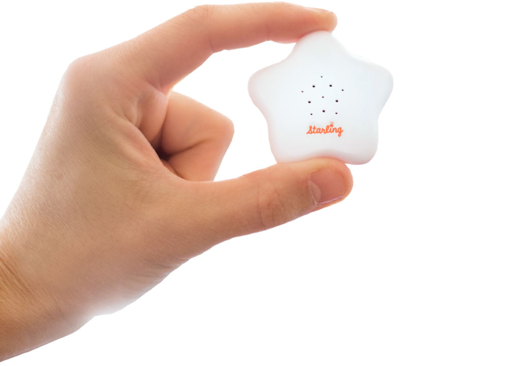
BEFORE: The Starling product was beautifully designed. But no matter how beautiful a product is, if it comes in a box, the box is also the product. And it needs to sell the product. The Starling box was simple and clean, but really didn’t communicate the importance and benefits of the product inside.

COMPS: Look, no one wants to redesign their packaging, no matter how much they know they have to. I started from the ascetic they wanted to achieve to begin with – clean and simple, only with a lot more info about what this special wearable is and can do. Even still, the best description we had for the thing that’s never existed was the confusing, “Wearable Word Counting System”. Because, still, what the Hell is that?

COMPS: The Starling’s value proposition was more compelling (at first glance) than “Wearable Word Counting System”. I added a lifestyle shot of an existing older-than-newborn baby to define the category and the big shocker of a proposition to attract any shelf-browser’s attention. Shown here are color and side panel variances.

COMPS: Yep, the back of the box. Everything had to work so hard and this was working the hardest. So many points of value for this product. Too much? Well, I don’t see how you could leave anything out with a product so full of important benefits.
It wasn’t just a matter of being louder or bigger, or more obnoxious and loud. The new package had to be true to our product, be informative, and be compelling to our audience. It also had to be inexpensive to produce and easy to switch out. Telling our story took a long time and was necessarily layered. So I went unconventional. I didn’t lead with an illustrative lifestyle photo of the Starling in action. If a picture says a thousand words, it still wasn’t enough to explain the Starling. Besides, they had already done that. I didn’t lead with a giant product shot (Pretty but what is it?), or our logo (no one knew who we were). Instead, I screamed our proposition – Loud and proud. If it took time to get people to understand the Starling, then I needed to get their attention first. Then I’d use bullet points, diagrams, eye candy, and short captions to educate them quickly.
In the end it worked. Kind of. For the Starling, typical rules of packaging just didn’t work, so I got to break them all – which was fun. Think of this the next time your project isn’t working the way it’s supposed to. Maybe you need to tackle it from a different angle.

DAVE SOPP – Creative
Yep, that’s me. I’ve got over 20 years of marketing strategy, graphic design, advertising art direction, and illustration experience. Want to use some of it? Email me at dave@davesopp.com