Design > Brochures
I was recently in a meeting with a CEO who was newly hired by a long time client (not VersaMe). He didn’t have the history on what lousy shape the marketing had been in before I started helping to pull it together. He mentioned his desire to increase B2B sales and I told him we’d recently finished a brochure for just that purpose. The CMO handed it over to him, and he leaned back and flipped through the brochure for nearly 2 seconds before he tossed it on his desk and said, “Well, this is table stakes.”

FINAL: The cover of the brochure that wasn’t really a brochure. Or was it? < Insert evil laugh here >

FINAL: Probably the most important spread in the brochook. Publishing information! So important-looking! :-)
I bring this up, not because it was kind of a shitty thing to do and say, but because it says a lot about what a brochure has to do. First, let me say that about a month before his arrival at the company, an old brochure (from before my time) existed. It was missing the logo on the cover. Actually it wasn’t missing, but the logo was the printed in the same color as its background color. So the tag line was visible in white and you could juuuussst barely see the logo if the light was shining on it just right. That CEO was actually lucky to even have table stakes to look at. Hahaha. But to my point – even though he didn’t look at the thing from the perspective of the reader it was designed for, which you should ALWAYS do no matter what C-level you are, he DID give just about the right amount of attention to it.
No one wants to read your brochure. Sorry, they don’t and they won’t. Not all of it, at least. That’s why you’d actually laugh out loud if you read all of a brochure I’ve designed and written. Look, every spread has got to solve one problem. Not page, SPREAD. But you can’t do it all at once, like in one big piece of copy. You’ve gotta boil down the point you want to make to its shortest, most effective form, and then repeat it on the same spread in different forms - pull quotes, diagrams, testimonials, icons, photos, captions. So that no matter what catches their eye as they flip through like that CEO did, something important will stick with them whether they like it or not (or even know it, or not).

FINAL: The first real spread is all about authority. This book is factual and the information comes from big places and important professionals.
All this being said, at VersaMe, we created a really quality piece as a leave-behind/mailer for our new Starling Partners Program. Our audience was libraries, pediatricians, speech language pathologists, pre-schools (public and private), teachers, and non-profit organizations. These people, who already knew the importance of early-education, were seeking out emerging technology that could: help their missions; keep them relevant; and in some cases, keep them well funded. This brochure assignment turned out to be my favorite ever because I decided I wasn’t going to make a brochure at all. Instead, I wrote a BOOK about the problems the reader faced. And midway (SPOILER ALERT), the Starling would appear as a fantastic example of what was available to solve those problems.
Because VersaMe were experts on early-education (true), and what we had to say in here was important (also true), we had to make this brochure (bookchure? brochook?) look important. That’s why I wrote it in a sort of third-persony way and even added publishing info to the title page (sometimes it’s the littlest things that do the most work for you).
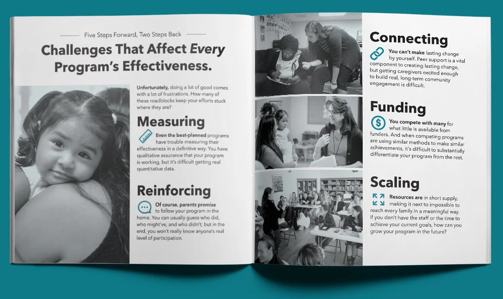
FINAL: Second spread is empathetic. We know your struggle is real.

FINAL: AH! Third spread and we final get to the Starling. But still talking about it as if we had nothing to do with it until the second sentence of the copy.
As a side-note, VersaMe had always wrestled with a minor identity crisis. They had only one SKU, the Starling, so did they really need the VersaMe name? Was it confusing? Should they just call the company Starling? It didn’t make since to have an umbrella company until you’ve got more kids to put under the umbrella. Still, always plan for success. Who knows when those new products would come (turns out not very long, after all). So in this case, using VersaMe as the author and publisher of this book, and Starling as the example solution late in the story, actually helped define the company/product name hierarchy for us. And it was just good theater.
Anyway, here’s how I broke down the spreads before designing it:
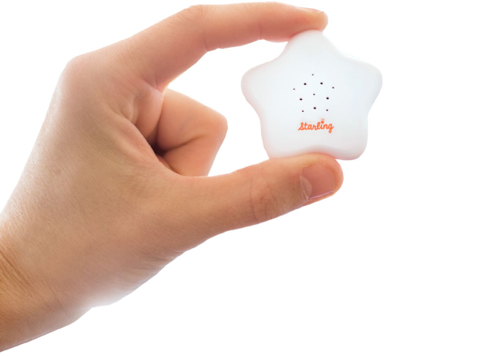
Cover: Looks like a book from a research company. I see someone who looks like me and what’s that cool star thing?
Spread 1: This information we’re giving you is as legit as these researchers, respected people, and institutions.
Spread 2: Your job is super hard, we get it.
Spread 3: There’s a thing called the Starling that will seem like a miracle to you.
Spread 4: The data you could get from something like the Starling could finally prove what you do is effective.
Spread 5: Organizations are already using this Starling thing.
Spread 6: Something as helpful as the Starling is easy to set up.
Spread 7: Look at these smart smarties who are helping your peers.
Spread 8: This is all it takes to solve your problem. Not scary or complicated at all.

FINAL: Reading left to right, spreads 4-8
And there you go. I mentioned above that no one wants to read a brochure. But people like reading books. Even thin-ish, square paperback books that give the right reader true, helpful information that they’re interested in, delivered in a way that welcomes them to learn about a very real solution to the problems they have while trying to help their communities to raise their children right.
Remember that dismissive CEO from before? It wasn’t two minutes after he tossed my brochure on the table before he snapped it back up and flipped straight to the spread touting friendly, knowledgeable professionals. Pointing to the feature photo of his IT Manager, he asked, “How’d you get him to smile? I’ve never seen a head of IT look that happy.”
Boom.

DAVE SOPP – Creative
Yep, that’s me. I’ve got over 20 years of marketing strategy, graphic design, advertising art direction, and illustration experience. Want to use some of it? Email me at dave@davesopp.com