Design > Brochures
Downtown had a brochure before I started working with them. In fact, they had too many brochures! Hahaha. There was one they had made, the Mooresville Historic Preservation Commission (HPC) made one also (without asking, even), and I think the local newspaper made their own for some reason. So when we finished all the strategy and identity stuff, I sat down to straighten all that out. Gotta say, it wasn’t like the HPC didn’t have any business in promoting Downtown. There was plenty of history to talk about Downtown. In fact, I even ended up using some of their stuff (I’d later become the Chairman of the HPC). It’s just that everyone (and everything) had to work together.

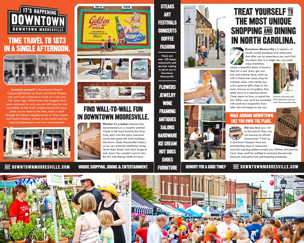
FINAL: The first brochure I did was so simple in the end. But it took a lot of work to define and visualize a Downtown Mooresville that didn’t quite exist in the way we were describing it.

BEFORE: A look at the existing situation before I got started on rebranding Downtown Mooresville. Clockwise from top left: 1. The many co-existing brochures of Downtown Mooresville. 2.-4. This is literally 90% of photography that existed of Downtown. People’s backs and empty streets. 5.-10. The real Downtown Mooresville. Lots of empty storefronts.
I mentioned before that “It’s Happening Downtown” was a big fat fib-a-roo. At least in the short term. Lots of events were planned for Downtown, but for the brochure, I couldn’t wait for them to roll into existence. I had to prove the lie immediately, while occupancy in Downtown Mooresville was at an major low. Also there were no photos in their photo bank to use. Just a few random shots of people’s backs. Man, thinking back on it, I was pretty screwed. Hahaha.
First I found myself a local photographer (the talented Jeremy Deal) via the frame shop owner on Main Street and off we went to try and hustle up some visual happenings. It was hilarious. Downtown was so D-E-A-D. And it’s not like we could go hire a bunch of models or crowds. The little girl on the cover is Jeremy’s daughter. The guy walking by the hardware store is my neighbor and eventual Mayor of Mooresville and his daughter. They happened to be passing by so we pressed them into service. The couple walking by the train depot? Friends of mine. In the end we did a pretty decent job of faking a lively (or at least sparsely populated Downtown). Take a look at that list of events. SO MANY! We really tried to segment the information as much as possible so at a skim, you got what we were gettin’ at.

FINAL: We pulled our new street banners through to the inside of the brochure, proving there were plenty of interesting businesses open for business in Downtown Mooresville. I was glad when we finally dropped the individual listings in favor of supporting Downtown as a richer, more engaging destination.
One cool thing we did was a simple map insert for the brochure. We’d heard this story from the old hardware store: when people were done shopping there, they’d ask, “Is there someplace I can grab a bite?”. They’d tell ‘em where to go, but who knows if they ever found the place. Turned out this was a common occurrence at most all the businesses. So we gave these maps to every shop Downtown and they’d circle where they were on the map, and the location of what the customer was looking for. Just like at a resort. And then those folks would leave with a helpful list of everything they could see and do and buy Downtown. Cool, right?
FINAL: We cobbled together enough for the first brochure, and eventually built our photobank up enough for a major revise. This time featuring way more images of what makes Downtown so amazing. Pictured above is the inside of the second brochure and below are some festival snaps we were able to get throughout the year.

FINAL: When I designed Downtown’s logo I designed it to live in a lot of different situations. But I hadn’t planned on it promoting weddings. I was happy that Downtown’s aggressive bold brand didn’t drown out the sweetness of this brochure’s messaging.
Eventually some of the merchants got together to form a sort of wedding conglomerate. It was such a neat idea. Each merchant had their own offerings for the newly betrothed (hair, makeup, fashion, tailoring, tuxedos, flowers, etc.) and they needed a brochure they could hand out at events they’d host. I mentioned this somewhere else, but getting merchants to work together is next to impossible, so I was super excited for them. I was also excited that they thought to even ask the Executive Director for help! Which was what anyone could do at any time (that’s why the Commission exists), but in the past everyone just went rouge and did whatever. So this was a sign they were not only listening, they were learning. Whew! It was interesting to try and soften our pretty hard-edged, railroad inspired brand to live in such a delicate wedding environment, but I think it turned out pretty well.

DAVE SOPP – Creative
Yep, that’s me. I’ve got over 20 years of marketing strategy, graphic design, advertising art direction, and illustration experience. Want to use some of it? Email me at dave@davesopp.com


