How to See If People Like What You Make, Then Be OK If They Don’t.

Design > Product

This is really weird. But it was supposed to be, so I achieved what I set out to do. I’d been working on a lot of really fun but intense projects that all sort of ended at the same time, so I felt I needed to stretch my legs a little and do something for me. So I decided that thing was to make some fun stickers. The thought was that I’d make sheets of bizarrely themed stickers and then turn the best ones into postcard sets, and then canvas bags, and then...you get the idea. I’d take everything I knew about what gift stores are buying today and illustrate my own odd little brand to offer folks.

FINAL: The idea behind Mr. Dave’s Best Stickers in three photos. A sheet of weirdly themed stickers. Which you could peel off and put to equally weird uses to delight your family, friends and co-workers. A genius product that was way before it’s tim…

FINAL: The idea behind Mr. Dave’s Best Stickers in three photos. A sheet of weirdly themed stickers. Which you could peel off and put to equally weird uses to delight your family, friends and co-workers. A genius product that was way before it’s time.

FINAL: I was especially pleased with how the back turned out. Yes. I wrote the copy all by myself.

FINAL: I was especially pleased with how the back turned out. Yes. I wrote the copy all by myself.

FINAL: Oh, there were all kinds of topics. I could go on forever. But fate had different plans!

FINAL: Oh, there were all kinds of topics. I could go on forever. But fate had different plans!

Kids! Hahaha...I love kids. My friends’ kids all call me Mr. Dave (I live in the South, you know) and I think it’s hilarious so that’s what I called my line. I went for a retro look to offset the not-retro-at-all themes. Sort of a brand subterfuge to make people think they’re about to see something really sweet and wholesome and then it turns out to be stickers of cats pooping.

I put a challenge to myself to do, like, 30 full sheets to prove that the idea had legs. I wanted to make sure that I didn’t get bored halfway or feel like I was running out of ideas. That ended up being over 150 individual drawings! So I took 5 sheets that best represented the line and them printed in China on the cheap. I thought I’d test out the concept on Etsy while running them past a bunch of gift boutiques. I quickly found that, um, people don’t come to Etsy to buy stickers, much less stickers of run-over animals (see Roadkill). Great for the unique, bad for strange. Gift stores didn’t know what to think. Hahaha. It was a mess. I don’t know what I was expecting, but no one wanted any part of that shit. They didn’t get the topics or anything. And these are people who’ve known my sense of humor for years. One store asked why it was so old fashioned. What? So I got my stickers into a big box store. Well, one big box store. Cost Plus World Market. The one closest to my house.

FINAL: Actually, there was a sort of categorical plan. Knowing what I know about the gift and greeting card industry, I was able to focus on weird themes in distinct categories: Animals, Fashion & Culture, Food & Drink, Home & Garden, an…

FINAL: Actually, there was a sort of categorical plan. Knowing what I know about the gift and greeting card industry, I was able to focus on weird themes in distinct categories: Animals, Fashion & Culture, Food & Drink, Home & Garden, and Health & Fitness.

FINAL: Oh, I also made postcards and posters. You can see more high-brow designs in the illustration category.

FINAL: Oh, I also made postcards and posters. You can see more high-brow designs in the illustration category.

Here’s what I did. I went in one day, found some items that were $6.95 (Mr. Dave’s MSRP) and took pictures of their price tags. I went home and printed out the tags and stuck them on the backs of 5 Unicorn Poop sticker sheets and 5 Dead and Dying Succulents sticker sheets. It was just days before Christmas, and World Market had a special little section for unicorn stuff (plush, notebooks, junk like that) and a special little collection nearby of potted succulents. Perfect places to surreptitiously drop my sticker packs and make a hasty retreat.

I returned the next day and found they were not only still hanging there, undiscovered by World Market Employees, but one of the Dead and Dying Succulent sticker sheets had sold! So I kept going back whenever I was in the neighborhood or needing more Hoi Son Sauce, and the selling proved to be slow going. After a few months they took down those special little displays. I thought that was the end of my experiment, but I found my stickers had simply been moved to another part of the store. I kept checking back periodically and was sorry to see that the savvy World Market shopper was really not interested in Unicorn Poop stickers. I hadn’t sold any. But there were only 2 left of the succulents. Yay? What’s weird is the stickers never made it to the Clearance shelves. I’d have been so sad if they had, but they just continued to be repositioned around the store. At month seven, I couldn’t find them anywhere and thought, “Oh, well, it was fun while it lasted.” But the next day my wife sent me a picture showing they’d been moved up to the checkout impulse racks – just three Unicorn Poop sheets hanging below the gluten-free gum and salted licorice from Norway.

FINAL: The great World Market experiment. On the left is where I left my Dead and Dying Succulents stickers and on the right the sad aftermath months and months later. Just a couple Unicorn Poop stickers left!

FINAL: The great World Market experiment. On the left is where I left my Dead and Dying Succulents stickers and on the right the sad aftermath months and months later. Just a couple Unicorn Poop stickers left!

I’m so sorry, I don’t think I have a point here. Hahaha. I guess it’s that when something doesn’t work, try and learn what you can from it and move on. Or make a quasi-illegal game out of it to keep yourself amused while you go on to the next adventure.

DAVE SOPP – Creative

Yep, that’s me. I’ve got over 20 years of marketing strategy, graphic design, advertising art direction, and illustration experience. Want to use some of it? Email me at dave@davesopp.com
 

How to Market a Product No One’s Seen Before That Solves a Problem No One Knows About.

Strategy > Branding

OMG the world needs this early-development technology. I’m dead serious. But even though this revolutionary wearable looks simple, how it works is actually pretty complicated. And did I mention the results aren’t immediate? (Just wait, I’ll get there). But one thing is absolutely clear – the result of using this technology means your child will get a substantial educational head-start over his or her peers. That head-start begins in infancy, and keeps distancing your child ahead of others for life.

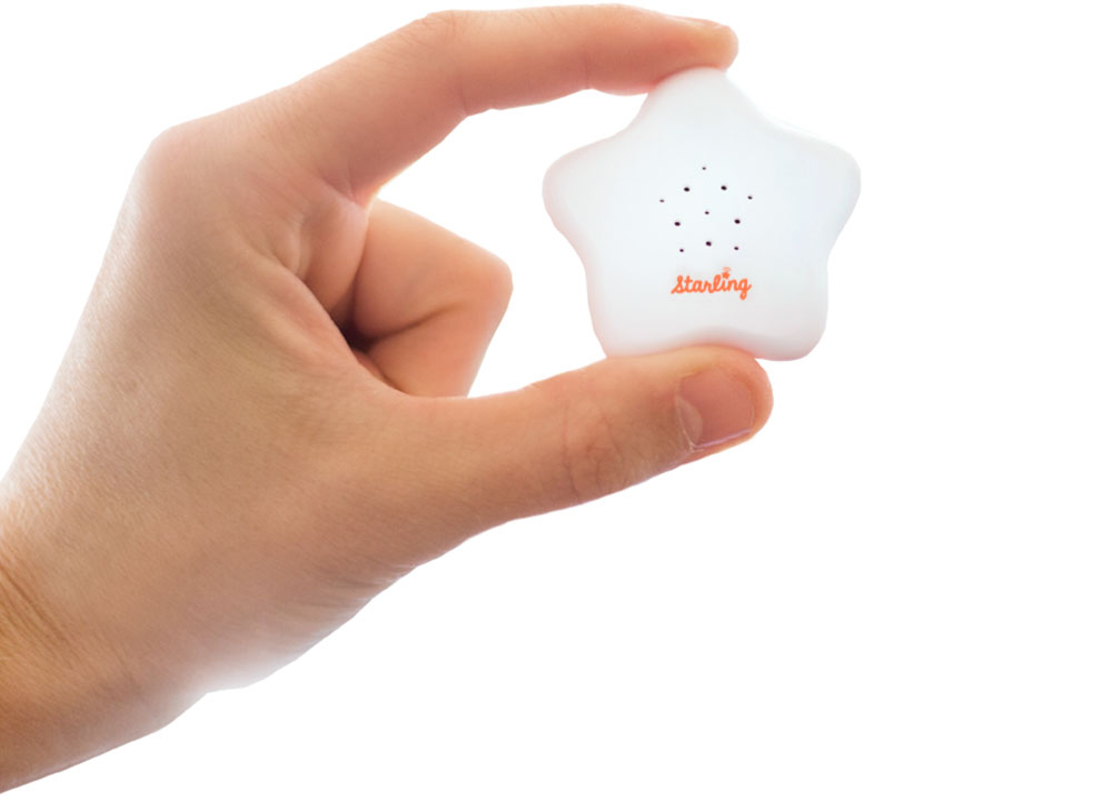
PRODUCT: This is the Starling. So tiny, so cute, so powerful.

PRODUCT: This is the Starling. So tiny, so cute, so powerful.

FINAL: One of the first things I made at Versame – a 6”x9” two-sided handout for parents touting the Starling’s benefits.

FINAL: One of the first things I made at Versame – a 6”x9” two-sided handout for parents touting the Starling’s benefits.

The great advantage of doing what I do at this point in my career is being able to choose the projects I work on, and the people I work with. I really liked the people at VersaMe before I even knew about the product. Chris and Jon, two of the company’s founders, contacted Kelly and I out of the blue. They had left Silicon Valley like we did, and now lived just a couple of towns down the I77, in Huntersville. They explained that they were fans of our parenting board book, Safe Baby Handling Tips. In fact, the bit about Playing with Baby was one of the early slides in their investor pitch for a startup they were launching with a third partner, Nicki “The Money” Boyd (the nickname I gave her). Nicki controlled the finances and managed the development team back in Redwood City, while the rest of the team worked out here in NC.

BEFORE AND AFTER: The original packaging on the left didn’t communicate the product or it’s value. My redesign on the right led with the value proposition and steadily unfolded the whole story in easy-to-digest snippets.

BEFORE AND AFTER: The original packaging on the left didn’t communicate the product or it’s value. My redesign on the right led with the value proposition and steadily unfolded the whole story in easy-to-digest snippets.

Kelly and I met Jon and Chris for coffee and they explained what they were making. They had a passion for early education and learning (it ran in their family). They knew that the education system was not only broken, but historically broken and getting worse. From studying years of scientific research they concluded the only way to nip the problem was, literally, in the bud. They sought to jump-start the learning process as early (and as correctly) as possible. This was the problem they worked on at Stanford and they already went through a successful round of funding. The hardware and development infrastructure was built, and they were about to launch on Kickstarter. The three had a lot of the planning done (and it was good) but they asked us on to help them out with tightening up the branding and early messaging. That’s when we learned all about the Starling.

The Starling was a beautifully designed, high-tech wearable for children 0-4 years old. When you clipped it to your child’s clothes, the Starling would count every word spoken to your baby throughout the day. It did this in virtual real-time, without recording, and sent the data to your phone with beautiful graphics telling you how many words your child heard that hour, that day, that month, that year. It let you set word count goals to challenge you every day. Anticipating how hard it can be to carry on a one-sided conversation (Chris and Jon were also parents), the app gave you fun daily prompts to help you keep talking to your baby at every occasion - in the car, during your afternoon run with the jog stroller, at bedtime, etc. Feeling competitive? There was even a leader board that you could use to see how much quality engagement you gave your child compared to other Starling parents. Amazing, right?

I bet I can guess what you’re thinking right now. “Why?”

Why all this technology to talk to a newborn? It’s not like I’m NOT going to say anything to my baby, so why all the extreme fuss? You’re not wrong to think that. But here’s a big fact – the more words you say to a child from 0-4 years old, the more likely they are to reach their full potential. And the “to” is super important. You can’t just talk “at” your child, like over your shoulder while you’re doing the dishes. No, doing that doesn’t work the same way. Think reading, with the child on your lap. Or telling a story while making lots of eye contact. There you go, that’s the right stuff. It’s about engagement. Feed a child’s brain enough words like this and soon you’ll find yourself with an early talker. Then while other babies are still learning to talk, yours is busy learning to read. Get it? And while other people’s kids are learning to read picture books, yours is reading chapter books. This goes on for their whole life!

FINAL: For professionals who already understood the importance of verbal communication, I created this “bookshure” to introduce them to a powerful new tool – the Starling.

FINAL: For professionals who already understood the importance of verbal communication, I created this “bookshure” to introduce them to a powerful new tool – the Starling.

But understand this – doing all this talking with engagement doesn’t mean every child can grow up to be Einstein. It’s all about maximizing your child’s genetic (not economic) potential. If it’s only within a child’s genetic capacity to be average smart, they’ll get there faster and stay there for life. This can make a huge difference to a child’s quality of life, considering where they could end up without the benefit of this help. And I can’t stress this enough – I’m talking about  ALL children. Not just poor children. Or special needs children. ALL CHILDREN. (If you’re a parent reading this, please note your feelings right now. I’ll get to them later). 

Finally, dear reader, here lies the rub. Look how long it took me to explain the Starling to you and the problem it solves. My expertise in working with clients in San Francisco was taking really complicated concepts and making them dead simple for a consumer (best example here). I worked on the Starling for two years and what you read above is the shortest I think I’ve ever gotten the complete pitch. So as a marketer, here are your options:

  1. Explain how The Starling works, and then explain why it solves an early-education problem you didn’t know existed

  2. Explain how you need to talk to your baby as much as possible from 0-4 years old, and then explain what the Starling is and how it could help you do that

You can’t do one (explain the Starling) without the other (how early development works). 

The three founders had become early-childhood experts, for real. And their research scientist, librarian, pediatrician, speech language pathologist, mentors and partners were all in touch on the regular, keeping tabs on the Starling’s progress and correcting messaging when necessary so that everything stayed absolutely factual. We needed to look like experts, but not scientists. The messaging had to be intriguing, inviting and fun – but not misleading or fantastical.

FINAL: A one-sheet for interested schools to get a little more detail on how the Starling can help their mission.

FINAL: A one-sheet for interested schools to get a little more detail on how the Starling can help their mission.

The Kickstarter launch was a success in that it did what we needed – raise as much awareness as cash. (As I said, VersaMe was already funded by an investment group). Our mailing list blossomed. Sales started coming in. But that’s when the real work began.

I’ve worked on big tech in San Francisco. A lot. Sun Microsystems, Borland, Sybase, Veritas, Dell, Adobe, blah blah blah. That’s not including all the dot coms. I was there for the first big boom, and the first big bust, working freelance for almost every agency in the City. Startups are different. It’s EXACTLY like in the show “Silicon Valley” (the first season, anyway). It’s crazy and confusing and exciting and hilarious and scary and frustrating and fun as hell. You’ll NEVER pack more work into a shorter span of time than when you work for a startup. Because even though we were focused on who we were, and which audience we were talking to, we were saying it all - in every conceivable way. And we had practically no budget to do it with. Even though there was $10M in seed money, you gotta watch like a hawk how you spend it (right, Nicki?). Because it’s only going to last so long. So we were begging, borrowing, and stealing while testing the messaging multiple time a day, every day, everywhere. And once we saw progress in any direction we’d run after it full speed.

There’s no way I can ever tell you everything we did. It was so much! But one of the first things  was to use everything that inspired the creation of the Starling to build a giant online resource center for new parents, filled with published studies that prove the benefits of direct, verbal communication. Then we published articles and how-to’s on our blog everyday giving tips on how (and why) to maximize your baby-talking skills. Our newsletters were going out weekly to new parents, filled with communication tips and info on developmental milestones. I found out that the founders had invested in a HUGE AdWords ad buy that included a lot of YouTube videos. I had two weeks to deliver finished product and there was nothing in the works. We set up tents in shopping malls and Nicki and I did the ABC show in Vegas (to have a meeting with Barnes & Noble, who said no, then inexplicably sent us a huge order two weeks later). We got into a hipster tech showroom in Silicon Valley. I totally redesigned the packaging. I made an online school for new parents. We developed a custom Reading App that you could use with the Starling. We hired influencers on social media. We created a mobile app game based on the Starling. We brought on a respected social media agency to give it a go. We. Tried. Everything.

WORK: And lots of it! This is probably about 2% of the things we did to position, explain, and sell the Starling. Clockwise from top left: Dumbing it down, we created multitudes of info-loaded landing online campaigns and landing pages, we created a…

WORK: And lots of it! This is probably about 2% of the things we did to position, explain, and sell the Starling. Clockwise from top left: Dumbing it down, we created multitudes of info-loaded landing online campaigns and landing pages, we created and ran an online school, we sent the founders to present at indie book stores, parenting groups, schools and libraries. I made a Starling Honors program for little students, we made an educational mobile game, we tried multitudes of simple online campaigns and landing pages, we gave away free information (so much free information), we changed the whole website, we started marketing the platform the Starling was built on, and we developed ridiculously complex email newsletters and campaigns.

Nothing worked. At least, not on the level we wanted it to. It was just too much for people to wrap their heads around. Most thought it was a great product...for terrible parents. And of course, THEY were all excellent parents. There’s actually a study that exists which found 90% of parents thought they were parenting in the 5th percentile of awesome parents. Which, of course, is mathematically impossible. So we pivoted to focus on Starling Partnersschools (public and private), libraries, speech pathologists, pediatrician clinics, non-profit organizations. Frankly, any group that already understood the importance of early learning. Most ended up being too outright dysfunctional, painfully slow to act, or too strapped for funds to make a difference to our bottom line. Our biggest success came from developing a program for libraries to loan Starlings out to patrons. We got ourselves into a lot of libraries but not enough, and not fast enough. In the end we had to stop. There was nothing left to try. This amazing technology is now in the hands of the scientific researchers who inspired it. They’re using it to further understand how we can make our children better, smarter, happier people. I’m 100,000% sure that someday you’ll see this product (or something like it) make a huge consumer splash in the future. Sometimes a good idea doesn’t make it simply because of something that no one can foresee or control  – timing.

DAVE SOPP – Creative

Yep, that’s me. I’ve got over 20 years of marketing strategy, graphic design, advertising art direction, and illustration experience. Want to use some of it? Email me at dave@davesopp.com


How to Say Everything in a Small Space.

Design > Street Banners

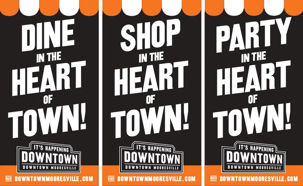
Every piece I do has got to work its ass off, and the street banners for Downtown Mooresville were no exception. With street banners, you don’t have a lot of room. And it’s outdoor, so your copy’s gotta be super brief. Which made this an excellent challenge to support our Downtown message: It’s Happening Downtown. I’ve told you about all the events the Downtown Commission created to pull in traffic, but we also had to prove this wasn’t all about events. Downtown looked empty when I started working on it. There were BIG gaps between open businesses. Lot’s of newspaper covered windows, know what I mean? We really needed to promote the events, but also the business that were already there. And there were quite a few of them (you just couldn’t really tell). And that’s why I did what I did on these banners. I listed all the types of shops and services that were ready and available right this second. It didn’t hurt that Main Street is also Highway 152. So a lot of traffic is coming from somewhere else, going somewhere else. But what a great message for passers by, either on foot or in cars. Downtown actually has a lot to offer.

FINAL: The first round of street banner I did for Downtown Mooresville told a story up and down the street – Downtown is full of business!

FINAL: The first round of street banner I did for Downtown Mooresville told a story up and down the street – Downtown is full of business!

COMPS: This is an idea we presented for the second round of banners, when occupancy was WAY up and people knew there was fan to be had in Downtown Mooresville. In fact, we even had a joke campaign that mostly complained how there wasn’t any parking …

COMPS: This is an idea we presented for the second round of banners, when occupancy was WAY up and people knew there was fan to be had in Downtown Mooresville. In fact, we even had a joke campaign that mostly complained how there wasn’t any parking available Downtown.

FINAL: In the end we went with more festive, shorter messaging to reinforce the things you could do (and probably are already doing) while you’re Downtown.

FINAL: In the end we went with more festive, shorter messaging to reinforce the things you could do (and probably are already doing) while you’re Downtown.

After a while it was time for a refresher. Downtown had blossomed. In fact, things were booming everywhere in Mooresville. And that meant competition. Now, I’ve told you about the situation with Lake Norman. Well all those Mooresville shopping mall / apartment complex combos butting up against all those Best Buys and Applebees were vying to become the lake-side’s version of Downtown Mooresville. And, I kid you not, one giant development, just one exit down the I77, had plans to rename their micro-city from Langtree at the Lake to...wait for it...Downtown Mooresville. Ehem, but fuck them. Needless to say, that didn’t go far. But we did see the need to claim our rightful ownership of being the Heart of Downtown Mooresville. And so we did. :-)

dave_bug.jpg

DAVE SOPP – Creative

Yep, that’s me. I’ve got over 20 years of marketing strategy, graphic design, advertising art direction, and illustration experience. Want to use some of it? Email me at dave@davesopp.com


How and When to Use Restraint.

Design > Logos

Sometimes the solution to a problem is right in front of your face. Downtown Mooresville is the birthplace of Mooresville, NC. You can honestly say the train delivered it. Incorporated in 1891, the town began with a railroad depot where farmers would load their cotton. Many of the buildings that sprang up soon after are still here in a little 2 x 3 block area that straddles the rails which still see a freight engine once a day. Only now, it loads grain from the mill on North Main Street. One block down from the depot (not the original, due to a fire, but still charming) are the ruins of Mill #1 where cotton was spun. Further south is the massive mill complex that would replace it - Burlington Mill. I’m telling you all this because that’s the kind of charm Downtown has. It’s not fancy, but it’s not dull. It’s historic as gangbusters, but not famous. It seeps potential. Heck, it’s why I moved from SF to live a couple of blocks from it.

FINAL: Here’s where Mooresville started – at the train depot. It was a simple farming town and Downtown Mooresville still reflects it’s historic railroad heritage.

FINAL: Here’s where Mooresville started – at the train depot. It was a simple farming town and Downtown Mooresville still reflects it’s historic railroad heritage.

While Downtown had been here for over a century, about 85% of new residents (those living among all the Super Targets, Red Robin’s, and Chipotle’s near the lake) had no idea Downtown existed. Seriously. They just never thought about turning right when they got off the freeway on their way home from Charlotte. On the Downtown side, people knew it was there, but there was an identity vacuum. Downtown was at about 40% business occupancy where we started. The merchants who were slugging it out were desperate to increase traffic as they saw a boom beginning to happen down in Charlotte. NoDa (for North Davidson), Dillworth, Plaza Midwood – these were old neighborhoods that were becoming hipster hot spots. A smattering of coffee shops and breakfast dives moved into the 50’s and 60’s era gas stations and whatnot in these mainly residential neighborhoods – and they were getting buzz. It was where the cool people hung out. Mooresville merchants thought...“Downtown needs cool people. So we need a cool name.”

“The Dirty Mo’” and “DoMo” (see what they did with that one?) were big favorites among them. In fact, the sushi place made shirts and stickers and was running full steam with their “DoMo” idea, whether anyone agreed with it or not. Look, having a cool name is great. I’m a big fan. But when people don’t even know you exist, it can work against you. Take DoMo. What the fuck is that? Run with that and you’ll 100% have to explain it in the tag line. “DoMo. In Downtown Mooresville!” Two wasted opportunities to identify yourself. No, if you have to start from chapter 0, then do the work and call yourself what you are – Downtown Mooresville. Oh, and no one had ever used a capital D when writing the word Downtown in copy before. We told them to start. It’s a destination, so treat it like one. Always. Anyway, even though we’d name Downtown what it already was, we’d do something important with the logo – we’d lead with the tagline and use the name as support.

FINAL: See? Same hardware store as 100 years ago, but now we have people who run for fun. I think they call it “exercise”. The logo still suits the atmosphere, no?

FINAL: See? Same hardware store as 100 years ago, but now we have people who run for fun. I think they call it “exercise”. The logo still suits the atmosphere, no?

The logo itself was inspired by old railroad signage from historic photos of Downtown. If you’re thinking, “oooh, big idea using railroad graphics for a railroad town”, think again. The big money Lake Norman side has a freeway, a lake and Five Guys Burgers and Fries. We’ve got the railroad and the 104 year old hardware store. Work with what works best for your message. This is how you build an historic rail district. And if you’re still miffed about the railroad imagery, get ready to be more miffed. The font I used was called Railroad Gothic. You know, sometimes the best idea is the obvious one.

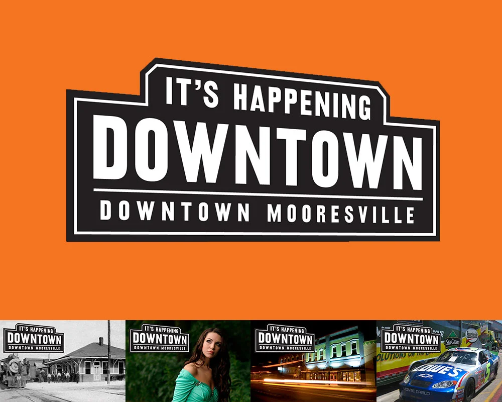
FINAL: I used these images when I presented the final logo to the Downtown Commission. Even though it’s simple and historic, the logo had to be able to live in a variety of modern situations that’ll likely come Downtown. Clothing stores, restaurants…

FINAL: I used these images when I presented the final logo to the Downtown Commission. Even though it’s simple and historic, the logo had to be able to live in a variety of modern situations that’ll likely come Downtown. Clothing stores, restaurants, nightlife, events of all kinds…the logo had to be able to support all that and keep it’s sense of place.

I used black and white for the logo, and as an accent, the red-orange that was predominant in the bricks of our historic buildings (it stood out like gangbusters in advertising). Then I locked it all up nice and neat with the tag line, and tweaked the perspective on the whole thing to give it a little motion. Sort of like you’re passing through town and seeing it from the train window, painted on a brick building (yep, Downtown’s got a lot of old advertising murals, too).

Oh, I almost forgot. The tag line itself is the best part. It was one of the biggest lies I’ve ever told (professionally). There was certainly nothing going on Downtown. But there’s would be. The Downtown Commission was gearing up for their first big flight of non-stop events and we were cranking out supporting materials like crazy to get people to go to them. We had no idea that it would take less than a year for our big lie to become the absolute truth.

DAVE SOPP – Creative

Yep, that’s me. I’ve got over 20 years of marketing strategy, graphic design, advertising art direction, and illustration experience. Want to use some of it? Email me at dave@davesopp.com


How to Fake It 'Till You Make It.

Strategy > Branding

Downtown Mooresville is a special place. Its charm (and untapped potential) lured us away from San Francisco when we were looking for better schools and a less hectic lifestyle. We took a look at Downtown, found an old home a block and a half away, moved, set up shop in the old telegraph office along Broad Street across from the old train depot, and quietly kept doing what we were doing back in The City. Only this time, with a freight train passing by and blowing its whistle every day at 1pm. It was so loud you couldn’t plan any phone calls around that time slot. It was awesome (not sarcasm). The old Downtown was only a few blocks long on Main Street, and wore charming but warehousy treasures over its shoulder along Broad Street, too. 

FINAL: The first thing we did was define Downtown Mooresville as, well, Downtown Mooresville. The final logo could easily represent Downtown’s railroad past, but also make sense with shops you’d find there (fashion, restaurants, bars, hairstylists, …

FINAL: The first thing we did was define Downtown Mooresville as, well, Downtown Mooresville. The final logo could easily represent Downtown’s railroad past, but also make sense with shops you’d find there (fashion, restaurants, bars, hairstylists, hardware, etc.), and event that would be held there. It had to play nice with everything you threw at it.

It’s hard to not meet people Downtown. Heck, most of them were neighbors as it turned out. One of those neighbors turned out to be Kim Atkins. She’d had successful career in the printing business and became a shop owner on Main Street. It didn’t work out. Rather than do what anyone would have done (curse Downtown and never return), she did the opposite and was elected the Executive Director of the Downtown Commission. Our boys went to the same elementary school and had become inseparable pals.

Downtown Mooresville was founded in 1873 along a rail line (yep, trains still use it!). In the 1960’s, Duke Power created the man-made Lake Norman while at the same time, the I77 was created to offer a faster way to motor to Charlotte down south, and Statesville up north. The lake was to the west of Downtown and offered about a jillion miles of lakefront property opportunity. The I77 freeway divided the town in more ways than one. Downtown was considered the poor side of Mooresville. Lake Norman (LKN) was where the money was. Hot-Cha!

BEFORE: Oh, there was clearly nothing happening Downtown when we started this project. Open shops had huge gaps of vacant, papered-over storefronts between them. That’s real bad for encouraging foot traffic and look at the mess. By code, closed busi…

BEFORE: Oh, there was clearly nothing happening Downtown when we started this project. Open shops had huge gaps of vacant, papered-over storefronts between them. That’s real bad for encouraging foot traffic and look at the mess. By code, closed businesses had to have their windows papered. So we had the idea to paper them with interesting facts about Downtown. It would pull people through to all the open shops, entertain and educate visitors, clean up the overall look of Downtown Mooresville, and cover up it’s vacancy problem. And, being black and white, it’d be affordable. So many problems solved with one easy solution!

BEFORE: The many brochures (and identities) of Downtown Mooresville, all in circulation at the same time when we started working with them.

BEFORE: The many brochures (and identities) of Downtown Mooresville, all in circulation at the same time when we started working with them.

Cut to modern times and it’s still the same. One side of Lake Norman has all the Red Robins, Super Targets, and Olive Gardens they can handle. While our side (I live in this part, remember) is a little weathered, but has all the heart and soul of what this town used to be. It didn’t help that Downtown was all but empty, lacking both shops and people. The most going concern though, was really going. Soirée was situated in a beautifully restored building in the center of Downtown and was a destination on any night of the week. The problem was, the few shops and business Downtown were never open when Soirée was pulling in the public. Worse yet, the town was so divided that (and I’m not exaggerating here), 85% of the fancy people on the Lake side didn’t even know Downtown existed!

FINAL: The first step – getting our house in order. With some selective photography we presented the Downtown we wanted people to see. All beautiful old buildings and historic charm. We dressed up Main Street with some handsome, attention-getting, h…

FINAL: The first step – getting our house in order. With some selective photography we presented the Downtown we wanted people to see. All beautiful old buildings and historic charm. We dressed up Main Street with some handsome, attention-getting, hard-working street banners, nailed down our identity and made ONE exciting brochure.

Sorry. Lots of backstory, but it’s super important (especially if you’re a small town in a similar situation). Downtown was quiet, but not dead. They launched a VERY aggressive event schedule to get folks over the I77 to our side, but they didn’t really have a brand to hang it all upon. Some merchants were calling Downtown “the Dirty Mo” on their social media. Some called it “DoMo” (Downtown Mooresville). Messaging was all over the place and none of it was cohesive or sticking. So Kim asked us for ideas on what to do.

The first thing I recommended was nixing the idea of a clever name altogether. People didn’t even know there WAS an old Downtown in Mooresville. Calling it fancy things would just confuse the issue. It was Downtown Mooresville, so just let it be Downtown Mooresville. You can always make a fun nickname later. They brought us on for branding Downtown and the  next thing I did was lie through my teefs.

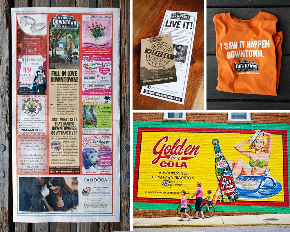
FINAL: Next it was time to promote Downtown as a destination. Clockwise from the left: 1. By working closely with the pubs we advertised in, we were able to create uniquely branded templates. 2. Our award-winning program to celebrate fans of Downtow…

FINAL: Next it was time to promote Downtown as a destination. Clockwise from the left: 1. By working closely with the pubs we advertised in, we were able to create uniquely branded templates. 2. Our award-winning program to celebrate fans of Downtown Mooresville. 3. Our first piece of Downtown merch. 4. We created a photobank of amazing images that we could use to show folks what we saw in Downtown Mooresville.

Downtown was tired and mostly empty, but not dead. And with a roster of new events, we had to make it seem like there was a secret party going on over here that the Lake people weren’t privy to. In a nod to our railroad history, I designed a vintage/modern logo lockup with the tag line, It’s Happening Downtown. And that was the big lie. Sort of. It was GOING to happen, it just hadn’t actually happened yet. Operation “Fake It ‘Till You Make It” was in full effect. We started running monthly event ads in the local papers. We installed street banners, made bar coasters, put up signage at our local ballpark. We started doing spreads with an event calendar in the local magazines. We rebuilt the website. We got on social media. All the stuff you need to do before we got really creative.

FINAL: From 2009 to 2017 we’d spread the word about Downtown Mooresville. Clockwise from top left: 1. The website we designed for Downtown. 2, One of many posters we did to promote their crazy amount of fun events. 3. A magazine ad designed to intro…

FINAL: From 2009 to 2017 we’d spread the word about Downtown Mooresville. Clockwise from top left: 1. The website we designed for Downtown. 2, One of many posters we did to promote their crazy amount of fun events. 3. A magazine ad designed to introduce newcomers to Downtown. 4. One of many little quarter page newspaper ads promoting monthly events Downtown.

For example, we made calling cards for Downtown merchants and employees to hand out to other shop and restaurant owners whenever they happened to find themselves in a business they wished was Downtown. A bakery, a great Indian restaurant, that kind of thing. It said, “If you’re reading this, your business should be Downtown.” One the back was an invitation to call Kim Atkins to discuss retail opportunities. OMG, even if you weren’t looking to relocate, it sure made it look like shit was going down in Downtown Mooresville. Super buzz worthy, and it worked. Despite our launching during a recession (always fun), within a year, Charlotte was airing a live prime time news segment about Downtown’s revitalization. Finally, it really was happening Downtown. Lie turned truth.

We’d go on to make fun event posters, TV spots, and even more special little programs. Our custom-made Downtownie™ loyalty program would win an Innovation award from the State of North Carolina. Best of all, Main Street filled up. At its zenith, it reached 95% occupancy. Morning, noon, or night, people were coming to see what was Happening Downtown.

dave_bug.jpg

DAVE SOPP – Creative

Yep, that’s me. I’ve got over 20 years of marketing strategy, graphic design, advertising art direction, and illustration experience. Want to use some of it? Email me at dave@davesopp.com


How to Be Creative for Creatives.

Strategy > Branding

It all started at the big annual toy show in NY, the International Toy Fair. I was there representing Wrybaby and started up a convo in the Wrybaby booth with a nice guy who turned out to be from American Greetings. I don’t even know how we got to it, but he mentioned that they were looking for a way to do something that I can’t write about here (ask me in person and maybe I’ll tell you). I said I had an idea that would work perfectly for that. After the show, I pitched my idea to his boss over the phone. He was the head of American Greetings Properties (AGP). AGP managed licensing for all of American Greetings’ legacy properties like Hollie Hobbie, Care Bears, Madballs, Strawberry Shortcake etc. But they also thought up lots of new stuff, too. They were creating properties to develop themselves or to pitch to companies like Disney and Nickelodeon, and that’s why they took an interest in our idea. It was really out-of-the-box. So the head of AGP loved what we presented and said he wanted to make this idea happen with us. He flew down to visit our office in Mooresville, then he invited us for what would be a super weird visit to the AG mothership in Cleveland (ask me in person and I’ll tell you all about it). Then he dumped us into a really shitty negotiation process with AG’s entertainment lawyers in LA where they continuously threatened to steal our idea outright. Super hardball shitty. I told the lawyers that they and AGP could, literally, to go fuck themselves and hung up on them. And then the AGP boss asked us to rebrand them. Well, first he asked us to design a fun corporate team-building program for the department. And then he asked us to rebrand them. How freaking weird is that!?

FINAL: The whole idea was based on the home page. An island fantasy land of AGP properties where all the dispirit characters could live in harmony. You can check out the website design deets and see bigger pictures here.

FINAL: The whole idea was based on the home page. An island fantasy land of AGP properties where all the dispirit characters could live in harmony. You can check out the website design deets and see bigger pictures here.

BEFORE: This was AGP’s home page when I was brought on. You can see what they tried to do from the start – create a fun-but-not-too-fun envelope that can hold variously styled characters from the 70’s to today (the properties slugged along as a slid…

BEFORE: This was AGP’s home page when I was brought on. You can see what they tried to do from the start – create a fun-but-not-too-fun envelope that can hold variously styled characters from the 70’s to today (the properties slugged along as a slide show). So, done, right? Sort of. The problem was that it didn’t set AGP up as the creative all-stars they were. It was just a generic box of characters you either knew or didn’t.

And we did it. Which was even weirder. But all of the (very real) unpleasantness aside, it was a cool project and they paid us what we were worth <shrug>. Chalk it up to me always rooting for the underdogs, I guess. Which, despite all the success and billions of dollars they generated, AGP and the team that supported it deserved more respect. We got to meet all the crazy-talented artists and writers on our visit and they seemed like normal, good people. Remember, AGP might be pushing a lot of old brands, but they were also in the business of thinking up of a lot of new, exciting characters and shows. The problem was, when the studios saw they were hearing a pitch from AGP, they thought a couple of corporate grandpas would be shuffling in to show them some old Holly Hobbie shit. The AGP boss wanted to change that perception.

COMPS: Some (not all) of the ideas we presented in the first round to AGP. Each idea included whatever it took to get the concept across. So some ideas came tight with taglines attached. Some were just rough sketches. Clockwise from top left: 1. Fre…

COMPS: Some (not all) of the ideas we presented in the first round to AGP. Each idea included whatever it took to get the concept across. So some ideas came tight with taglines attached. Some were just rough sketches. Clockwise from top left: 1. Freshen up the old characters and spice up the new by presenting each character’s personality in a modern way. 2. Incorporate the characters into a graphic envelope (the safest idea, just in case they freak out over the others), 3. Explore exciting new worlds with AGP. Visit planets and discover unique characters. 4. The world of AGP as an island inhabited by strange, sweet, wonderful, and exotic characters.

American Greetings, duh, already has a brand. We were just giving the one department a new look. We started calling it a “restaging,” because we had to use the AG logo lockup unmolested in anything we did. So the first thing we did was present a whole mess of concepts (from tight to super sketchy) to hang their new skin on. These guys were all artists (and all WAY better than me), so we knew that they’d get what we meant if we showed them loose drawings. We showed them all kinds of directions they could go to solve their problem (as we do for every project). For example, there was one idea about how creative the team in the department was, and all the crazy things that happened in their building on the steady. We’d do a lot of videos, social media (with a focus on Linkdin), email newsletters to the industry, etc. The employees would get a chance to be stars and use their awesome talents to help promote their common cause. I only mention this so you can get an idea of how different each idea was. What they chose was way different. The idea was to refresh the old stuff, pull the new stuff into the spotlight, and bring all the properties together as one. Instead of being the keepers of the old that sometimes had new ideas, AGP would represent a big fun world of full of creative ideas. We’d just take “legacy” out of the conversation altogether.

FINAL: Every pop-up on the AGP website, in every category, would include a strip of bright, clever, modern infographics. One trivia block in each strip would be animated, too, leaving the visitor with a ton of tiny positive impressions of how amazin…

FINAL: Every pop-up on the AGP website, in every category, would include a strip of bright, clever, modern infographics. One trivia block in each strip would be animated, too, leaving the visitor with a ton of tiny positive impressions of how amazing these properties are, no matter how dated they seemed to you before.

FINAL: We pulled the map theme across everything from their massive trade show booth (back wall pictured above) to Powerpoint presentations. We also gave their team a host of logo lockups they could use wherever in the future. All predesigned and re…

FINAL: We pulled the map theme across everything from their massive trade show booth (back wall pictured above) to Powerpoint presentations. We also gave their team a host of logo lockups they could use wherever in the future. All predesigned and ready to go go go.

The final execution would all bloom (see what I did there?) from a new home page featuring a fanciful, illustrated map of an island filled with AGP’s properties. Visitors would click on any of the characters for a pop-up filled with info on that property along with its licensing opportunities. Kelly and I came up with a ton of fun taglines to support this idea, and they picked our favorite in the end – Happiness Happens Here. As they created new properties, we’d just add ‘em to the island. Once the site as approved and in production, I took the island I’d illustrated and pulled the concept through everything from their giant trade show booth to PowerPoint templates for presentations. The whole thing was modern, unconventional, bright and fun. Just the way AGP wanted to be thought of.

dave_bug.jpg

DAVE SOPP – Creative

Yep, that’s me. I’ve got over 20 years of marketing strategy, graphic design, advertising art direction, and illustration experience. Want to use some of it? Email me at dave@davesopp.com