Strategy > Product Development
I’d designed and manufactured all kinds of products – baby clothing, children’s hooded towels, toys, stacking blocks, board books, even pacifier cases. OMG it was all so HARD. I had always wanted to make a line of plush (normal people call them stuffed animals), but was intimidated by the potential for it to go wrong. Hahaha. I’m such a chicken, but being gun-shy DID bring me success in our Mysterio line. So, I put that kind of thinking against the plush problem.
First of all, and if you know me you already know this, it couldn’t be like any plush. I didn’t want to make furry lions, or sweet teddy bears out of recycled sweaters. It had to be different. I was super intrigued by blind box art toys. Especially the artists who were sculpting one simple form, and then re-skinning that form in different ways. It seemed so simple and yet so endless what you could do within those confines. So I started noodling forms and experimenting with what could be done with them.
Where I ended up was certainly really different. Canvas forms filled with beans at the base so they stood on their own. Easy surface to print on, simple shape to sew. Manufacturing would be easy since I’d only be held to a printing minimum rather than a per piece construction minimum. I could make a lot of different dolls without a lot of expense. But it wasn’t “fluffy expected” and it wasn’t particularly “baby”. I didn’t think it mattered. I was going for something beyond expectation.

FINAL: This is Robot Stuf. Because we were funding this line ourselves we had to do it as economically as possible. Can you guess one of our methods? Right. Limited colors on each doll (notice the ON switch on the back isn’t green). But it made it a challenge. So what do you do when you’re limited on colors? Double down and make it work to distinguish each dolls individuality and character.

FINAL: All along It was always this simple. The form on the left was Big Stuf, 12” tall. On the right, Small Stuf, 6” tall. These were the blank factory samples we approved.

FINAL: While some Stuf families had the same patterns on the back of each doll (Robot Stuf all had ON and OFF buttons, Circus Stuf all had a shared graphic pattern), Pirate Stuf all had a bit about each pirate’s personality on the back. My favorite, I think, was the orange Shaggy Dan who was “only a little afraid of the water”.

FINAL: Circus Stuf was probably my favorite family and it was an honor to have them for sale at the Ringling (as in Ringling Brothers) Museum of Art Florida. Pictured with the Circus Stuf family is the Big Top-themed wood and canvas backdrop I later added to the line.

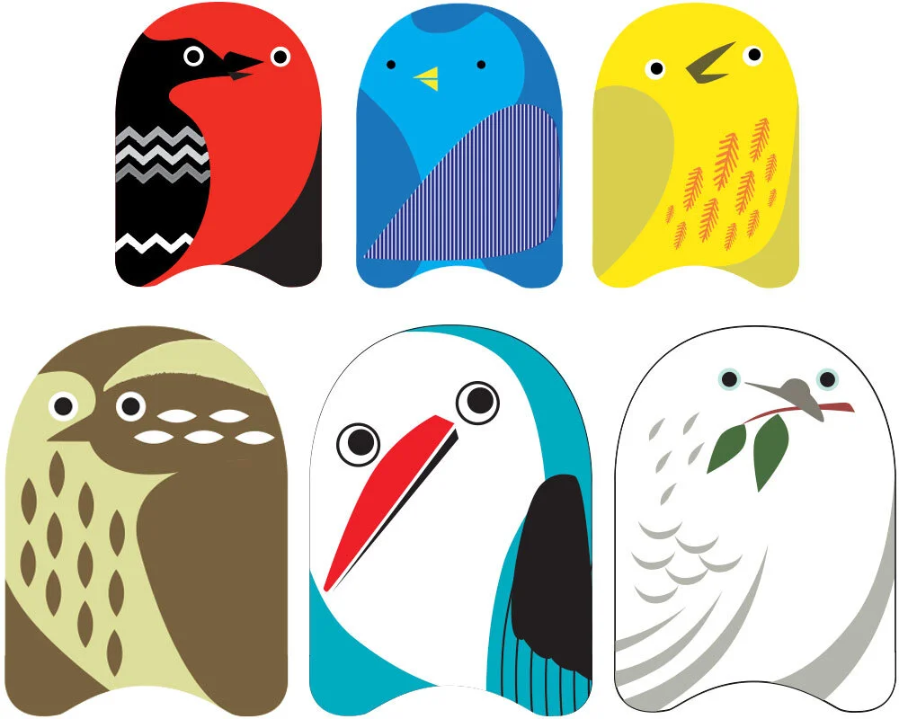
FINAL: Bird Stuf and Developmental Stuf.
I always tell my clients that they need to design their audience before they design their product. I knew I wanted this line to appeal to art-types, and that because of it’s plush category nature, they’d likely be parents. So why not make collectible art plush for children? And that’s when I started working on themes. I went EVERYWHERE and it was SO fun. I eventually landed on five different sets – Circus, Bird, Robot, Pirate, and Developmental. Developmental Stuf was interesting because developmental research shows that babies respond positively to high contrast items. It stimulates their brains like crazy (in a good way).
Side note: No matter how simple you try to make things, it always gets complicated. We had hired a freelance production manager who’d worked for the likes of the Gap and we found a factory who’d manufactured for Disney, yet 75% of our container shipment arrived practically destroyed. Badly sewn, misprinted, stained and unsellable. The 25% we could use was exactly to specification, thank goodness. Entrepreneurs, know this: no matter how much you try to prevent this situation, it’s ALWAYS a possibility. Which ALWAYS sucks.
I’d always planned to market Stuf in a special way. Like, exclusive special. So I developed a line presentation that would set it up to be museum quality from the beginning. Even the name, Stuf, gave a simplistic European flavor without the fancy umlauts. Each line of Stuf would be a limited series, and a percentage of proceeds would be donated to a specific charity related to each theme. Bird Stuf, for example, would donate to the American Bird Conservatory. Developmental Stuf would contribute to Plan. The idea was for stores to display each line of Stuf alongside an engraved plaque we had made with the charity information. When a customer brought a Stuf doll to the register, the shopkeep would retrieve a fresh product from the back for purchase. It was special art you could buy. And this is an important part of the strategy – perceived value. We set this up to look like each piece (with its charitable contributions and lack of back stock) would retail for $40 each. No. Each of the small dolls retailed for just $12.95. The big ones for just $24.95.

FINAL: Our online retail packaging was clean, simple and graphic, like the brand.

FINAL: Developmental Stuf in NY MOMA.
Finally I get to the REAL strategy part. We didn’t cop to being the creators of Stuf. We were just the DISTRIBUTERS. We never told our stores or any interested parties where Stuf came from. And this is important to building mystique. We build a whole separate website for Stuf and only offered a single Stuf email as contact info. No order forms. No list of stores that we sold to. No wholesale reps to contact to buy it. Nothing. This all lived in the background before we launched at the big NY International Gift Fair.
When Wrybaby did bring it to market, we played dumb. We found this line and we’re the distributors. It was so different from anything else in the Wrybaby booth, it was totally plausible. And we gave it wide berth to attract stores we’d never been in before. Those store were museum stores. Modern art museums. And we got their attention. Before too long Stuf was available in:
MOMA NY
MOMA SF
Contemporary Arts Center - Cinncinati
Walker Art Center - Minneapolis
The Art Gallery of new South Wales
Arkansas Arts Center
Contemporary Arts Museum Houston
Delaware Art Museum
Portland Art Museum
Tacoma Art Museum
Dallas Museum of Art
Museum of Contemporary Art Cleveland
Museum of Contemporary Art Chicago
Ringling Museum of Art Florida
The Getty Museum
The Ackland Museum NC
The Autry Museum
The Bremam Museum
Bay Area Discovery Museum

FINAL: Once the concept proved itself, Stuf got to have it’s own booth at NYIGF. So clean! I wish I had a better camera to document it. :-P
But here’s the best part. Museums liked Stuf, but we pulled the whole third-party distributorship act through to the end. Emails to the Stuf website went unanswered, or a Stuf Staffer replied vaguely. There was no phone number to call. It was like those Stuf people weren’t really interested in selling their plush dolls at all. Stuf’s website was hilariously smug. It was set up like a modern art gallery site. It only listed the products, the museums they were in (which expanded by the week), the charities it funded, and the trade shows it would be presented at. I’ll tell you, I sat on the one museums PO for months until they were calling me every day to fill our their new vendor form and ship them. Why? Sometimes the more you make people want something and the more they have to work for it, the more valuable it becomes to them. It’s the law of exclusivity. Availability works the same way.
Stuf was successful enough to warrant an INCREDIBLE trade show booth dedicated to it. Very artsy. We added cool canvas backdrops to the product line so kids could put on plays using characters from each Stuf theme. Stuf went through another reorder with another factory (much better) and we retired the line to focus on other projects. But I’ve still have the bragging rights to having my art featured in most of America’s major art museums (even if it was in the gift shops).

DAVE SOPP – Creative
Yep, that’s me. I’ve got over 20 years of marketing strategy, graphic design, advertising art direction, and illustration experience. Want to use some of it? Email me at dave@davesopp.com