Design > Product
I’ve said before that your packaging is as much the product as the product is. This is another example of how true that is. If you don’t know, Mysterio makes a baby t-shirt that can predict your child’s future. Kelly and I had just published a children’s picture book about Mysterio and we were looking to expand his product line. Mysterio was always more of a gift for parents than a gift for baby. Sure, the baby got a shirt. But the parents, the baby shower guests and the gift-giver, all got a fun, memorable experience. So why not develop more experiences for them

FINAL: BEHOLD! Mysterio’s Deluxe Keepsake Chest! An expansion of the Mysterio infant t-shirts that predict your baby’s future. It was so fun to play in this sandbox from a design and illustration standpoint. Almost too fun. In the end I made way too much stuff for it. Made it a little hard to explain all the contents!
That’s where Mysterio’s Keepsake Chest came from. It was a deluxe collection of Mysterio’s baby shirt, his book, two fun games, a wooden top, and a paper craft. Over the years, customer feedback told us that people really did keep Mysterio’s shirts once their baby’s grew out of them. How fun to see if the future would eventually come true! So one of the games we developed predicted more specific events – Milestones. At the bottom of the box lies the game board and a heavy card filled with milestones. Spin the top and name a milestone. When it stops, it will point to the age at which the child will reach that milestone. Write it down on the card. Easy! The fun part is discovering that your child’s first haircut will happen at 58 years of age. Yes, all silly, good fun at a baby shower. Flip the game board over, and you’ll find that Mysterio will answer any YES or NO questions you have. Again, ask the question, spin the top, get Mysterio’s answer.

FINAL: SEE?! TOO MUCH STUFF! The tag on the outside had a list of contents (as brief as I could make it), but it still read like a novella. The game board that’s flipping up? That’s two games on one board. Of course it comes with a one of Mysterio’s signature baby t-shirts and his new picture book.
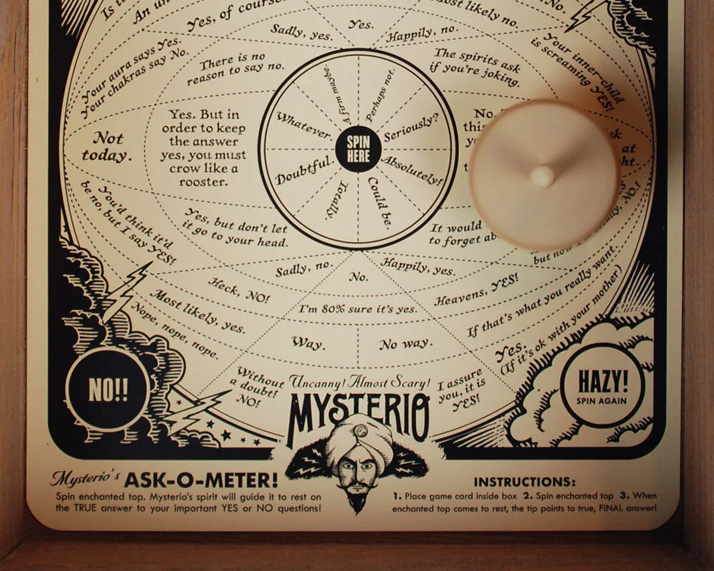
FINAL: A close up look at the Ask-O-Meter! Think of it as a flat, paper, much sassier Magic 8-Ball. I’ve got one of these in our living room and we use it all the time to make YES or NO decisions for us. I like how a lot of the answers end up being sort of confusingly ambiguous/
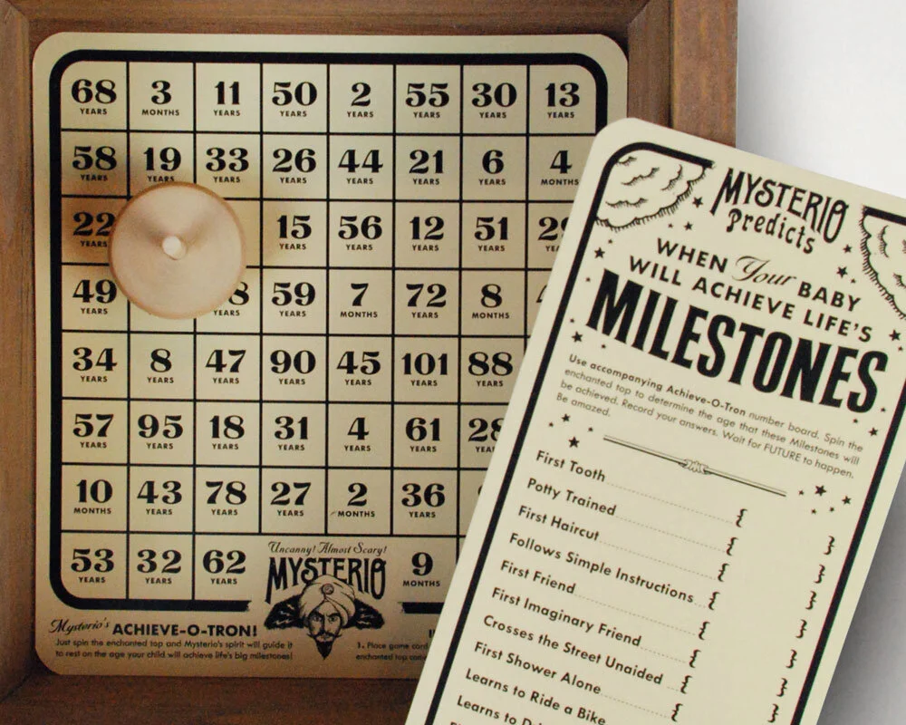
FINAL: The flip side to the Ask-O-Meter is a fun way to record when your baby will meet their major development milestones. What’s so funny is how horribly wrong Mysterio’s predictions get. First Tooth could be at 51 years, for example. Hilarious.

FINAL: There’s even a little papercraft Mysterio that you can pop on a shelf to keep a mystical eye out for baby. I like the extra credit (which I always say is for chumps) of printing a back to the paper Mysterio complete with all the instructions reversed as well. And here’s a shot of me tying up a box to ship out. I’d do 100 of these at a go and it KILLED my fingers. The things you do for art.
I think my favorite part of the whole thing was the clever packaging. We stuffed the box with wood excelsior so it looked all wild and exotic. We even slid the lid closed to leave some of the curly fill sticking out because it looked so cool. And just like we did on his baby shirt packaging, we let the lid be pretty simple and straightforward. We used a paper tag to really detail all the info. But even the tag was cool because, as the gift-giver, you could clip off the contents part and be left with a nice gift tag to fill out. Then, the giftee could discover the contents on their own. Also, it looked WAY not-commercial that way, too. Oh, and to keep people from getting into the box in stores (I already learned they would try), I wrapped each one with heavy rope and fastened it tight with heavy black wire. It killed my hands (yes, I wrapped them all myself), but it was totally worth it.
When baby was too big for Mysterio things, the whole kit and kaboodle could be stored away in Mysterio’s handsome wooden chest. Someday, far in the future, the child would find it, and have a good chuckle.

DAVE SOPP – Creative
Yep, that’s me. I’ve got over 20 years of marketing strategy, graphic design, advertising art direction, and illustration experience. Want to use some of it? Email me at dave@davesopp.com