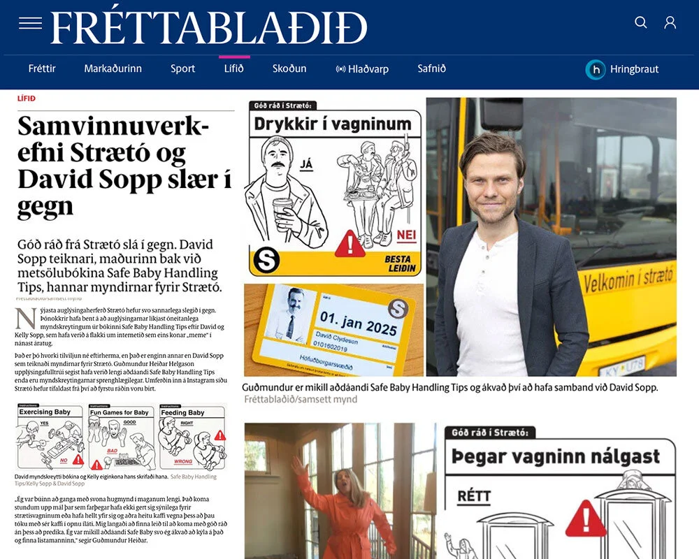
I’d never done a mural before. After my successful project teaching Icelanders how to ride a bus safely and not-insanely, I was asked to do four (FOUR!) giant murals inside Strætó’s Reykjavík headquarters. I was ecstatic and terrified, but mostly curious. Their ad agency handled the public reception room and it was nice. Typical Reykjavík skyline in modern thin lines, and stuff like that. The four murals they wanted would be in places only employees can see – the marketing/PR office, the tire shop, the dispatch office, and a very long wall in the company cafeteria. There wasn’t a creative direction other than, “what would you do?”

This is the cafeteria and, in a nutshell, the whole process of the project. My client sent me multiple photos of each wall, which I turned into panoramas (top). Then I turned those into a digital canvas and used those to make measurement guides. This wall was fairly easy with only those few vents. Wait until you see the dispatch room and tire center. I drew everything in pieces in Procreate, then put them all together in Illustrator. Then I popped the whole thing into my panoramas for client approval (bottom).
I started by doing what I always do for any project – consider the challenge I’ve been asked to solve and the what the intended audience would appreciate, then offer a range of solutions. It was seemingly simple. De-dullify some big, blank walls and lighten up the everyday lives of employees. If it was one wall, no prob. But this was four interior walls that employees would encounter multiple times a day. It really felt like it needed a theme to tie them all together.
My wife asked me why I was stressing so much over a wall decorating project. But to me it was so much more. It was a chance to celebrate the people who worked hard at a public service job that is typically unappreciated by its benefactors. The real challenge was helping those employees feel proud of what they do, and reminding them they matter greatly to their community. I believe every marketing or creative opportunity is a chance to do so much more than asked.
From the outset I had a direction I knew I wanted to go in. Bring the bus into the only place it doesn’t go in Iceland – INSIDE THE HQ.
I started with a litmus test to plumb the tone of the project. Serious? Funny? Fantastical? After all, there were no rules. But being 3,000 miles away from Iceland, I had no way of walking around to check the atmosphere of each department. My clients were my guide, and in the end, they went with what I hoped they’d choose. As I set out to bring the bus into the HQ, I thought, why not bring along the passengers, too?

This is what I presented in the first round - four different themes. I wasn’t sure what level of whimsy they wanted to bring in so I kept the spread pretty broad. 1. This was the one they’d eventually pick to bring the buses and their riders into the building. 2. This was based on something that my client had told me when I was working up the Riding Tips. He said people leave some crazy shit on the bus. So that’s what I had represented for the cafeteria. All the stuff left on buses. Yes, even a prosthetic arm! 3. I don’t even know where this came from. I’m glad they didn’t choose this because it looks like a pediatricians waiting room. 4. This was my second favorite theme - buses running the bus company! Every wall would represent the work going on there, only by buses! Hilarious.
The idea would feature Icelanders interacting with one another while riding and eagerly waiting for the bus. It was a great way to show a slice of Icelandic life, just doing the things that Icelanders do when they use Strætó. Early conversations about the Safe Bus Riding Tips revealed that people often do bizarre things on the bus. I thought there was a fun opportunity to make the murals a sort of “Where’s Waldo” of truths and funny inside jokes for the employees. It would also be a great way to create a story that could connect the murals in each department, converging in an “in bus” experience where all the employees come together - the cafeteria.

Final - Marketing/PR Office (top) My client told me that there are these really aggressive geese that are all over the place bullying people for handouts. They even get on the buses sometimes! So of course we had to add that in. As well as other feathered sights you’d see at a bus stop. That blank spot on the bus? That’s where a whiteboard is glued to the wall. I had to work around a ton of stuff in the dispatch office.

Final - Dispatch Room (top) Oh, man. So many windows! And a giant beam that divided the wall right in the middle. But we cleverly designed worked around it all by incorporating it into the drawing.

Final - Tire Center (top) The tall skinny gray boxes are support beams we had to work around. The other two boxes? This is the best - they’re bathroom doors!!! The men’s room is on the right, where the dudes are hanging out and the women’s restroom is at the front of the bus. Hilarious.

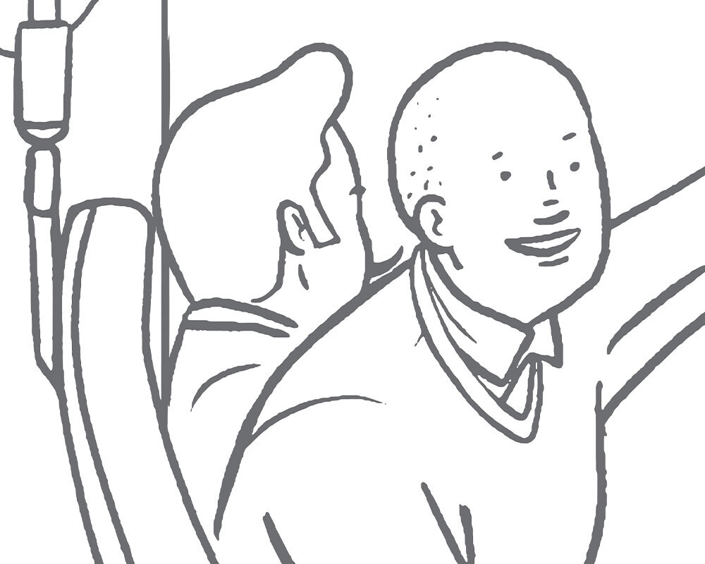
Final - Cafeteria (top) This is my favorite wall. I mentioned hiding little bus-life details before. One of those is a nod to weird giant things people try and bring on the bus. And I love the guys going to a soccer game in the front. See those two lost in their books? Notice how similar they look? The girl’s book is titled, “How to Find Your Perfect Match”.
Afterwards I noticed that all murals are signed and I didn’t sign any of these! But in the cafeteria mural, if you look hard enough, you can spot me gazing out the window at the beautiful Icelandic countryside. I can’t wait to go and see these in person!
While the walls were super long, the actual office spaces were pretty tight. Anything colorful or too aggressive would have been way to jarring to live with every day. So we decided to go with line art in a medium gray that would fill the space, but not fry the mind. From a production standpoint it was…interesting. I’ve written about how detail crazy I am, especially about physical space. But since I couldn’t measure it myself, my client photographed each wall the best he could, and I made a measurement guide from those photos. They accounted for every vent, pipe, beam, window, and any other possible obstruction. It’s was pretty damned detailed. He kindly confirmed the measurements in my detailed guide without cursing me (as far as I know). Then I drew the elements of the murals (piece by piece) and assembled them onto templates I made from the measurements. After that, I made Photoshop mock-ups to scale of how each mural would look after installation. Oh, and no one had to paint all this! They went with printed wall wraps. Smart.
In the end it was WAY more illustrating than I had originally planned on. What will all the passengers and all, but it was so much fun. Each figure was independent of everything else in the mural, so we could move any passenger wherever we liked in order to get the best composition. I’m told the reception by employees was really, really positive. I can’t wait to hop on a Strætó bus to HQ one day, and have a look for myself.

DAVE SOPP – Creative
Yep, that’s me. I’ve got over 20 years of marketing strategy, graphic design, advertising art direction, and illustration experience. Want to use some of it? Email me at dave@davesopp.com